Cherubim: Winged Celestial Beings on the Title-Pages of Early Hebrew Books
Cherubim: Winged Celestial Beings on the Title-Pages of Early Hebrew Books
by
Marvin J. Heller[1]
And having driven out the man, He stationed at the east of the Garden of Eden the Cherubim and the flame of the ever-turning sword, to guard the way to the Tree of Life (Genesis 3:24).
You shall make two Cherubim of gold—hammered out shall you make them—from both ends of the cover. You shall make one cherub from the end at one side and one Cherub from the end at the other; from the cover shall you make the Cherubim at its two ends. The Cherubim shall be with wings spread upward, shielding the Cover with their wings with faces toward one another; toward the cover shall be the faces of the Cherubim being turned toward the cover. (Exodus 25: 18-20).
Rav Ketina said: When the Jewish people would ascend for one of the pilgrimage festivals, the priests would roll up the curtain for them and show them the cherubs, which were clinging to one another, and say to them: See how you are beloved before God, like the love of a male and female (B.T. Yoma 54a).
Cherubim (angels) are a frequent presence on the title-pages of early Hebrew imprints in the sixteenth century and afterward, the latter beyond the scope of this article. They are also to be found in incunabula, on the frames of initial pages and head-pieces for text.
How do you define what are cherubim? One definition, that of the Encyclopedia Judaica, is “a winged celestial being which appears in the Bible in several different guises.” It then proceeds to give several descriptions of cherubim. The Jewish Encyclopedia begins with a more detailed description, stating cherubim are “the name of a winged being mentioned frequently in the Bible. The prophet Ezekiel describes the cherubim as a tetrad [set of four] of living creatures, each having four faces—of a lion, an ox, an eagle, and a man—the stature and hands of a man, the feet of a calf, and four wings.”[2]
The use of cherubim is also noted in the 1911 Encyclopædia Britannica where they are described as “imaginary winged animal figures of a sacred character, referred to in the description of Solomon’s temple (1 Kings vi. 23-35, vii. 29, viii. 6, 7), and also in that of the ark of the tabernacle (Ex. xxv. 18-22, xxvi. 1, 31, xxxvii. 7-9). . . . In Gen. iii. 24 the cherubim are the guards of Paradise . . .”[3]
The frequency of the appearance of cherubim in Hebrew literature can be found on Sefaria, a bibliography of Jewish texts, which records fifty-six entries for cherubim under biblical, Mishnah 27, and Talmud 991. Among other entries are Midrash, 590; Halakhah 7947; Kabbalah 747; and yet still others as well as multiples of commentaries on the first works.[4]
These multi-winged creatures are also a feature in general literature. Franz Sales Meyer, under the heading Miscellaneous heads, describes the “Angel faces, youthful heads, with a circular or disc-like halo, are first met-with in the Byzantine style, as the result of ecclesiastic articles,” He continues that in the early Italian Renaissance such renderings were charmingly naïve. They appeared as adornments on friezes and arches, medallions, and in borders. They also are to be found on tombs and are “Much used in Modern ecclesiastical decorations.” The text is accompanied by a page of examples of the cherub head, including one of a skull.[5]
It had been my intention to describe Hebrew title-pages with images of cherubim over a period of two centuries.[6] The numerous instances of such usage, however, has necessitated a considerable limiting of our subject period. Indeed, rather than noting all the examples in our current period, in the sixteenth century, we only describe several exemplars, giving background about the books in which they appear, that is, the publisher, author, and book subject.[7] This article is expansive, that is, in describing cherubim, it discusses the varieties of Hebrew literature, the authors of the subject works, the presses that published them, and even Hebrew book history. The title-pages and infrequent text pages with displays of cherubim addressed here are in chronological order, but from diverse locations and, again, on a variety of books, indicative of how widespread Hebrew publishing was and even more so the depth and nature of Hebrew literature.[8]
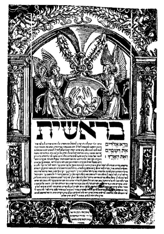
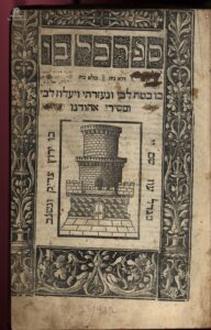
1514-18, Hameshei Humshei Torah – Our first work with the appearance of cherubim is a folio (20) edition Hameshei Humshei Torah (Pentateuch) with haftorat and commentary of Rashi printed in 1514-18 in Prague at the press of Gershom ben Solomon ha-Kohen and partners. Gershom later received a royal privilege from King Ferdinand of Bohemia, allowing him, that is Gershom alone, to enjoy a monopoly on Hebrew printing in Prague. His descendants, known as the Gersonides, continued to print in Prague until the mid-seventeenth century.
1514, Hameshei Humshei Torah
Courtesy of the Library of the Jewish Theological Seminary
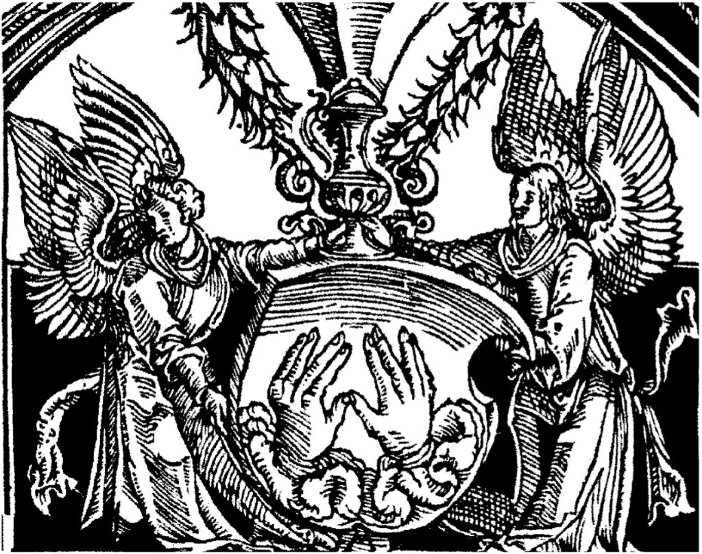
A magnificent edition, with ornate woodcut frames and large type for the text. Each book has a unique decorative opening page, there is no title page, comprised of four separate pieces, those on the pillared sides with vases, leaves, and cherubim, similar but not identical, the top piece with a concave bottom edge. Genesis has a convex curved piece to fit with this top piece on the upper half of the page, with winged cherubim holding a shield with the spread hands of the Kohen giving the priestly blessing.[9]
Work on the Pentateuch began on 10 Sivan (June 14, 1514) but, perhaps as a result of the success of the prayer book, the partners found they had overextended themselves and found it necessary to suspend work on this project for two years. In 1530 Gershom and his sons reprinted this Pentateuch in an identical format, except for changes to the decorated initial pages.
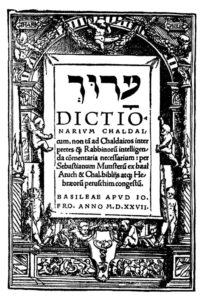
1527, Dictionarium Chaldai – Our next entry with cherubim is an Aramaic grammar by the Christian-Hebraist scholar Sebastian Muenster (1489-1552). It was printed in Basle in 1527 at the press of Johannes Froben in quarto format (40: [1], 434, [7] pp.). The Froben family was the most significant printers of Hebrew books in Basle. Johannes Froben published as many as 250 titles, among them Hebrew/Latin books of the Bible and grammatical works, primarily works by Muenster.
Sebastian Muenster, a cosmographer, astronomer, and orientalist was, for twenty three years, professor at Basle. Born in Niederingelheim, Hesse, the son of a Spitalmeister (hospital master), Muenster had no university education nor did he ever receive a degree. His education consisted of some private instruction in Latin and later studies at Frieberg and attendance at lectures given by the Franciscans. In 1506, Muenster entered the Minorite order and was sent to study in Rufach under Conrad Pellican (Pellicanus, 1478-1556). The following year he took vows and, in 1512, was ordained a priest. Muenster assisted Pellican in teaching in Pforzheim and, from 1524-29, occupied the chair of Hebrew at the University of Heidelberg. In 1529, Muenster converted to Protestantism and moved to Basle, where he occupied the chair of Hebrew, at a salary of 60 gulden; from 1547/8 he was rector. From about 1525, Muenster was a student of Elijah Levita, translating and editing his grammatical works. Muenster also translated a number of other Hebrew works into Latin and was a prolific author in his own right. By the time of his death more than 100,000 volumes of his works were in circulation. His Jewish oeuvre, more than three-score publications, covers all aspects of Judaica, excepting Kabbalistic studies, which did not interest him. In 1523, Muenster published Dictionarium Hebraicum . . . adiectis Chaldaicis vocabulis, his study of the Aramaic language. The book reads from left to right but the text follows the Hebrew alphabet. Words are given in vocalized Hebrew, followed by their etymology, definition and examples.
The title page of the Dictionarium Chaldai has an architectural frame with cherubim in various positions, as well as additional cherubim below mounted and otherwise. This title page, designed by Hans Holbein, was used as early as 1516 on Basel statutes and into the seventeenth century.[10] [11]
Not long afterwards, from 1540 through 1543, at least five titles were printed in three locations with varied images of cherubim on the title-page, that is Augsburg, Prague, and Bologna. That is not to say these frames were not used on other books, most likely they were, but rather these are examples of cherubim used by the printers of Hebrew books at the time.
Augsburg has an early history related to Hebrew printing. Several early anti-Jewish works beginning with the apostate Johannes Pfefferkorn’s Der Judenfeind (1509) and other anti-Semitic books by apostates were published there. Another early Augsburg publication of note, this certainly more positive, albeit not a Hebrew edition of that popular and much republished work, is the first printing of R. Joseph ben Abraham Gikatilla’s (1248–c. 1325) kabbalistic classic, Sha’arei Orah, which explains and analyzes the ten Sefirot. This edition of Sha’arei Orah is a Latin translation of that work by the apostate Paulus Ricius (Paulus Israelita, 1480-1541) under the title Portae lucis, published in 1516 at the press of Johann Miller.
1527, Dictiorionarim Chaldai
Courtesy of the Fales Library and Special Collections, New York University
Serious Hebrew printing in Augsburg begins when Hayyim ben David Shahor, among the pioneers of Hebrew printing outside of Italy, came to Augsburg in about 1533/34. In Augsburg, Schwarz worked in the print shop of Silvan Otmar (d. 1540), a renowned and highly productive printer, and resided in the home of Bonifacius Wolfhart, a Protestant pastor who also served as the censor of Hebrew books for Augsburg.[12] Shahor printed several works in conjunction with his son, Isaac, and his son-in-law, Joseph ben Yakar, who assisted him at the press, although their names are not mentioned on the title-pages.[13]
Shahor likely joined with a non-Jewish printer, perhaps August Wind, a printer of Hebrew works for Christian clergyman. Hayyim left for Italy, returning to Augsburg in 1540. He then printed three books, Avkat Rokhel, Arba’ah Turim and a prayer book for, according to the Thesaurus of the Hebrew Book, a total of ten works in Augsburg. Due to a lawsuit by an apostate, Paulus Aemilus, with whom Shahor had been associated in Ferrara, resulting from their failed venture, Shahor and his family were forced to cease publication and leave Augsburg. Aemilus, seeing a market in Augsburg for Hebrew/Yiddish books, began to print on his own account. He issued a small number of titles, most notably the Melokhim Bukh (1543) and the Shmuel Bukh (1544), Yiddish poetical renditions of the books of Kings and Samuel, both with images of cherubim (below).[14]
1540, Avkat Rokhel – Our first Augsburg title is Avkat Rokhel, an eschatological work on the principles of faith attributed to R. Machir ben Isaac Sar Hasid, a student of R. Judah ben Asher, son of the Rosh. Printed in octavo format (80: 18 ff.), perchance by Shahor. The Thesaurus of the Hebrew Book attributes it, albeit in brackets, to Hayyim Shahor, in contrast to the National Library of Israel that records the printer as unknown.[15]
The text of the title page is set within a decorative frame with nineteen cherubim and a number of animals. The title-page states that it is,
Sefer Avkat Rokhel
Printed by the printers named at the end of the volume. Edited with great care, with all our ability, “the good hand of our [Lord] upon us,” (ref. Ezra 8:18). And it was completed, here Augsburg, the great city, with the help of the Lord and His salvation. In the year, “[Rejoice, O you nations, with his people; for he will avenge the blood of his servants,] and will render vengeance to his adversaries, and will make expiation כפר (300=1540) for the land of his people” (Deuteronomy 32:43).
The names of the printers, Hayyim Shahor, Isaac ben Hayyim, and Joseph ben Yakar, the statement on the title page notwithstanding, are not given at the end of the volume. A brief introduction informs that the work was named Avkat Rokhel (the perfumer’s powders, Song of Songs (3:7)) for as the perfumer’s powders strengthen the soul, so too when one reads this book will he fear and cause his soul to be pure and free from all sin and transgression, thus meriting the good.
 1540, Avkat Rokhel
Courtesy of the Dorot Jewish Division New York Public Library
The like title-pages of Avkat Rokhel and Unterricht Wie ain Christenmensch, the latter a non-Hebrew work printed approximately two decades earlier, reflect a relationship between Jewish and Christian printers, that is, Christian printers published Hebrew books in association with Jewish associates. The relationship between the printers was mutually beneficial. For the Christian publisher “the Hebrew books sector, being unique, was attractive to investors, being more limited and not so wildly competitive as the Italian book sector.”[16] In addition to the non-Jewish printer’s access to the Jewish book market, the Jewish publisher was able to not only publish Hebrew books, but he also gained access to the typographical material of his Christian associate. The latter, for example, frequently provided attractive frames to the former after having used them for his market and the Jewish partner also utilized the printer’s other ornamentation. This was of value to the Jewish partner as he did not have to go the expense of having decorative material prepared, at a relatively much greater expense as it would be utilized for a much smaller market. This despite the fact that the frames were often incompatible with traditional Jewish sensibilities.[17]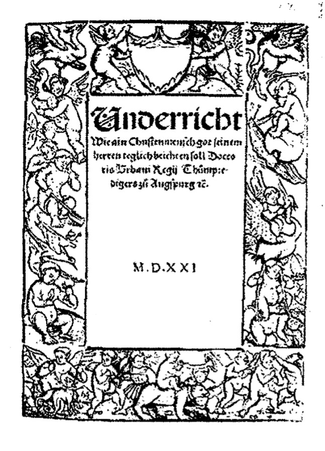
1521, Unterricht Wie ain Christenmensch [18]
The like title-pages of Avkat Rokhel and Unterricht Wie ain Christenmensch, the latter a non-Hebrew work printed approximately two decades earlier, reflect a relationship between Jewish and Christian printers, that is, Christian printers published Hebrew books in association with Jewish associates. The relationship between the printers was mutually beneficial. For the Christian publisher “the Hebrew books sector, being unique, was attractive to investors, being more limited and not so wildly competitive as the Italian book sector.”[19] In addition to the non-Jewish printer’s access to the Jewish book market, the Jewish publisher was able to not only publish Hebrew books, but he also gained access to the typographical material of his Christian associate. The latter, for example, frequently provided attractive frames to the former after having used them for his market and the Jewish partner also utilized the printer’s other ornamentation. This was of value to the Jewish partner as he did not have to go the expense of having decorative material prepared, at a relatively much greater expense as it would be utilized for a much smaller market. This despite the fact that the frames were often incompatible with traditional Jewish sensibilities.[20]
The title-page of Avkat Rokhel has the largest number of cherubim of our title-pages, nineteen in all, of our title-pages. The cherubim appear on the bottom, sides, and top of the frame, all active, albeit in different activities. The text of Avkat Rokhel is in three parts, each further subdivided. The first section addresses the struggle against one’s evil urge prior to redemption and the birth pangs and advent of the Messiah, and an explanation of the pertinent midrashim; the second part discusses the rewards and punishments of the soul after the resurrection, the nature of the world to come according to Judaism, in contrast to the views of non-Jews, and resurrection; and the third part the laws stated by the sages of the Talmud as halakhah Moshe me-Sinai, the formation of man and the number 248 limbs in a person, the statement of our sages concerning three partners in that process (God, man, and woman) and some gematriot.
This is the third edition of Avkat Rokhel, it having been printed previously in Constantinople (1516) and Rimini (1526). Ch. B. Friedberg records, in his Bet Eked Sepharim, more than twenty-five printed editions of Avkat Rokhel. It was translated into Latin by A. Hulsius and printed in his Theologia Judaica, (Breda, 1653) and a Yiddish edition was prepared by Naphtali Pappenheim (Amsterdam, 1647).[21]
1543, Melokhim Buch – Two additional works printed in Augsburg, attributed to Moses (Esrim ve-Arbeh) Ashkenazi, are Yiddish poetical renditions of the books of Kings and Samuel. Moses’ appellation, Esrim ve-Arbeh (24), derives from either his birthplace, Vierundzwanzig Hoefe (24 courts) in Wuerttemberg, or from his extensive knowledge of the 24 books of the Bible. Moses’ accreditation with either authoring or transcribing the Melokhim Bukh is due to its similarity to the Shmuel Bukh, more reliably attributed to him. Nevertheless, sufficient differences exist between the two works that many scholars believe they do not share a common author. It is clear, however, that the author, even if not this Moses, was an Ashkenazi Jew. The Melokhim Bukh was published in quarto format (40: [123] ff.) by, according to the colophon, Paulus Aemilus. A Latin colophon states, Augustae Vindelicorum/ per Paulum Aemilium, Anno/ Domini M. D. XLIII. Meyer Waxman suggests that it is doubtful, the colophon notwithstanding, that the publisher was Aemilus; more likely it was Hayyim Shahor.
We have noted above that the frames on these title-pages were first used by Christian printers and that when that market no longer needed the frames, they were made available to Jewish printers. The cherubim frames noted above were generally acceptable to a contemporary renaissance Jewish public, although some, many, were questionable and would not be used today. In contrast, the title-page of the Melokhim Buch has a border made up of a four-part frame, the top with a representation of a king, the left and right sides respectively with images of Adam and Eve, unclad, the latter with the snake, two small children, and expecting. At the bottom are two cherubim. Use of this frame is surprising, for in contrast to other frames its’ contents appear to be objectionable, more so than other frames, even those with mythological characters. It seems likely that this frame might also be distasteful to Christian sensibilities.[22]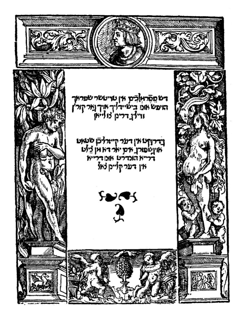
 1543, Melokhim Buch
Courtesy of Dr. Moshe Rosenfeld
The title page states that it is “The book Melokhim (Kings) in Taytsher sprach, beautiful and clear and very entertaining to read. Printed in the imperial city of Augsburg in the year 303 (=1543)” [23] The colophon dates the completion of the work to Friday, 14 Av, 303 (July 25, 1543), which was a Sunday in 1543.
The Melokhim Bukh was not written as a sequel to the Shmuel Bukh. It is the older of the two books, originally written as a separate work, possibly as early as the fourteenth century. The format of the Melokhim Bukh, a rhymed paraphrase of the book of Kings, is that of the heroic epic, stylistically modeled after comparable German sagas, such as the Nibelungen. The subject matter is the events in Kings I and II, imaginatively and colorfully enhanced by material from the Talmud and Midrashim, all expressed with a deep piety. Intended as a complete history, it begins with a hymn of praise to God in three strophes followed by nine strophes from the Exodus to the last days of David, the contents of Kings, and as a sequel, the history of the Jews to the end of the second commonwealth in thirty strophes). An example of the text is,
You have frequently performed signs for the children of Israel;
Therefore they are obliged to have You for their Lord.
And to fear Your name-that is useful and good for them.
That man is foolish who acts contrary to Your word.[24]
1544, Shmuel Bukh – The Shmuel Bukh was published, also likely by Hayyim Shahor in quarto format (Format 40: [102] ff.). It has an ornate title page made up of figurines above and about pillars with cherubim on the sides. It too is in Vaybertaytsh; among its reprints is a Latin edition (Ingolstadt,(1562). Waxman suggests that the Shmuel Bukh was likely written at least a hundred years earlier, most likely an original production of medieval Jewry. The author reworked the biblical material and incorporated aggadic elements. It was written in “vigorous poetic style” in eight line strophe and was meant to be sung.[25]
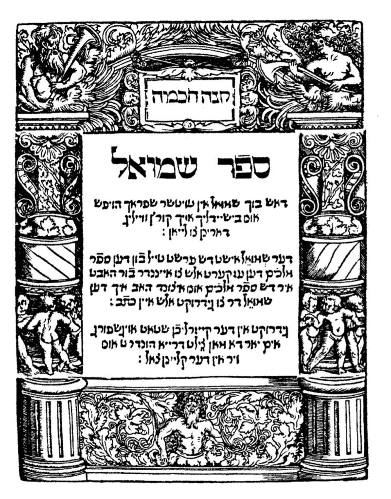 1544, Shmuel Bukh
Courtesy of Dr. Moshe Rosenfeld
In contrast to what was written above, “works that many scholars believe they do not share a common author,” Zinberg informs that both the Melokhim Bukh and the Shmuel Bukh are composed in the same verse-meter. Moreover, the title-page states that “Shmuel is the first part of
the book Melokhim, for it is all related.” Nevertheless, Zinberg quotes other sources that “these are two quite different works and were probably written by two different poets.”[26]
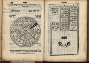
1553, Ma’yan Gannim – A composition book comprised of sample letters from R. Samuel ben Elhanan Jacob Archivolti (c. 1515-1611). Ma’yan Gannim was published in a small sextodecimo format (160: 45, [1] ff.) at the Venice press of Alvise Bragadin. The Bragadin press was active before the papal bull, dated August 22, 1553, by Cardinal Giovanni Pietro Caraffa, the future Pope Paul IV, an extreme reactionary and bitter anti‑Semite, who ordered the confiscation and burning of the Babylonian and Jerusalem Talmuds. This had a chilling effect on Hebrew printing and resulted in a considerable decline if not outright cessation of printing in Venice, and the subsequent expurgation and censorship of Hebrew books. When Hebrew printing resumed in Venice in 1563, among the Christian printers who took up the publication of Hebrew books was Alvise Bragadin. Bragadin died in the mid-1570’s, he was succeeded by his son, and after him by successive members of the family well into the eighteenth century, the last known Bragadin being Alvise III. Throughout that time the press remained a leading printer of Hebrew books in Venice.
 1553, Ma’yan Gannim
Courtesy of the Library of Agudas Chassidei Chabad Ohel Yosef Yitzhak
Archivolti, a student of R. Meir Katzenellenbogen (Maharam, 1473-1565), served as rabbi, av bet din, and rosh yeshivah in Padua. Among his students was R. Judah Aryeh (Leon) Modena (1571-1648). Prior to settling in Padua in 1568, Archivolti worked as a corrector for the Hebrew presses in Venice.
In contrast to our preceeding examples of cherubim, this exemplar does not appear on the title-page of the book, which has the Bragadin device, that is, three crowns, but rather at the beginning of each of the book’s five chapters, a woodcut illustration comprised of three cherubim in a cage, surrounded on all four sides by a verse.
The title is from “A fountain of gardens (ma’yan gannim), [a well of living waters, and streams from Lebanon” (Song of Songs 4:15). The text states that there are fifty letters, that is, twenty-five letters with their responses, written by Archivolti. There is a preface and introduction from Archivolti, followed by a table of contents, and, beginning on 7a, the text. Ma’yan Gannim is the first book written by Archivolti, for he describes it as his first fruits, an offering to the Lord. Archivolti also wrote Degel Ahavah (Venice, 1551), an ethical work; He’arot le-Sefer he-Arukh (Venice, 1553), textual references for the Arukh of Nathan ben Jehiel; and, his most important title, Arugat ha-Bosem (Venice, 1602) a grammatical work in 32 chapters.
The sections or chapters, each on a different theme, are correspondence between a father and son; between friends; from an older to a younger man; with government officials; and others, including letters of a romantic, and even sensual nature. Such letters, at the very least inappropriate by modern religious standards, are intermingled with those of a sacred nature, reflecting contemporary mores and addressing current issues, including therefore, information of historical and cultural value. Ma’yan Gannim is designed to teach through example the rules of correspondence. The letters are in metrical form, designed by Archivolti as literary models, many with ethical content, for his students.[27]
1556, She’ilot u’Teshuvot Jacob ben Moses Moellin (Maharil) – Two hundred and five responsa from R. Jacob ben Moses Moellin (Maharil, c. 1360-1447). The She’ilot u’Teshuvot were published in Cremona at the press of Vincenzo Conti in octavo format (80: [7] 79 ff.). After the Talmud was burned in Venice in 1554 there was a precipitous decline, if not a complete cessation, in the number of Hebrew books printed in Venice for several years. The breach was filled by presses in Ferrara, Sabbioneta, Cremona, and Riva di Trento. Vincenzo Conti (d. 1569) printed briefly in Sabbioneta and subsequently in Cremona, where his press was active from 1556 to 1567, issuing more than forty titles.
Maharil was the leading halakhic authority of his time. His most important work is Sefer Maharil (Minhagei Maharil, 1556, Sabbioneta), a popular and influential work on customs and laws. It was composed by his pupil Eleazar ben Jacob (Zalman of St. Goar), from the discourses that he heard from Maharil. She’ilot u’Teshuvot is comprised of Two hundred and five responsa, a small part only of Maharil’s responsa. The subject matter, as in the Sefer Mahril, deals to a great extent with custom, but also includes much personal material. They also reflect Maharil’s considerable humility and compassion.
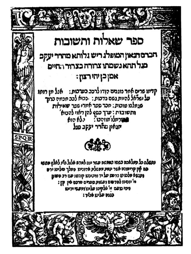
1556, She’ilot u’Teshuvot Jacob ben Moses Moellin (Maharil)
Courtesy of the Library of Agudas Chassidei Chabad Ohel Yosef Yitzhak
The title-page has an ornamental frame made up of four parts, enabling the printer to use them in other arrangements, although this is the manner in which the parts are most often employed. The top frame has the face of a man and cherubin; on the sides are suits of armor, shrubs, and musical instruments and, in the center of the left vertical frame the letters SPQR, reputedly standing for Senatus Populusque Romanus; and on the bottom a two headed crowned eagle and on the sides the cherubim. This frame was used by Conti on his early imprints, appearing on about ten works.
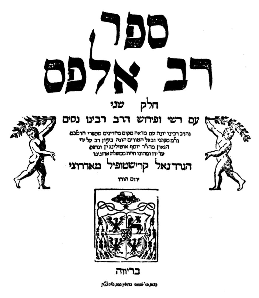
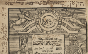
1558, Sefer Rav Alfas – Sefer Rav Alfas, (Hilkhot Rav Alfas, Sefer ha-Halakhot of Alfasi, Rif) was published in Riva di Trento by R. Joseph Ottolenghi and Cardinal Cristoforo Madruzzo in a three volume folio format (20: 288, 268, 302 [8] ff.). The Tyrolese town of Riva di Trento is the source of an unusual episode in the history of the Hebrew book. It was for a short time, from 1558 to 1562, a refuge for the Hebrew book; one in which about forty Hebrew titles were printed. Believed to be the first work printed in Riva di Trento, Hilkhot Rav Alfas was likely selected, in addition to its inherent popularity and value, due to the ban on the Talmud, the Rif, being a halakhic compendium of the Talmud, filling, to some extent, the gap left by the scarcity of that work.
It was in Riva di Trento that Cardinal Cristoforo Madruzzo (1512-78), Cardinal of Trent, a scholar and supporter of learning, who argued at the Council of Trent (1562) for leniency and moderation in condemning books, became the patron and protector of a Hebrew press, which was also a source of revenue for him. Ottolenghi (d. 1570), originally of Ettlingen, in Baden, Germany, reflected in its Italianized form in his name, was rosh yeshivah at Cremona, and under his tutelage Talmudic studies had continued in Cremona after that work had been banned and burned elsewhere. He assisted the press, providing indices and annotations to a number of works and assuring that material offensive to the church had been deleted from those books of value to his yeshiva. and R. Jacob Marcaria, a dayyan on the bet din presided over by Ottolenghi and a physician, recruited by Madruzzo help finance and play a role in the press. Marcaria edited and wrote brief prefaces for most of the books printed in Riva di Trento. The press was located in the house of Antonio Broën.
Sefer Rav Alfas is a halakhic compendium by R. Isaac ben Jacob Alfasi (Rif, 1013-1103). Alfasi, born in the Algerian village of Qal’at Hammad, was a student of the great sages R. Nissim ben Jacob (c, 990-1062) and Hananel ben Hushi’el (d. c. 1055) in Kairouan. After learning with them Alfasi relocated to Fez, from where his surname al-Fasi (Rif) is derived, and became recognized as the leading Talmudic sage of the time. In 1088, at the age of 75, two informers denounced him to the government – the charges are unknown – and he was forced to flee to Spain. Eventually settling in Lucena, Alfasi succeeded R. Isaac ben Judah ibn Ghayyat (c. 1020-89), who had died a few months earlier, as head of the yeshiva.
1558, Sefer Rav Alfas
Courtesy of the National Library of Israel
The text of the title-page of each volume has cherubim at the sides, and below bears the Cardinal’s coat‑of‑arms , a significant statement of the Cardinals’ support and protection of the press at a time when his church was burning and banning Hebrew books. Furthermore, the title pages informs that Sefer Rav Alfas was edited with great care by the gaon R. Joseph Ottolenghi and was printed and financed by him, and that this was done, “in the dominion of” the following in bold letters “Cardinal Cristoforo Madruzzo.”
Sefer Rav Alfas, Alfasi’s major work, is one of the greatest works in halakhic literature. It is extracts all pertinent legal decisions from the Talmud, eliminating non-halakhic material, discussions, and subject matter not applicable today. It covers the following orders of the Talmud, Mo’ed, Nashim, and Nezikim, as well as tractates Berakhot and Hullin. Laws in Kodashim and Tohorot, such as mezuzah and tefillin, are organized as Halakhot Ketannot. Sefer Rav Alfas differs from earlier works, such as Halakhot Gedolot, in that it is more comprehensive, more detailed, and by the inclusion of material from the geonim, although, like them, it follows the order of the tractates.
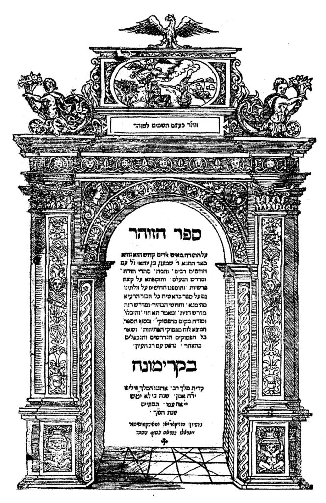
1559-60, Zohar – Classic kabbalistic work of Jewish mysticism, attributed to R. Simeon bar Yohai (second century). This, the second printing of the Zohar, it was published previously in Mantua (1558-60), published in Cremona at the press of Vincenzo Conti in a three volume folio format (20: 132, 122, 146 ff.) by Vincenzo Conti (d. 1569). Conti, who had printed briefly in Sabbioneta, is better known for his activity in Cremona, where his press, active from 1556 to 1567, issued more than forty titles.
The title page of has a decorative architectural frame with an arch, at the top a vignette of Akedat Yizhak (the binding of Isaac), surmounted by an eagle, and accompanying cherubim; below in the bottom squares, figurines, perchance also cherubim. It is dated, “For the Lord will not forsake כי לא יטש (319=1559) his people [for his great name’s sake] (Samuel I 12:22), and it was completed in the year ש”ך ([5]320=1560).” At the bottom of the page is an imprimature from the Inquisition on the title page, the sole Cremona imprint to place it there, as well as a longer permission at the end of the book.
1559-60, Zohar
Courtesy of the Library of the Jewish theological Seminary
Written in Aramaic and Hebrew, Sefer ha-Zohar al ha-Torah is a comprehensive system of kabbalistic theosophy, encompassing cosmology, the soul, and good and evil. It is an esoteric commentary on the Torah, with homilies, midrashic passages, parables, and numerous discursive passages. It is based on the concept that within scriptures is a concealed stratum, deciphered by Kabbalah, expressing the inner meaning of the Torah, with its “splendor, beauty, and greatness.”
The corrector (and expurgator) was the apostate Vittorio Eliano, grandson of the foremost grammarian, Elijah Bahur Ashkenazi Segal. A member of a Dominican commission to review Hebrew books, Eliano was associated with all the books published by Conti from 1558 through 1559. Although begun later than the Mantua edition, noted above, this printing, done in haste, was completed earlier. Nevertheless, it was not immediately released for sale, for when more than 10,000 Hebrew books were burned in Cremona, with the complicity of Eliano, the entire edition was seized. It was just barely saved, in contrast to other works, by the apostate Dominican, Sixtus of Siena. It is known as the Zohar Gadol (large Zohar), in contrast to the smaller Mantua edition (Zohar Katan), and is also referred to, because of Eliano’s involvement, as the “Christian edition.” This notwithstanding, the Cremona edition was the preferred of the two editions by eastern European kabbalists.[28]
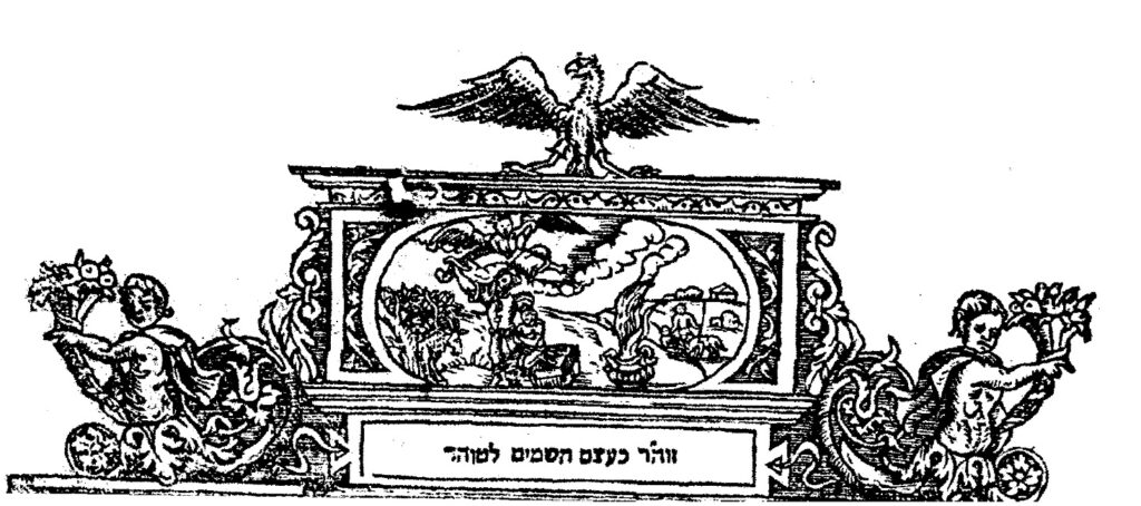
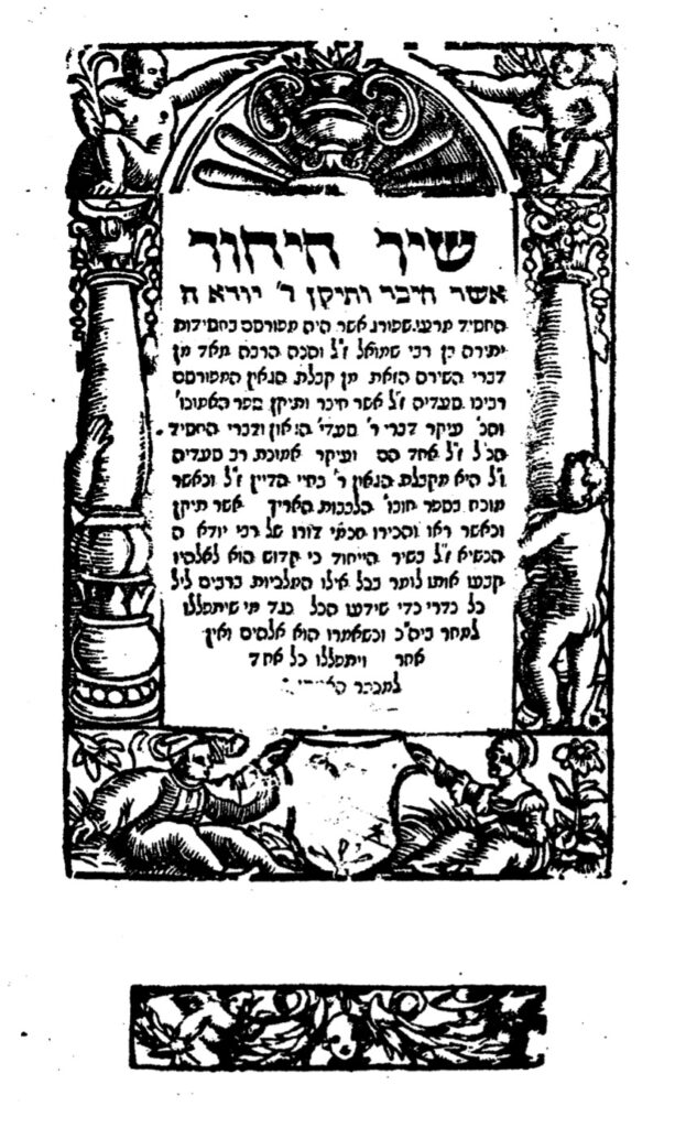
1560, Shir ha-Yihud – Shir ha-Yihud (Hymn of Divine Unity) an anonymous piyyut (liturgical poem) written in the mid-twelfth century, most often attributed to Samuel ben Kalonymus he-Hasid (c. 1130-1175), less often to his son, Judah ben Samuel he-Hasid (c. 1150-1217), author of the Sefer Hasidim, both among the foremost representatives of the Hasidei Ashkenaz, and, on occasion, to yet others.
Shir ha-Yihud
Courtesy of the National Library of Israel
Shir ha-Yihud was published at the press of Eliezer and Joseph ben Naphtali Hertz Treves. Active for one year only, in 1560, they issued six books, before being forced to close by a meeting of the leaders, both Protestant and Catholic, of the Swiss Confederation in June, 1560, who feared that they were about to print the Talmud.
The frame, one of several with cherubim employed by the press, also was used on the title-page of Begidat Hazman, an allegoric maqāma (a poetic narrative in rhymed prose) by Mattathias (Mattityah ben Moses), a 15th century Spanish or Provençal Hebrew poet or Mattathias ha-Yiẓhari, a representative of the Jewish communities of Aragon at the Tortosa disputation (1413–14).
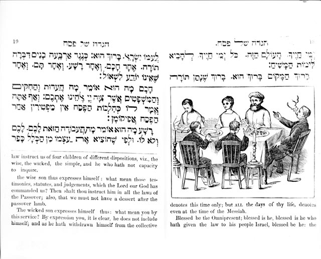
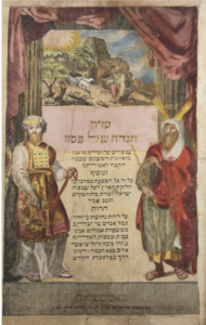
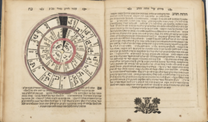
1568, Passover Haggadah – Passover Haggadah printed in Mantua in folio format (20: 36 ff.) by Joseph Shalit ben Jacob Ashkenazi of Padua. This edition is a reprint of the 1560 Passover Haggadah, also printed in Mantua, but with modifications and the addition of the marginalia of R. Joseph Shalit ben Jacob Ashkenazi of Padua entitled Nimukei Yosef.
![]()
 1568, Passover Haggadah
Courtesy of the National Library of Israel
The title page frame has representations of the Mars and Minerva followed by the first text page, which has two woodcuts of cherubim along the top. Following text pages have those cherubim image, as well as numerous other cherubim images, including several marginal cherubim images. This Haggadah shares some features with the Prague Haggadah of 1526. Woodcuts are accompanied by captions, given as rhymed couplets, a feature of Ashkenaz manuscript Haggadot. In some instances, for example, by the four questions, the earlier edition was framed by a lush Italian border, without illustrations. Here the types and the top and upper left borders with their vines and cherubs only are alike.[29]
1576, Yosef Lekah – Yosef Lekah is a commentary on Megillat Esther by R. Eliezer ben Elijah Ashkenazi (1513-86). It was published in Cremona in 1576 by Christopher Draconi in octavo format (40: 83, 1 ff.). Draconi, previously associated with Vincenzo Conti, attempted to publish Hebrew books in Cremona. Although he would issue Latin books from 1569 to 1614, he printed one Hebrew book only, Yosef Lekah.
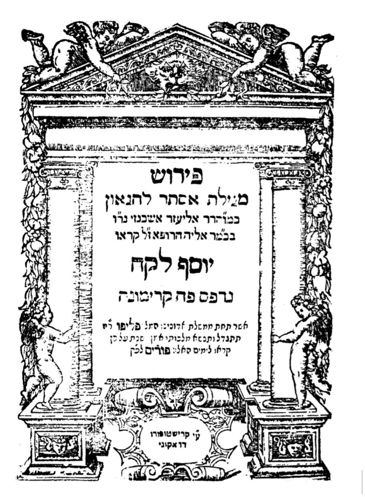 1576, Yosef Lekah
Courtesy of the Fales Library and Special Collections, New York University
R. Eliezer ben Elijah Ashkenazi was a multi-faceted individual, a Talmudist, physician, and well-rounded scholar, who served as rabbi in a number of varied communities. His first rabbinic position, from 1538-61, was in Fostat, Egypt. Forced to leave Fostat, Ashkenazi went to Famagusta, Cyprus, where he was rabbi for two years, and then to Venice. He left for Prague (1561), after a dispute with the Maharam of Padua, and after traveling as far as the Crimea, returned, via Famagusta, to Venice. Ashkenazi was next rabbi in Cremona, where he published Yosef Lekah. Shortly after he left to be rabbi of Posen, and, from 1584, was in Cracow. Ashkenazi experienced difficulties in Poland, disputing over his right to open a yeshiva in close proximity to an existing yeshiva, so that Joseph Solomon Delmedigo (1591-1655) wrote about him, “You have brought a vine from Egypt; you have cast out the nations, and planted it” (Psalms 80:9). Ashkenazi was highly regarded by his contemporaries, corresponding with prominent rabbinic figures such as R. Joseph Caro, R. Joseph Ha-Kohen (Katz), R. Moses Isserles (Rema), and R. Solomon Luria (Maharshal), several mentioning him in their responsa. R. Elijah of Pesaro, in Famagusta in 1563, praised Ashkenazi’s scholarship, noting that he was fluent in twelve languages.
The title-page has four cherubim images, two reclining at the top of the structure, two standing erect by the pillars at the sides. The title-page is dated “Therefore they called these days Purim קראו לימים האלו פורים (336 = 1576)” (Esther 9:26). Yosef Lekah is dedicated to Don Joseph Nasi, Duke of Naxos, whom Ashkenazi, in the introduction, compares to Joseph in Mizraim and Mordecai at the time of Ahasuerus. Ashkenazi, therefore, entitled this work Yosef Lekah. Two, almost identical, editions of Yosef Lekah exist, both dated 1576. Although almost exact copies of the original, it is clear, upon close examination, that the book was reset. Christopher Draconi’s Yosef Lekah was the last Hebrew book printed in Cremona.
Ashkenazi’s most important work is Ma’aseh HaShem (Venice, 1583), on the historical occurrences in the Torah, with a commentary on the Passover Haggadah; selichot; and, not extant today, a super-commentary on the Ramban (Nachmanides) and annotations to R. Caro’s Beit Yosef.[30]
Conclusion – In this article we have described books printed in Augsburg, Basle, Cremona, Mantua, Prague, and Venice. The cherubim imagery on these title-pages, reflecting the influence of Renaissance humanism, their attractiveness notwithstanding, do not appear on the title-pages or accompanying the text in Hebrew books published in more modern times. A review of the title-pages reproduced here, all dissimilar, with their numerous depictions of cherubim, attest to the popularity of that image. Given the strictures on Hebrew printing from the mid-sixteenth century in Italy, the frequent use of cherubim testify to the cooperation of Jewish and non-Jewish printers, their frequency perchance suggesting a positive relationship going beyond mere monetary gain.
We conclude with the Talmudic statement above, which suggests why the image of cherubim was so popular:
Rav Ketina said: When the Jewish people would ascend for one of the pilgrimage festivals, the priests would roll up the curtain for them and show them the cherubs, which were clinging to one another, and say to them: See how you are beloved before God, like the love of a male and female. (Yoma 54a)
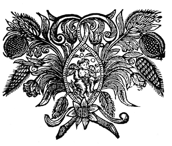
Lastly, in conclusion an image of a cherub, both chronologically and, in cherubian activity, quite different from those depicted in this article. It is included as it is unusual and eye catching, an image of a Cherub smoking a pipe. It appears in in at least two Basle imprints published by Israel ben Moses ben Abraham Halle, active in Offenbach, although not continuously, from 1718/19 to c. 1738/43. The works are Anaf Etz Avot, R. Benjamin ben Yekutiel Wulff’s commentary on Pirke Avot, and tractate Sanhedrin (1721).[31]
- Once again, I would like to express my gratitude and appreciation to Eli Genauer for reading the article and his insightful comments. ↑
- Emil G. Hirsch, W. Muss-Arnolt, J. Frederic McCurdy, Louis Ginzberg, “Cherub (
 ; plural, Cherubim)” Jewish Encyclopedia IV (New York, 1901-06), pp. 13-16; Shalom M. Paul, Louis Isaac Rabinowitz, “Cherub” Encyclopedia Judaica IV (Jerusalem, 2007), pp. 600-01. ↑
 - Thomas Kelly Cheyne, 1911 Encyclopædia Britannica, Volume 6, reproduced in https://en.wikisource.org/wiki/1911_Encyclop%C3%A6dia_Britannica/Cherubim ↑
- https://www.sefaria.org/search?q=%D7%9B%D7%A8%D7%95%D7%91%D7%99%D7%9D&tab=text&tvar=1&tsort=relevance&svar=1&ssort=relevance. ↑
- Franz Sales Meyer, Handbook of Ornament: a Grammar of Art, Industrial and Architectural Designing in all its Branches for Practical as well as Theoretical use (New York, 1957), pp. 108-09. ↑
- Codices and early imprints did not have title-pages, the first leaf normally being left blank to protect the book, that page later becoming a dedicated page. The first book with a detailed title-page was the Calendarium of Johannes Regiomontanus, appearing in 1476 (Venice), being a fifty-five year calendar (1475-1530), printed by Johannes Regiomontanus. The first Hebrew book with a title-page was the Sefer ha‑Roke’ah (Fano, 1505) of R. Eleazar ben Judah of Worms (c. 1165 – c. 1230). ↑
- Cherubim also appear on the frames of Hebrew books printed in the incunabular period. For examples of such frames see Marvin J. Heller “Behold, you are beautiful, my love: The Use of Ornamental Frames in Hebrew Incunabula” Printing History NS 10 (New York, July, 2011), pp. 39-55, reprinted in Further Studies in the Making of the Early Hebrew Book (Leiden/Boston, 2013), pp. 3-33. ↑
- The following book descriptions are selected, modified from Marvin J. Heller, The Sixteenth Century Hebrew Book: An Abridged Thesaurus ( Brill, Leiden, 2004), var. cit. ↑
- Avraham Yaari, Hebrew Printers’ Marks (Jerusalem, 1943), pp. 7 and 126-27 n. 10 [Hebrew]. ↑
- Jerome Friedman, The Most Ancient Testimony. Sixteenth-Century Christian-Hebraica in the Age of Renaissance Nostalgia (Athens, Ohio, 1983), pp. 44-48, 214-15; A. M. Habermann, Title Pages of Hebrew Books (Tel Aviv, 1969), p. xi [Hebrew with English introduction], pp. 19-20, 125-26 nos. 4-5; Joseph Prijs, Die Basler Hebräischen Drucke (1492-1866) (Olten, 1964), pp. 49-51 n. 26; Frank Rosenthal, “The Rise of Christian Hebraism in the Sixteenth Century,” Historia Judaica II (New York, 1945), (New York, 1945), pp. 182-91; and Richard S.Westfall, “Sebastian Muenster,” http://es.rice.edu/ES/humsoc/Galileo/Catalog/Files/muenster.html ↑
- An interesting example of this later usage is R. Moses ben Hanokh Altschul’s (c. 1546–1633) Brant Shpigl, a popular Yiddish work on ethics, correct demeanor, and customs for women, published by Konrad Waldkirch (Basle, 1602), also indicative of the passage of typographic material between printers. ↑
- Stephen G. Burnett, “German Jewish Printing in the Reformation Era (1530-1633),” University of Nebraska – LincolnUniversity of Nebraska – Lincoln DigitalCommons@University of Nebraska – LincolnDigitalCommons@University of Nebraska. ↑
- Ch. B. Friedberg, History of Hebrew Typography of the following Cities in Central Europe: Altona, Augsberg, Berlin, Cologne, Frankfort M., Frankfort O., Fürth, Hamberg, Hanau, Heddernheim, Homberg, Ichenhausen, Neuwied, Wandsbeck, and Wilhermsdorf. Offenbach, Prague, Sulzbach, Thannhausen from its beginning in the year 1513 (Antwerp, 1935), pp. 29-31 [Hebrew]. ↑
- A. M. Habermann, “The Printer Hayyim Shahor, his Son Isaac and Son-in-law Joseph Yakar,” in Studies in the History of Hebrew Printers and Books (Jerusalem, 1978), pp. 103-07 [Hebrew]. ↑
- Yeshayahu Vinograd, Thesaurus of the Hebrew Book. place, and year printed, name of printer, number of pages and format, with annotations and bibliographical references II (Jerusalem, 1993-95), p. 2 no. 10 [Hebrew]. ↑
- Zipora Baruchson, “Money and Culture: Financing Methods in the Hebrew Printing Shops in Cinquecento Italy,” La Bibliofilia 92 (1990), 25. ↑
- For examples of such usage see Marvin J. Heller, “Behold, you are beautiful, my love: The Use of Ornamental Frames in Hebrew Incunabula” Printing History NS 10 (New York, July, 2011), pp. 39-55, reprinted in Further Studies in the Making of the Early Hebrew Book. (Brill, Leiden/Boston, 2013), pp. 3-33; “Mars and Minerva on the Hebrew Title Page,” The Papers of the Bibliographical Society of America 98:3 (New York, N. Y., 2004), pp. 269-92, reprinted in Studies in the Making of the Early Hebrew Book (Brill, Leiden/Boston, 2008), pp. 1-17; and the “The Printer’s Mark of Marc Antonio Giustiniani and the Printing Houses that Utilized It,’ Library Quarterly, 71:3 (Chicago, July, 2001), pp. 383-89, reprinted in Studies, pp. 44-53. ↑
- Unterricht Wie ain Christenmensch by Urbanus Rhegiosu (1489-1541), a Protestant Reformer active in Northern and Southern Germany promoting Lutheran unity in the Holy Roman Empire. Unterricht is one of several titles with this frame printed by Silvan Otmar of Augsburg (https://www.flickr.com/photos/58558794@N07/6576279085). ↑
- Zipora Baruchson, “Money and Culture: Financing Methods in the Hebrew Printing Shops in Cinquecento Italy,” La Bibliofilia 92 (1990), 25. ↑
- For examples of such usage see Marvin J. Heller, “Behold, you are beautiful, my love: The Use of Ornamental Frames in Hebrew Incunabula” Printing History NS 10 (New York, July, 2011), pp. 39-55, reprinted in Further Studies in the Making of the Early Hebrew Book. (Brill, Leiden/Boston, 2013), pp. 3-33; “Mars and Minerva on the Hebrew Title Page,” The Papers of the Bibliographical Society of America 98:3 (New York, N. Y., 2004), pp. 269-92, reprinted in Studies in the Making of the Early Hebrew Book (Brill, Leiden/Boston, 2008), pp. 1-17; and the “The Printer’s Mark of Marc Antonio Giustiniani and the Printing Houses that Utilized It,’ Library Quarterly, 71:3 (Chicago, July, 2001), pp. 383-89, reprinted in Studies, pp. 44-53. ↑
- Ch. B. Friedberg, Bet Eked Sepharim, (Israel, n. d), alef 286 [Hebrew]. ↑
- A later example of an objectionable title-page is the responsa of R. Joel ben Samuel Sirkes’ (Bach, 1561-1640), She’elot u-Teshuvot Bayit Hadash, printed in Frankfurt am Main (1697) by Johann Wust. The title-page had an ornate frame with forms of unclad women which aroused rabbinic opposition, for those authorities considered the title-page inappropriate and offensive to Jewish sensibilities. The quire had to be reprinted with a new title-page, now with two cherubim holding a floral wreath with grapes. A similar situation occurred earlier in Hanau in 1630. Sefer ha-Roke’ah, by R. Eleazer of Worms, was issued in a small format, 12×16 cm., due to the economic restrictions resulting from the Swedish War. On the title-page “Venus rises naked from the waters on a seashell – a common pagan motif” (The book was issued by a press belonging to a non-Jew, Hans Jacob Hena, so that, it has been suggested, no attention was initially given to the title-page. When the book was sold, “many Jewish purchasers tore out the offending page” (Raphael Posner and Israel Ta-Shema, ed. The Hebrew Book: An Historical Survey [Jerusalem: Keter Publishing House, 1975]). There does not appear to have been any opposition to this last title-page in Venice, for the Venus rising from the waters motif appears in Hebrew works printed there, where it was the press mark of Alessandro Gardoni (Venice, 1577-78) and can be found in the Mishneh Torah printed by Meir Parenzo at the press of Alvise Bragadin in 1574. ↑
- Taytsher sprach (Vaybertaytsh), is a type generally but not exclusively reserved for Yiddish books, so named because these works were most often read by the less educated and women. Concerning the early use of Vaybertaytsh see Herbert C. Zafren, “Variety in the Typography of Yiddish: 1535-1635,” Hebrew Union College Annual LIII (Cincinnati, 1982), pp. 137-63. ↑
- Israel Zinberg, A History of Jewish Literature, translated and edited by Bernard Martin VII (Cleveland, 1973), p. 116.
↑ - Meyer Waxman, A History of Jewish Literature (1933, reprint Cranbury, 1960), II pp. 632-33. ↑
- Zinberg, p. 106. ↑
- Robert Bonfil, Jewish Life in Renaissance Italy (Berkeley, 1994), tr. Anthony Oldcorn, pp. 133, 169; Deror Schwartz, “Samuel Archivolti, his Life and Writings,” Asufot VII, ed. Meir Benayahu (Jerusalem, 1993), pp. 82-83 [Hebrew]; and Zinberg, II p. 130. ↑
- Amram, pp. 324-27; Robert Bonfil, “Change in the Cultural Patterns of a Jewish Society in Crisis: Italian Jewry at the Close of the Sixteenth Century,” in Essential Papers on Jewish Culture in Renaissance and Baroque Italy, ed. David B. Ruderman (New York, 1992), p. 418; Rachel Elior, “Messianic Expectations and Spiritualization of Religious Life in the Sixteenth Century,” in Essential Papers . . ., p. 286. ↑
- Yaari, Printers’ Marks, pp. 12, 132 n. 19; Yosef Hayim Yerushalmi, Haggadah and History (Philadelphia, 1975), nos. 28-31; and Isaac Yudlov, The Haggadah Thesaurus. Bibliography of Passover Haggadot: From the Beginning of Printing until 1960 (Jerusalem, 1997). p. 4 n. 25 [Hebrew]. ↑
- David Amram, The Makers of Hebrew Books in Italy (Philadelphia, 1909, reprint London, 1963), p. 319; Meir Benayahu, Hebrew Printing at Cremona: Its History and Bibliography (Jerusalem, 1971), pp. 22-24, 232-34; and Jacob Elbaum, Openness and Insularity. Late Sixteenth Century Jewish Literature in Poland and Ashkenaz (Jerusalem, 1990), p. 47, [Hebrew]. ↑
- This image appeared in my article “Offenbach Revisited: An enigma Reexamined,” published in the Gutenberg-Jahrbuch (Mainz, 2012), pp. 219-28, and reprinted in Essays on the Making of the Early Hebrew Book (Brill, Leiden/Boston, 2021) pp. 273-92. It was noted there that “in his observations to a draft of this paper, Professor Dr. Hans Schneider observes that he has never seen ‘a cherub smoking a pipe’ and suggests that if the figure is an angel the instrument is a flute. He agrees, however, that the object in question does look like a clay pipe as in the self-portrait of Gerrit Dou. Professor Dr. Schneider suggests that the figure might be an oriental man or boy, as was often painted in the seventeenth and eighteenth century, wearing a turban-like cap with plumes, and that what appears to be an angel’s wings might be a fluttering cape. The reader may draw his or her own conclusions.” ↑


 There are two notable works by R. Emden, his Siddur, (
 As detailed in chapter 8 of Epstein’s Medieval Haggadah, the early 14th Century Golden Haggadah is perhaps the most female-centric Haggadah and may have been commissioned for a woman. That manuscript emphasizes the unique, positive, and critical role women played in the Exodus narrative. Although it also depicts the practice of overzealous cleaning with a woman sweeping the ceiling. The 1430 Darmstadt Haggadah has a full-page illumination of women teachers, but its connection to the text is opaque. Finally, we
 After completing the Haggadah, Moss was asked to reproduce it, and, with Levy’s permission, produced, what the former Librarian of Congress, Daniel Bornstein, described as one of the greatest examples of 20th-century printing. The reproduction, on vellum, nearly perfectly replicates the handmade one. This edition was limited to 500 copies, all of which were sold. From time to time, these copies appear at auction and are offered by private dealers, a recent copy sold for $35,000. President Regan presented one of these copies to the former President of Israel, Chaim Herzog, when he visited the White House in 1987. While that is out of reach for many, this version is housed at many libraries, and if one is in Israel, one can visit Moss at his workshop in the artist colony in Jerusalem, where he continues to produce exceptional works of Judaica and view the reproduction. There is also a highly accurate reproduction, on paper that is