Cherubim: Winged Celestial Beings on the Title-Pages of Early Hebrew Books

Cherubim: Winged Celestial Beings on the Title-Pages of Early Hebrew Books
by
Marvin J. Heller[1]
 

And having driven out the man, He stationed at the east of the Garden of Eden the Cherubim and the flame of the ever-turning sword, to guard the way to the Tree of Life (Genesis 3:24).

You shall make two Cherubim of gold—hammered out shall you make them—from both ends of the cover. You shall make one cherub from the end at one side and one Cherub from the end at the other; from the cover shall you make the Cherubim at its two ends. The Cherubim shall be with wings spread upward, shielding the Cover with their wings with faces toward one another; toward the cover shall be the faces of the Cherubim being turned toward the cover. (Exodus 25: 18-20).

Rav Ketina said: When the Jewish people would ascend for one of the pilgrimage festivals, the priests would roll up the curtain for them and show them the cherubs, which were clinging to one another, and say to them: See how you are beloved before God, like the love of a male and female (B.T. Yoma 54a).

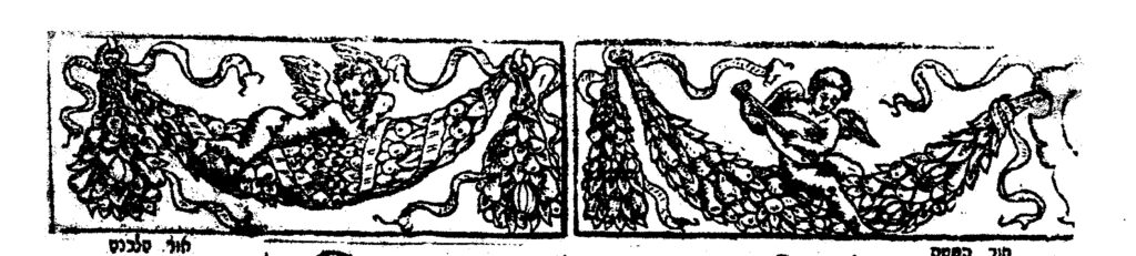
Cherubim (angels) are a frequent presence on the title-pages of early Hebrew imprints in the sixteenth century and afterward, the latter beyond the scope of this article. They are also to be found in incunabula, on the frames of initial pages and head-pieces for text.

How do you define what are cherubim? One definition, that of the Encyclopedia Judaica, is “a winged celestial being which appears in the Bible in several different guises.” It then proceeds to give several descriptions of cherubim. The Jewish Encyclopedia begins with a more detailed description, stating cherubim are “the name of a winged being mentioned frequently in the Bible. The prophet Ezekiel describes the cherubim as a tetrad [set of four] of living creatures, each having four faces—of a lion, an ox, an eagle, and a man—the stature and hands of a man, the feet of a calf, and four wings.”[2]
The use of cherubim is also noted in the 1911 Encyclopædia Britannica where they are described as “imaginary winged animal figures of a sacred character, referred to in the description of Solomon’s temple (1 Kings vi. 23-35, vii. 29, viii. 6, 7), and also in that of the ark of the tabernacle (Ex. xxv. 18-22, xxvi. 1, 31, xxxvii. 7-9). . . . In Gen. iii. 24 the cherubim are the guards of Paradise . . .”[3]
The frequency of the appearance of cherubim in Hebrew literature can be found on Sefaria, a bibliography of Jewish texts, which records fifty-six entries for cherubim under biblical, Mishnah 27, and Talmud 991. Among other entries are Midrash, 590; Halakhah 7947; Kabbalah 747; and yet still others as well as multiples of commentaries on the first works.[4]

These multi-winged creatures are also a feature in general literature. Franz Sales Meyer, under the heading Miscellaneous heads, describes the “Angel faces, youthful heads, with a circular or disc-like halo, are first met-with in the Byzantine style, as the result of ecclesiastic articles,” He continues that in the early Italian Renaissance such renderings were charmingly naïve. They appeared as adornments on friezes and arches, medallions, and in borders. They also are to be found on tombs and are “Much used in Modern ecclesiastical decorations.” The text is accompanied by a page of examples of the cherub head, including one of a skull.[5]

It had been my intention to describe Hebrew title-pages with images of cherubim over a period of two centuries.[6] The numerous instances of such usage, however, has necessitated a considerable limiting of our subject period. Indeed, rather than noting all the examples in our current period, in the sixteenth century, we only describe several exemplars, giving background about the books in which they appear, that is, the publisher, author, and book subject.[7] This article is expansive, that is, in describing cherubim, it discusses the varieties of Hebrew literature, the authors of the subject works, the presses that published them, and even Hebrew book history. The title-pages and infrequent text pages with displays of cherubim addressed here are in chronological order, but from diverse locations and, again, on a variety of books, indicative of how widespread Hebrew publishing was and even more so the depth and nature of Hebrew literature.[8]

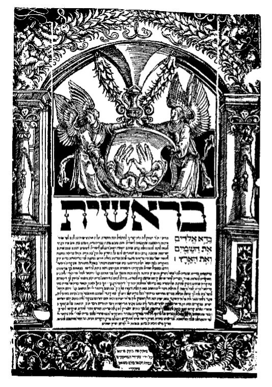
1514-18, Hameshei Humshei Torah – Our first work with the appearance of cherubim is a folio (20) edition Hameshei Humshei Torah (Pentateuch) with haftorat and commentary of Rashi printed in 1514-18 in Prague at the press of Gershom ben Solomon ha-Kohen and partners. Gershom later received a royal privilege from King Ferdinand of Bohemia, allowing him, that is Gershom alone, to enjoy a monopoly on Hebrew printing in Prague. His descendants, known as the Gersonides, continued to print in Prague until the mid-seventeenth century.
 

1514, Hameshei Humshei Torah
Courtesy of the Library of the Jewish Theological Seminary

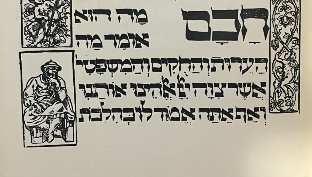
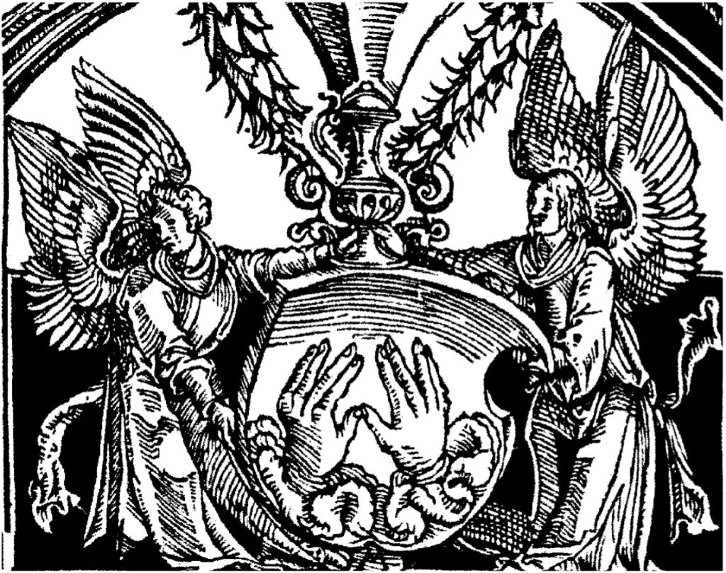
A magnificent edition, with ornate woodcut frames and large type for the text. Each book has a unique decorative opening page, there is no title page, comprised of four separate pieces, those on the pillared sides with vases, leaves, and cherubim, similar but not identical, the top piece with a concave bottom edge. Genesis has a convex curved piece to fit with this top piece on the upper half of the page, with winged cherubim holding a shield with the spread hands of the Kohen giving the priestly blessing.[9]

Work on the Pentateuch began on 10 Sivan (June 14, 1514) but, perhaps as a result of the success of the prayer book, the partners found they had overextended themselves and found it necessary to suspend work on this project for two years. In 1530 Gershom and his sons reprinted this Pentateuch in an identical format, except for changes to the decorated initial pages.

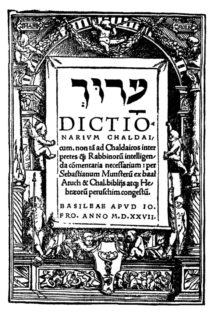
1527, Dictionarium ChaldaiOur next entry with cherubim is an Aramaic grammar by the Christian-Hebraist scholar Sebastian Muenster (1489-1552). It was printed in Basle in 1527 at the press of Johannes Froben in quarto format (40: [1], 434, [7] pp.). The Froben family was the most significant printers of Hebrew books in Basle. Johannes Froben published as many as 250 titles, among them Hebrew/Latin books of the Bible and grammatical works, primarily works by Muenster.

Sebastian Muenster, a cosmographer, astronomer, and orientalist was, for twenty three years, professor at Basle. Born in Niederingelheim, Hesse, the son of a Spitalmeister (hospital master), Muenster had no university education nor did he ever receive a degree. His education consisted of some private instruction in Latin and later studies at Frieberg and attendance at lectures given by the Franciscans. In 1506, Muenster entered the Minorite order and was sent to study in Rufach under Conrad Pellican (Pellicanus, 1478-1556). The following year he took vows and, in 1512, was ordained a priest. Muenster assisted Pellican in teaching in Pforzheim and, from 1524-29, occupied the chair of Hebrew at the University of Heidelberg. In 1529, Muenster converted to Protestantism and moved to Basle, where he occupied the chair of Hebrew, at a salary of 60 gulden; from 1547/8 he was rector. From about 1525, Muenster was a student of Elijah Levita, translating and editing his grammatical works. Muenster also translated a number of other Hebrew works into Latin and was a prolific author in his own right. By the time of his death more than 100,000 volumes of his works were in circulation. His Jewish oeuvre, more than three-score publications, covers all aspects of Judaica, excepting Kabbalistic studies, which did not interest him. In 1523, Muenster published Dictionarium Hebraicum . . . adiectis Chaldaicis vocabulis, his study of the Aramaic language. The book reads from left to right but the text follows the Hebrew alphabet. Words are given in vocalized Hebrew, followed by their etymology, definition and examples.

The title page of the Dictionarium Chaldai has an architectural frame with cherubim in various positions, as well as additional cherubim below mounted and otherwise. This title page, designed by Hans Holbein, was used as early as 1516 on Basel statutes and into the seventeenth century.[10] [11]

Not long afterwards, from 1540 through 1543, at least five titles were printed in three locations with varied images of cherubim on the title-page, that is Augsburg, Prague, and Bologna. That is not to say these frames were not used on other books, most likely they were, but rather these are examples of cherubim used by the printers of Hebrew books at the time.

Augsburg has an early history related to Hebrew printing. Several early anti-Jewish works beginning with the apostate Johannes Pfefferkorn’s Der Judenfeind (1509) and other anti-Semitic books by apostates were published there. Another early Augsburg publication of note, this certainly more positive, albeit not a Hebrew edition of that popular and much republished work, is the first printing of R. Joseph ben Abraham Gikatilla’s (1248–c. 1325) kabbalistic classic, Sha’arei Orah, which explains and analyzes the ten Sefirot. This edition of Sha’arei Orah is a Latin translation of that work by the apostate Paulus Ricius (Paulus Israelita, 1480-1541) under the title Portae lucis, published in 1516 at the press of Johann Miller.
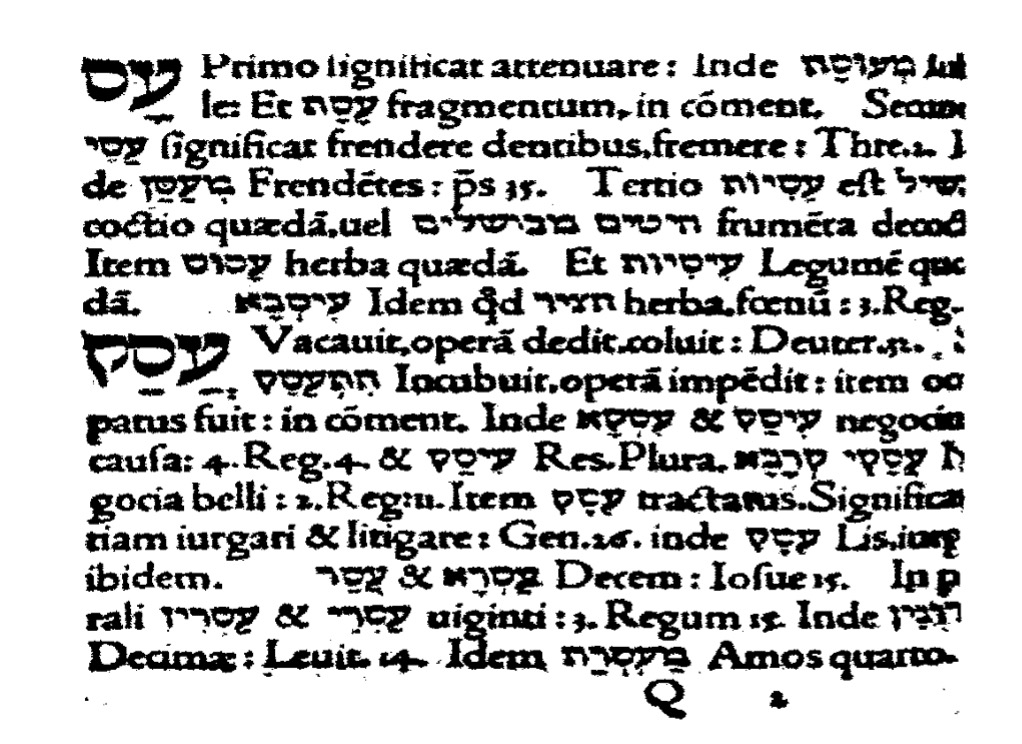
1527, Dictiorionarim Chaldai
Courtesy of the Fales Library and Special Collections, New York University

Serious Hebrew printing in Augsburg begins when Hayyim ben David Shahor, among the pioneers of Hebrew printing outside of Italy, came to Augsburg in about 1533/34. In Augsburg, Schwarz worked in the print shop of Silvan Otmar (d. 1540), a renowned and highly productive printer, and resided in the home of Bonifacius Wolfhart, a Protestant pastor who also served as the censor of Hebrew books for Augsburg.[12] Shahor printed several works in conjunction with his son, Isaac, and his son-in-law, Joseph ben Yakar, who assisted him at the press, although their names are not mentioned on the title-pages.[13]

Shahor likely joined with a non-Jewish printer, perhaps August Wind, a printer of Hebrew works for Christian clergyman. Hayyim left for Italy, returning to Augsburg in 1540. He then printed three books, Avkat Rokhel, Arba’ah Turim and a prayer book for, according to the Thesaurus of the Hebrew Book, a total of ten works in Augsburg. Due to a lawsuit by an apostate, Paulus Aemilus, with whom Shahor had been associated in Ferrara, resulting from their failed venture, Shahor and his family were forced to cease publication and leave Augsburg. Aemilus, seeing a market in Augsburg for Hebrew/Yiddish books, began to print on his own account. He issued a small number of titles, most notably the Melokhim Bukh (1543) and the Shmuel Bukh (1544), Yiddish poetical renditions of the books of Kings and Samuel, both with images of cherubim (below).[14]

1540, Avkat Rokhel Our first Augsburg title is Avkat Rokhel, an eschatological work on the principles of faith attributed to R. Machir ben Isaac Sar Hasid, a student of R. Judah ben Asher, son of the Rosh. Printed in octavo format (80: 18 ff.), perchance by Shahor. The Thesaurus of the Hebrew Book attributes it, albeit in brackets, to Hayyim Shahor, in contrast to the National Library of Israel that records the printer as unknown.[15]

The text of the title page is set within a decorative frame with nineteen cherubim and a number of animals. The title-page states that it is,

Sefer Avkat Rokhel

Printed by the printers named at the end of the volume. Edited with great care, with all our ability, “the good hand of our [Lord] upon us,” (ref. Ezra 8:18). And it was completed, here Augsburg, the great city, with the help of the Lord and His salvation. In the year, “[Rejoice, O you nations, with his people; for he will avenge the blood of his servants,] and will render vengeance to his adversaries, and will make expiation כפר (300=1540) for the land of his people” (Deuteronomy 32:43).

The names of the printers, Hayyim Shahor, Isaac ben Hayyim, and Joseph ben Yakar, the statement on the title page notwithstanding, are not given at the end of the volume. A brief introduction informs that the work was named Avkat Rokhel (the perfumer’s powders, Song of Songs (3:7)) for as the perfumer’s powders strengthen the soul, so too when one reads this book will he fear and cause his soul to be pure and free from all sin and transgression, thus meriting the good.
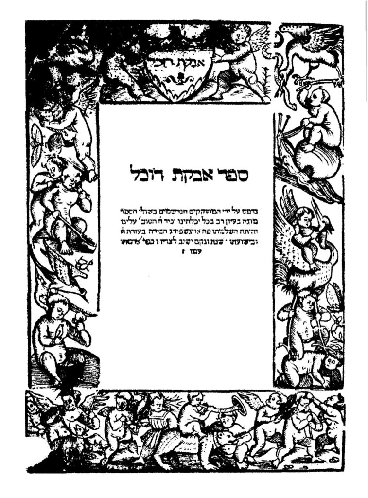
1540, Avkat Rokhel
Courtesy of the Dorot Jewish Division New York Public Library

The like title-pages of Avkat Rokhel and Unterricht Wie ain Christenmensch, the latter a non-Hebrew work printed approximately two decades earlier, reflect a relationship between Jewish and Christian printers, that is, Christian printers published Hebrew books in association with Jewish associates. The relationship between the printers was mutually beneficial. For the Christian publisher “the Hebrew books sector, being unique, was attractive to investors, being more limited and not so wildly competitive as the Italian book sector.”[16] In addition to the non-Jewish printer’s access to the Jewish book market, the Jewish publisher was able to not only publish Hebrew books, but he also gained access to the typographical material of his Christian associate. The latter, for example, frequently provided attractive frames to the former after having used them for his market and the Jewish partner also utilized the printer’s other ornamentation. This was of value to the Jewish partner as he did not have to go the expense of having decorative material prepared, at a relatively much greater expense as it would be utilized for a much smaller market. This despite the fact that the frames were often incompatible with traditional Jewish sensibilities.[17]
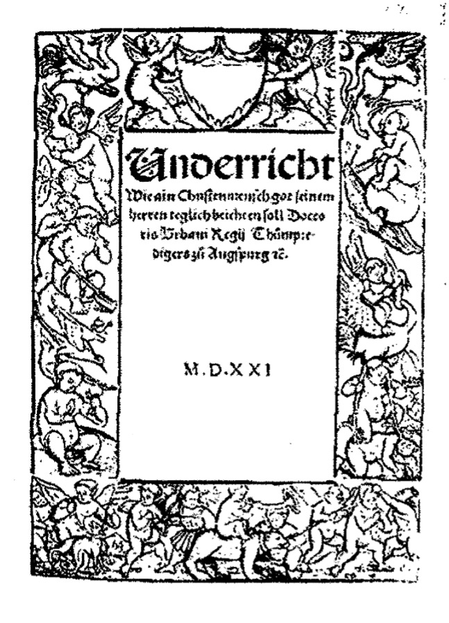
1521, Unterricht Wie ain Christenmensch [18]

The like title-pages of Avkat Rokhel and Unterricht Wie ain Christenmensch, the latter a non-Hebrew work printed approximately two decades earlier, reflect a relationship between Jewish and Christian printers, that is, Christian printers published Hebrew books in association with Jewish associates. The relationship between the printers was mutually beneficial. For the Christian publisher “the Hebrew books sector, being unique, was attractive to investors, being more limited and not so wildly competitive as the Italian book sector.”[19] In addition to the non-Jewish printer’s access to the Jewish book market, the Jewish publisher was able to not only publish Hebrew books, but he also gained access to the typographical material of his Christian associate. The latter, for example, frequently provided attractive frames to the former after having used them for his market and the Jewish partner also utilized the printer’s other ornamentation. This was of value to the Jewish partner as he did not have to go the expense of having decorative material prepared, at a relatively much greater expense as it would be utilized for a much smaller market. This despite the fact that the frames were often incompatible with traditional Jewish sensibilities.[20]

The title-page of Avkat Rokhel has the largest number of cherubim of our title-pages, nineteen in all, of our title-pages. The cherubim appear on the bottom, sides, and top of the frame, all active, albeit in different activities. The text of Avkat Rokhel is in three parts, each further subdivided. The first section addresses the struggle against one’s evil urge prior to redemption and the birth pangs and advent of the Messiah, and an explanation of the pertinent midrashim; the second part discusses the rewards and punishments of the soul after the resurrection, the nature of the world to come according to Judaism, in contrast to the views of non-Jews, and resurrection; and the third part the laws stated by the sages of the Talmud as halakhah Moshe me-Sinai, the formation of man and the number 248 limbs in a person, the statement of our sages concerning three partners in that process (God, man, and woman) and some gematriot.

This is the third edition of Avkat Rokhel, it having been printed previously in Constantinople (1516) and Rimini (1526). Ch. B. Friedberg records, in his Bet Eked Sepharim, more than twenty-five printed editions of Avkat Rokhel. It was translated into Latin by A. Hulsius and printed in his Theologia Judaica, (Breda, 1653) and a Yiddish edition was prepared by Naphtali Pappenheim (Amsterdam, 1647).[21]

1543, Melokhim Buch Two additional works printed in Augsburg, attributed to Moses (Esrim ve-Arbeh) Ashkenazi, are Yiddish poetical renditions of the books of Kings and Samuel. Moses’ appellation, Esrim ve-Arbeh (24), derives from either his birthplace, Vierundzwanzig Hoefe (24 courts) in Wuerttemberg, or from his extensive knowledge of the 24 books of the Bible. Moses’ accreditation with either authoring or transcribing the Melokhim Bukh is due to its similarity to the Shmuel Bukh, more reliably attributed to him. Nevertheless, sufficient differences exist between the two works that many scholars believe they do not share a common author. It is clear, however, that the author, even if not this Moses, was an Ashkenazi Jew. The Melokhim Bukh was published in quarto format (40: [123] ff.) by, according to the colophon, Paulus Aemilus. A Latin colophon states, Augustae Vindelicorum/ per Paulum Aemilium, Anno/ Domini M. D. XLIII. Meyer Waxman suggests that it is doubtful, the colophon notwithstanding, that the publisher was Aemilus; more likely it was Hayyim Shahor.

We have noted above that the frames on these title-pages were first used by Christian printers and that when that market no longer needed the frames, they were made available to Jewish printers. The cherubim frames noted above were generally acceptable to a contemporary renaissance Jewish public, although some, many, were questionable and would not be used today. In contrast, the title-page of the Melokhim Buch has a border made up of a four-part frame, the top with a representation of a king, the left and right sides respectively with images of Adam and Eve, unclad, the latter with the snake, two small children, and expecting. At the bottom are two cherubim. Use of this frame is surprising, for in contrast to other frames its’ contents appear to be objectionable, more so than other frames, even those with mythological characters. It seems likely that this frame might also be distasteful to Christian sensibilities.[22]
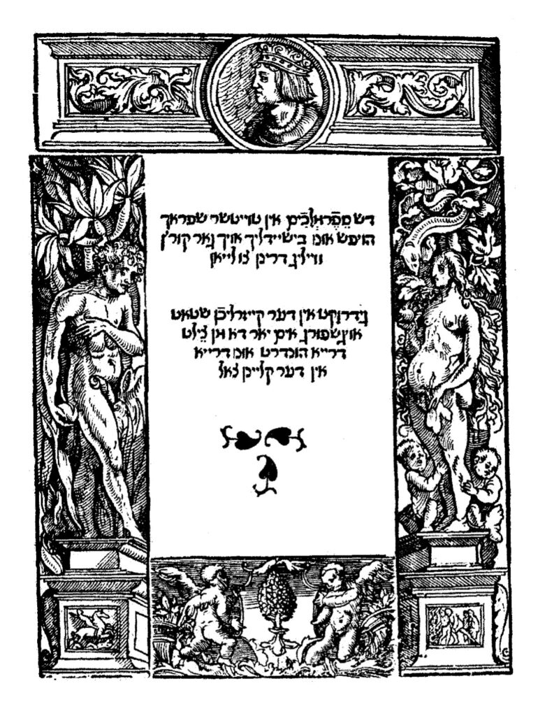
1543, Melokhim Buch
Courtesy of Dr. Moshe Rosenfeld

The title page states that it is “The book Melokhim (Kings) in Taytsher sprach, beautiful and clear and very entertaining to read. Printed in the imperial city of Augsburg in the year 303 (=1543)” [23] The colophon dates the completion of the work to Friday, 14 Av, 303 (July 25, 1543), which was a Sunday in 1543.

The Melokhim Bukh was not written as a sequel to the Shmuel Bukh. It is the older of the two books, originally written as a separate work, possibly as early as the fourteenth century. The format of the Melokhim Bukh, a rhymed paraphrase of the book of Kings, is that of the heroic epic, stylistically modeled after comparable German sagas, such as the Nibelungen. The subject matter is the events in Kings I and II, imaginatively and colorfully enhanced by material from the Talmud and Midrashim, all expressed with a deep piety. Intended as a complete history, it begins with a hymn of praise to God in three strophes followed by nine strophes from the Exodus to the last days of David, the contents of Kings, and as a sequel, the history of the Jews to the end of the second commonwealth in thirty strophes). An example of the text is,

You have frequently performed signs for the children of Israel;

Therefore they are obliged to have You for their Lord.

And to fear Your name-that is useful and good for them.

That man is foolish who acts contrary to Your word.[24]

1544, Shmuel Bukh The Shmuel Bukh was published, also likely by Hayyim Shahor in quarto format (Format 40: [102] ff.). It has an ornate title page made up of figurines above and about pillars with cherubim on the sides. It too is in Vaybertaytsh; among its reprints is a Latin edition (Ingolstadt,(1562). Waxman suggests that the Shmuel Bukh was likely written at least a hundred years earlier, most likely an original production of medieval Jewry. The author reworked the biblical material and incorporated aggadic elements. It was written in “vigorous poetic style” in eight line strophe and was meant to be sung.[25]
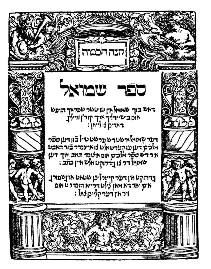
1544, Shmuel Bukh
Courtesy of Dr. Moshe Rosenfeld

In contrast to what was written above, “works that many scholars believe they do not share a common author,” Zinberg informs that both the Melokhim Bukh and the Shmuel Bukh are composed in the same verse-meter. Moreover, the title-page states that “Shmuel is the first part of

the book Melokhim, for it is all related.” Nevertheless, Zinberg quotes other sources that “these are two quite different works and were probably written by two different poets.”[26]

1553, Ma’yan GannimA composition book comprised of sample letters from R. Samuel ben Elhanan Jacob Archivolti (c. 1515-1611). Ma’yan Gannim was published in a small sextodecimo format (160: 45, [1] ff.) at the Venice press of Alvise Bragadin. The Bragadin press was active before the papal bull, dated August 22, 1553, by Cardinal Giovanni Pietro Caraffa, the future Pope Paul IV, an extreme reactionary and bitter anti‑Semite, who ordered the confiscation and burning of the Babylonian and Jerusalem Talmuds. This had a chilling effect on Hebrew printing and resulted in a considerable decline if not outright cessation of printing in Venice, and the subsequent expurgation and censorship of Hebrew books. When Hebrew printing resumed in Venice in 1563, among the Christian printers who took up the publication of Hebrew books was Alvise Bragadin. Bragadin died in the mid-1570’s, he was succeeded by his son, and after him by successive members of the family well into the eighteenth century, the last known Bragadin being Alvise III. Throughout that time the press remained a leading printer of Hebrew books in Venice.
1553, Ma’yan Gannim
Courtesy of the Library of Agudas Chassidei Chabad Ohel Yosef Yitzhak

Archivolti, a student of R. Meir Katzenellenbogen (Maharam, 1473-1565), served as rabbi, av bet din, and rosh yeshivah in Padua. Among his students was R. Judah Aryeh (Leon) Modena (1571-1648). Prior to settling in Padua in 1568, Archivolti worked as a corrector for the Hebrew presses in Venice.

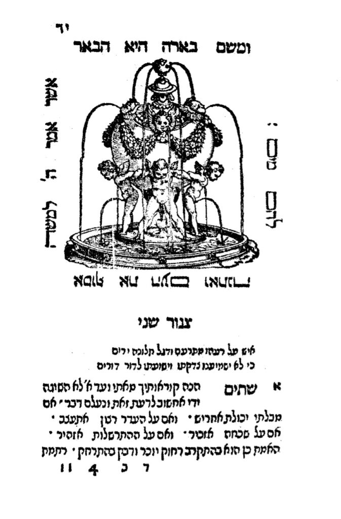
In contrast to our preceeding examples of cherubim, this exemplar does not appear on the title-page of the book, which has the Bragadin device, that is, three crowns, but rather at the beginning of each of the book’s five chapters, a woodcut illustration comprised of three cherubim in a cage, surrounded on all four sides by a verse.

The title is from “A fountain of gardens (ma’yan gannim), [a well of living waters, and streams from Lebanon” (Song of Songs 4:15). The text states that there are fifty letters, that is, twenty-five letters with their responses, written by Archivolti. There is a preface and introduction from Archivolti, followed by a table of contents, and, beginning on 7a, the text. Ma’yan Gannim is the first book written by Archivolti, for he describes it as his first fruits, an offering to the Lord. Archivolti also wrote Degel Ahavah (Venice, 1551), an ethical work; He’arot le-Sefer he-Arukh (Venice, 1553), textual references for the Arukh of Nathan ben Jehiel; and, his most important title, Arugat ha-Bosem (Venice, 1602) a grammatical work in 32 chapters.

The sections or chapters, each on a different theme, are correspondence between a father and son; between friends; from an older to a younger man; with government officials; and others, including letters of a romantic, and even sensual nature. Such letters, at the very least inappropriate by modern religious standards, are intermingled with those of a sacred nature, reflecting contemporary mores and addressing current issues, including therefore, information of historical and cultural value. Ma’yan Gannim is designed to teach through example the rules of correspondence. The letters are in metrical form, designed by Archivolti as literary models, many with ethical content, for his students.[27]

1556, She’ilot u’Teshuvot Jacob ben Moses Moellin (Maharil) – Two hundred and five responsa from R. Jacob ben Moses Moellin (Maharil, c. 1360-1447). The She’ilot u’Teshuvot were published in Cremona at the press of Vincenzo Conti in octavo format (80: [7] 79 ff.). After the Talmud was burned in Venice in 1554 there was a precipitous decline, if not a complete cessation, in the number of Hebrew books printed in Venice for several years. The breach was filled by presses in Ferrara, Sabbioneta, Cremona, and Riva di Trento. Vincenzo Conti (d. 1569) printed briefly in Sabbioneta and subsequently in Cremona, where his press was active from 1556 to 1567, issuing more than forty titles.

Maharil was the leading halakhic authority of his time. His most important work is Sefer Maharil (Minhagei Maharil, 1556, Sabbioneta), a popular and influential work on customs and laws. It was composed by his pupil Eleazar ben Jacob (Zalman of St. Goar), from the discourses that he heard from Maharil. She’ilot u’Teshuvot is comprised of Two hundred and five responsa, a small part only of Maharil’s responsa. The subject matter, as in the Sefer Mahril, deals to a great extent with custom, but also includes much personal material. They also reflect Maharil’s considerable humility and compassion.
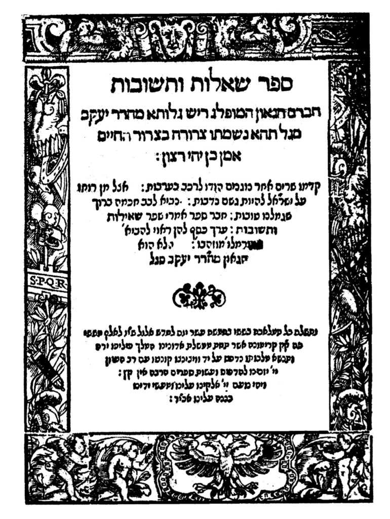
1556, She’ilot u’Teshuvot Jacob ben Moses Moellin (Maharil)
Courtesy of the Library of Agudas Chassidei Chabad Ohel Yosef Yitzhak

The title-page has an ornamental frame made up of four parts, enabling the printer to use them in other arrangements, although this is the manner in which the parts are most often employed. The top frame has the face of a man and cherubin; on the sides are suits of armor, shrubs, and musical instruments and, in the center of the left vertical frame the letters SPQR, reputedly standing for Senatus Populusque Romanus; and on the bottom a two headed crowned eagle and on the sides the cherubim. This frame was used by Conti on his early imprints, appearing on about ten works.

1558, Sefer Rav Alfas Sefer Rav Alfas, (Hilkhot Rav Alfas, Sefer ha-Halakhot of Alfasi, Rif) was published in Riva di Trento by R. Joseph Ottolenghi and Cardinal Cristoforo Madruzzo in a three volume folio format (20: 288, 268, 302 [8] ff.). The Tyrolese town of Riva di Trento is the source of an unusual episode in the history of the Hebrew book. It was for a short time, from 1558 to 1562, a refuge for the Hebrew book; one in which about forty Hebrew titles were printed. Believed to be the first work printed in Riva di Trento, Hilkhot Rav Alfas was likely selected, in addition to its inherent popularity and value, due to the ban on the Talmud, the Rif, being a halakhic compendium of the Talmud, filling, to some extent, the gap left by the scarcity of that work.

It was in Riva di Trento that Cardinal Cristoforo Madruzzo (1512-78), Cardinal of Trent, a scholar and supporter of learning, who argued at the Council of Trent (1562) for leniency and moderation in condemning books, became the patron and protector of a Hebrew press, which was also a source of revenue for him. Ottolenghi (d. 1570), originally of Ettlingen, in Baden, Germany, reflected in its Italianized form in his name, was rosh yeshivah at Cremona, and under his tutelage Talmudic studies had continued in Cremona after that work had been banned and burned elsewhere. He assisted the press, providing indices and annotations to a number of works and assuring that material offensive to the church had been deleted from those books of value to his yeshiva. and R. Jacob Marcaria, a dayyan on the bet din presided over by Ottolenghi and a physician, recruited by Madruzzo help finance and play a role in the press. Marcaria edited and wrote brief prefaces for most of the books printed in Riva di Trento. The press was located in the house of Antonio Broën.

Sefer Rav Alfas is a halakhic compendium by R. Isaac ben Jacob Alfasi (Rif, 1013-1103). Alfasi, born in the Algerian village of Qal’at Hammad, was a student of the great sages R. Nissim ben Jacob (c, 990-1062) and Hananel ben Hushi’el (d. c. 1055) in Kairouan. After learning with them Alfasi relocated to Fez, from where his surname al-Fasi (Rif) is derived, and became recognized as the leading Talmudic sage of the time. In 1088, at the age of 75, two informers denounced him to the government – the charges are unknown – and he was forced to flee to Spain. Eventually settling in Lucena, Alfasi succeeded R. Isaac ben Judah ibn Ghayyat (c. 1020-89), who had died a few months earlier, as head of the yeshiva.
1558, Sefer Rav Alfas
Courtesy of the National Library of Israel

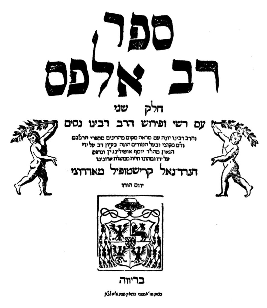
The text of the title-page of each volume has cherubim at the sides, and below bears the Cardinal’s coat‑of‑arms , a significant statement of the Cardinals’ support and protection of the press at a time when his church was burning and banning Hebrew books. Furthermore, the title pages informs that Sefer Rav Alfas was edited with great care by the gaon R. Joseph Ottolenghi and was printed and financed by him, and that this was done, “in the dominion of” the following in bold letters “Cardinal Cristoforo Madruzzo.”

Sefer Rav Alfas, Alfasi’s major work, is one of the greatest works in halakhic literature. It is extracts all pertinent legal decisions from the Talmud, eliminating non-halakhic material, discussions, and subject matter not applicable today. It covers the following orders of the Talmud, Mo’ed, Nashim, and Nezikim, as well as tractates Berakhot and Hullin. Laws in Kodashim and Tohorot, such as mezuzah and tefillin, are organized as Halakhot Ketannot. Sefer Rav Alfas differs from earlier works, such as Halakhot Gedolot, in that it is more comprehensive, more detailed, and by the inclusion of material from the geonim, although, like them, it follows the order of the tractates.

1559-60, ZoharClassic kabbalistic work of Jewish mysticism, attributed to R. Simeon bar Yohai (second century). This, the second printing of the Zohar, it was published previously in Mantua (1558-60), published in Cremona at the press of Vincenzo Conti in a three volume folio format (20: 132, 122, 146 ff.) by Vincenzo Conti (d. 1569). Conti, who had printed briefly in Sabbioneta, is better known for his activity in Cremona, where his press, active from 1556 to 1567, issued more than forty titles.

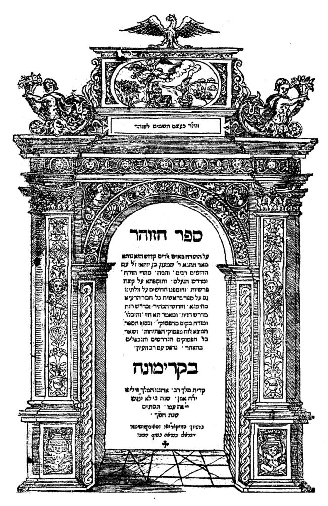
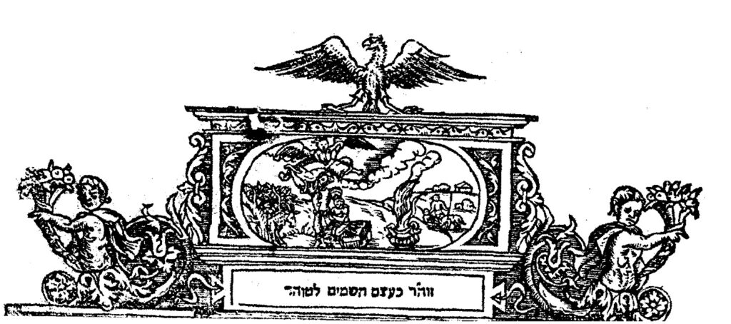
The title page of has a decorative architectural frame with an arch, at the top a vignette of Akedat Yizhak (the binding of Isaac), surmounted by an eagle, and accompanying cherubim; below in the bottom squares, figurines, perchance also cherubim. It is dated, “For the Lord will not forsake כי לא יטש (319=1559) his people [for his great name’s sake] (Samuel I 12:22), and it was completed in the year ש”ך ([5]320=1560).” At the bottom of the page is an imprimature from the Inquisition on the title page, the sole Cremona imprint to place it there, as well as a longer permission at the end of the book.
1559-60, Zohar
Courtesy of the Library of the Jewish theological Seminary

Written in Aramaic and Hebrew, Sefer ha-Zohar al ha-Torah is a comprehensive system of kabbalistic theosophy, encompassing cosmology, the soul, and good and evil. It is an esoteric commentary on the Torah, with homilies, midrashic passages, parables, and numerous discursive passages. It is based on the concept that within scriptures is a concealed stratum, deciphered by Kabbalah, expressing the inner meaning of the Torah, with its “splendor, beauty, and greatness.”

The corrector (and expurgator) was the apostate Vittorio Eliano, grandson of the foremost grammarian, Elijah Bahur Ashkenazi Segal. A member of a Dominican commission to review Hebrew books, Eliano was associated with all the books published by Conti from 1558 through 1559. Although begun later than the Mantua edition, noted above, this printing, done in haste, was completed earlier. Nevertheless, it was not immediately released for sale, for when more than 10,000 Hebrew books were burned in Cremona, with the complicity of Eliano, the entire edition was seized. It was just barely saved, in contrast to other works, by the apostate Dominican, Sixtus of Siena. It is known as the Zohar Gadol (large Zohar), in contrast to the smaller Mantua edition (Zohar Katan), and is also referred to, because of Eliano’s involvement, as the “Christian edition.” This notwithstanding, the Cremona edition was the preferred of the two editions by eastern European kabbalists.[28]

1560, Shir ha-Yihud – Shir ha-Yihud (Hymn of Divine Unity) an anonymous piyyut (liturgical poem) written in the mid-twelfth century, most often attributed to Samuel ben Kalonymus he-Hasid (c. 1130-1175), less often to his son, Judah ben Samuel he-Hasid (c. 1150-1217), author of the Sefer Hasidim, both among the foremost representatives of the Hasidei Ashkenaz, and, on occasion, to yet others.
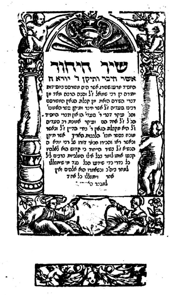
Shir ha-Yihud
Courtesy of the National Library of Israel

Shir ha-Yihud was published at the press of Eliezer and Joseph ben Naphtali Hertz Treves. Active for one year only, in 1560, they issued six books, before being forced to close by a meeting of the leaders, both Protestant and Catholic, of the Swiss Confederation in June, 1560, who feared that they were about to print the Talmud.

The frame, one of several with cherubim employed by the press, also was used on the title-page of Begidat Hazman, an allegoric maqāma (a poetic narrative in rhymed prose) by Mattathias (Mattityah ben Moses), a 15th century Spanish or Provençal Hebrew poet or Mattathias ha-Yiẓhari, a representative of the Jewish communities of Aragon at the Tortosa disputation (1413–14).

1568, Passover Haggadah Passover Haggadah printed in Mantua in folio format (20: 36 ff.) by Joseph Shalit ben Jacob Ashkenazi of Padua. This edition is a reprint of the 1560 Passover Haggadah, also printed in Mantua, but with modifications and the addition of the marginalia of R. Joseph Shalit ben Jacob Ashkenazi of Padua entitled Nimukei Yosef.
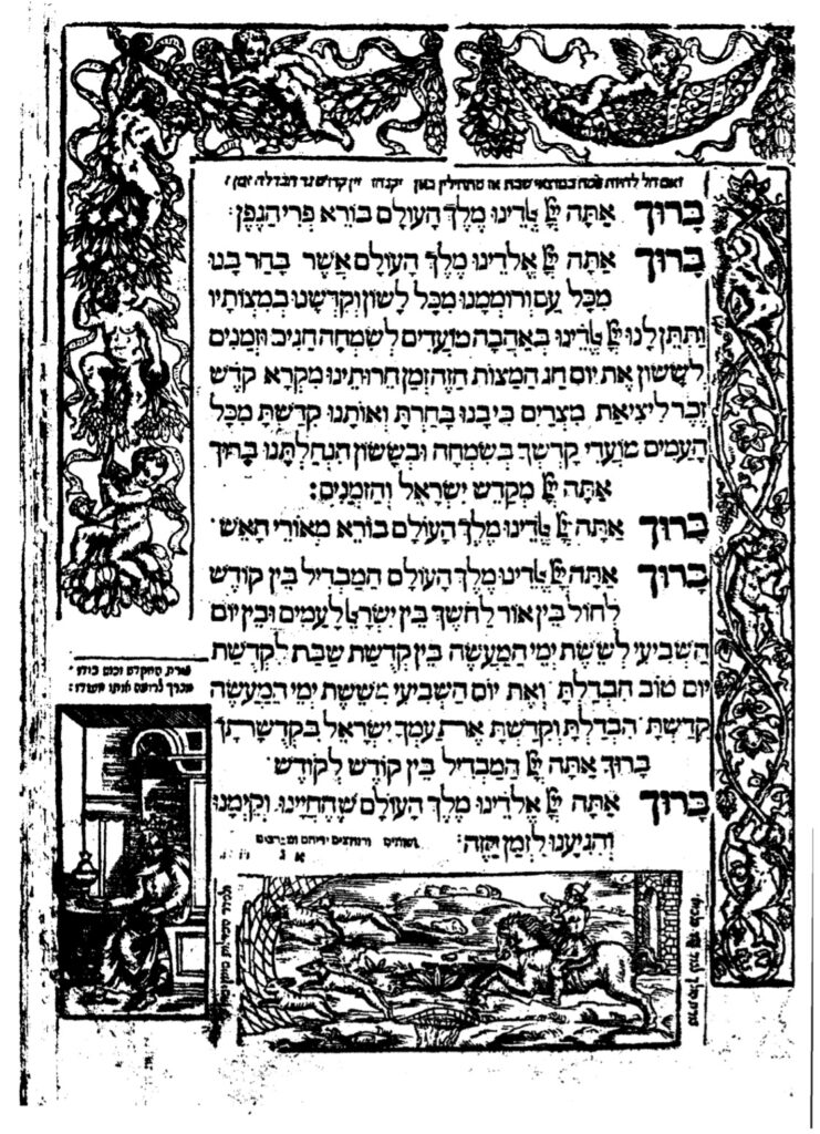
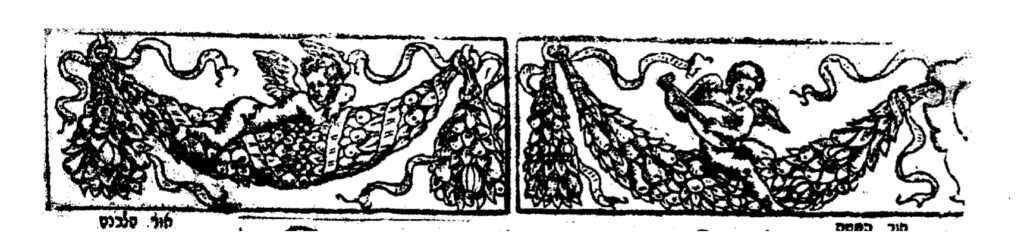
1568, Passover Haggadah
Courtesy of the National Library of Israel

The title page frame has representations of the Mars and Minerva followed by the first text page, which has two woodcuts of cherubim along the top. Following text pages have those cherubim image, as well as numerous other cherubim images, including several marginal cherubim images. This Haggadah shares some features with the Prague Haggadah of 1526. Woodcuts are accompanied by captions, given as rhymed couplets, a feature of Ashkenaz manuscript Haggadot. In some instances, for example, by the four questions, the earlier edition was framed by a lush Italian border, without illustrations. Here the types and the top and upper left borders with their vines and cherubs only are alike.[29]


1576, Yosef LekahYosef Lekah is a commentary on Megillat Esther by R. Eliezer ben Elijah Ashkenazi (1513-86). It was published in Cremona in 1576 by Christopher Draconi in octavo format (40: 83, 1 ff.). Draconi, previously associated with Vincenzo Conti, attempted to publish Hebrew books in Cremona. Although he would issue Latin books from 1569 to 1614, he printed one Hebrew book only, Yosef Lekah.
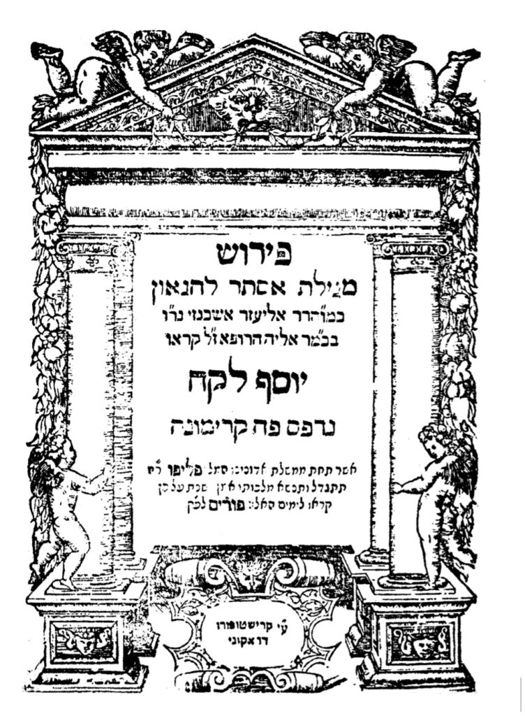
1576, Yosef Lekah
Courtesy of the Fales Library and Special Collections, New York University

R. Eliezer ben Elijah Ashkenazi was a multi-faceted individual, a Talmudist, physician, and well-rounded scholar, who served as rabbi in a number of varied communities. His first rabbinic position, from 1538-61, was in Fostat, Egypt. Forced to leave Fostat, Ashkenazi went to Famagusta, Cyprus, where he was rabbi for two years, and then to Venice. He left for Prague (1561), after a dispute with the Maharam of Padua, and after traveling as far as the Crimea, returned, via Famagusta, to Venice. Ashkenazi was next rabbi in Cremona, where he published Yosef Lekah. Shortly after he left to be rabbi of Posen, and, from 1584, was in Cracow. Ashkenazi experienced difficulties in Poland, disputing over his right to open a yeshiva in close proximity to an existing yeshiva, so that Joseph Solomon Delmedigo (1591-1655) wrote about him, “You have brought a vine from Egypt; you have cast out the nations, and planted it” (Psalms 80:9). Ashkenazi was highly regarded by his contemporaries, corresponding with prominent rabbinic figures such as R. Joseph Caro, R. Joseph Ha-Kohen (Katz), R. Moses Isserles (Rema), and R. Solomon Luria (Maharshal), several mentioning him in their responsa. R. Elijah of Pesaro, in Famagusta in 1563, praised Ashkenazi’s scholarship, noting that he was fluent in twelve languages.

The title-page has four cherubim images, two reclining at the top of the structure, two standing erect by the pillars at the sides. The title-page is dated “Therefore they called these days Purim קראו לימים האלו פורים (336 = 1576)” (Esther 9:26). Yosef Lekah is dedicated to Don Joseph Nasi, Duke of Naxos, whom Ashkenazi, in the introduction, compares to Joseph in Mizraim and Mordecai at the time of Ahasuerus. Ashkenazi, therefore, entitled this work Yosef Lekah. Two, almost identical, editions of Yosef Lekah exist, both dated 1576. Although almost exact copies of the original, it is clear, upon close examination, that the book was reset. Christopher Draconi’s Yosef Lekah was the last Hebrew book printed in Cremona.

Ashkenazi’s most important work is Ma’aseh HaShem (Venice, 1583), on the historical occurrences in the Torah, with a commentary on the Passover Haggadah; selichot; and, not extant today, a super-commentary on the Ramban (Nachmanides) and annotations to R. Caro’s Beit Yosef.[30]

Conclusion – In this article we have described books printed in Augsburg, Basle, Cremona, Mantua, Prague, and Venice. The cherubim imagery on these title-pages, reflecting the influence of Renaissance humanism, their attractiveness notwithstanding, do not appear on the title-pages or accompanying the text in Hebrew books published in more modern times. A review of the title-pages reproduced here, all dissimilar, with their numerous depictions of cherubim, attest to the popularity of that image. Given the strictures on Hebrew printing from the mid-sixteenth century in Italy, the frequent use of cherubim testify to the cooperation of Jewish and non-Jewish printers, their frequency perchance suggesting a positive relationship going beyond mere monetary gain.

We conclude with the Talmudic statement above, which suggests why the image of cherubim was so popular:

Rav Ketina said: When the Jewish people would ascend for one of the pilgrimage festivals, the priests would roll up the curtain for them and show them the cherubs, which were clinging to one another, and say to them: See how you are beloved before God, like the love of a male and female. (Yoma 54a)

Lastly, in conclusion an image of a cherub, both chronologically and, in cherubian activity, quite different from those depicted in this article. It is included as it is unusual and eye catching, an image of a Cherub smoking a pipe. It appears in in at least two Basle imprints published by Israel ben Moses ben Abraham Halle, active in Offenbach, although not continuously, from 1718/19 to c. 1738/43. The works are Anaf Etz Avot, R. Benjamin ben Yekutiel Wulff’s commentary on Pirke Avot, and tractate Sanhedrin (1721).[31]
  1. Once again, I would like to express my gratitude and appreciation to Eli Genauer for reading the article and his insightful comments.
  2. Emil G. Hirsch, W. Muss-Arnolt, J. Frederic McCurdy, Louis Ginzberg, “Cherub ( ; plural, Cherubim)” Jewish Encyclopedia IV (New York, 1901-06), pp. 13-16; Shalom M. Paul, Louis Isaac Rabinowitz, “Cherub” Encyclopedia Judaica IV (Jerusalem, 2007), pp. 600-01.
  3. Thomas Kelly Cheyne, 1911 Encyclopædia Britannica, Volume 6, reproduced in https://en.wikisource.org/wiki/1911_Encyclop%C3%A6dia_Britannica/Cherubim
  4. https://www.sefaria.org/search?q=%D7%9B%D7%A8%D7%95%D7%91%D7%99%D7%9D&tab=text&tvar=1&tsort=relevance&svar=1&ssort=relevance.
  5. Franz Sales Meyer, Handbook of Ornament: a Grammar of Art, Industrial and Architectural Designing in all its Branches for Practical as well as Theoretical use (New York, 1957), pp. 108-09.
  6. Codices and early imprints did not have title-pages, the first leaf normally being left blank to protect the book, that page later becoming a dedicated page. The first book with a detailed title-page was the Calendarium of Johannes Regiomontanus, appearing in 1476 (Venice), being a fifty-five year calendar (1475-1530), printed by Johannes Regiomontanus. The first Hebrew book with a title-page was the Sefer ha‑Roke’ah (Fano, 1505) of R. Eleazar ben Judah of Worms (c. 1165 – c. 1230).
  7. Cherubim also appear on the frames of Hebrew books printed in the incunabular period. For examples of such frames see Marvin J. Heller “Behold, you are beautiful, my love: The Use of Ornamental Frames in Hebrew Incunabula” Printing History NS 10 (New York, July, 2011), pp. 39-55, reprinted in Further Studies in the Making of the Early Hebrew Book (Leiden/Boston, 2013), pp. 3-33.
  8. The following book descriptions are selected, modified from Marvin J. Heller, The Sixteenth Century Hebrew Book: An Abridged Thesaurus ( Brill, Leiden, 2004), var. cit.
  9. Avraham Yaari, Hebrew Printers’ Marks (Jerusalem, 1943), pp. 7 and 126-27 n. 10 [Hebrew].
  10. Jerome Friedman, The Most Ancient Testimony. Sixteenth-Century Christian-Hebraica in the Age of Renaissance Nostalgia (Athens, Ohio, 1983), pp. 44-48, 214-15; A. M. Habermann, Title Pages of Hebrew Books (Tel Aviv, 1969), p. xi [Hebrew with English introduction], pp. 19-20, 125-26 nos. 4-5; Joseph Prijs, Die Basler Hebräischen Drucke (1492-1866) (Olten, 1964), pp. 49-51 n. 26; Frank Rosenthal, “The Rise of Christian Hebraism in the Sixteenth Century,” Historia Judaica II (New York, 1945), (New York, 1945), pp. 182-91; and Richard S.Westfall, “Sebastian Muenster,” http://es.rice.edu/ES/humsoc/Galileo/Catalog/Files/muenster.html
  11. An interesting example of this later usage is R. Moses ben Hanokh Altschul’s (c. 1546–1633) Brant Shpigl, a popular Yiddish work on ethics, correct demeanor, and customs for women, published by Konrad Waldkirch (Basle, 1602), also indicative of the passage of typographic material between printers.
  12. Stephen G. Burnett, “German Jewish Printing in the Reformation Era (1530-1633),” University of Nebraska – LincolnUniversity of Nebraska – Lincoln DigitalCommons@University of Nebraska – LincolnDigitalCommons@University of Nebraska.
  13. Ch. B. Friedberg, History of Hebrew Typography of the following Cities in Central Europe: Altona, Augsberg, Berlin, Cologne, Frankfort M., Frankfort O., Fürth, Hamberg, Hanau, Heddernheim, Homberg, Ichenhausen, Neuwied, Wandsbeck, and Wilhermsdorf. Offenbach, Prague, Sulzbach, Thannhausen from its beginning in the year 1513 (Antwerp, 1935), pp. 29-31 [Hebrew].
  14. A. M. Habermann, “The Printer Hayyim Shahor, his Son Isaac and Son-in-law Joseph Yakar,” in Studies in the History of Hebrew Printers and Books (Jerusalem, 1978), pp. 103-07 [Hebrew].
  15. Yeshayahu Vinograd, Thesaurus of the Hebrew Book. place, and year printed, name of printer, number of pages and format, with annotations and bibliographical references II (Jerusalem, 1993-95), p. 2 no. 10 [Hebrew].
  16. Zipora Baruchson, “Money and Culture: Financing Methods in the Hebrew Printing Shops in Cinquecento Italy,” La Bibliofilia 92 (1990), 25.
  17. For examples of such usage see Marvin J. Heller, “Behold, you are beautiful, my love: The Use of Ornamental Frames in Hebrew Incunabula” Printing History NS 10 (New York, July, 2011), pp. 39-55, reprinted in Further Studies in the Making of the Early Hebrew Book. (Brill, Leiden/Boston, 2013), pp. 3-33; “Mars and Minerva on the Hebrew Title Page,” The Papers of the Bibliographical Society of America 98:3 (New York, N. Y., 2004), pp. 269-92, reprinted in Studies in the Making of the Early Hebrew Book (Brill, Leiden/Boston, 2008), pp. 1-17; and the “The Printer’s Mark of Marc Antonio Giustiniani and the Printing Houses that Utilized It,’ Library Quarterly, 71:3 (Chicago, July, 2001), pp. 383-89, reprinted in Studies, pp. 44-53.
  18. Unterricht Wie ain Christenmensch by Urbanus Rhegiosu (1489-1541), a Protestant Reformer active in Northern and Southern Germany promoting Lutheran unity in the Holy Roman Empire. Unterricht is one of several titles with this frame printed by Silvan Otmar of Augsburg (https://www.flickr.com/photos/58558794@N07/6576279085).
  19. Zipora Baruchson, “Money and Culture: Financing Methods in the Hebrew Printing Shops in Cinquecento Italy,” La Bibliofilia 92 (1990), 25.
  20. For examples of such usage see Marvin J. Heller, “Behold, you are beautiful, my love: The Use of Ornamental Frames in Hebrew Incunabula” Printing History NS 10 (New York, July, 2011), pp. 39-55, reprinted in Further Studies in the Making of the Early Hebrew Book. (Brill, Leiden/Boston, 2013), pp. 3-33; “Mars and Minerva on the Hebrew Title Page,” The Papers of the Bibliographical Society of America 98:3 (New York, N. Y., 2004), pp. 269-92, reprinted in Studies in the Making of the Early Hebrew Book (Brill, Leiden/Boston, 2008), pp. 1-17; and the “The Printer’s Mark of Marc Antonio Giustiniani and the Printing Houses that Utilized It,’ Library Quarterly, 71:3 (Chicago, July, 2001), pp. 383-89, reprinted in Studies, pp. 44-53.
  21. Ch. B. Friedberg, Bet Eked Sepharim, (Israel, n. d), alef 286 [Hebrew].
  22. A later example of an objectionable title-page is the responsa of R. Joel ben Samuel Sirkes’ (Bach, 1561-1640), She’elot u-Teshuvot Bayit Hadash, printed in Frankfurt am Main (1697) by Johann Wust. The title-page had an ornate frame with forms of unclad women which aroused rabbinic opposition, for those authorities considered the title-page inappropriate and offensive to Jewish sensibilities. The quire had to be reprinted with a new title-page, now with two cherubim holding a floral wreath with grapes. A similar situation occurred earlier in Hanau in 1630. Sefer ha-Roke’ah, by R. Eleazer of Worms, was issued in a small format, 12×16 cm., due to the economic restrictions resulting from the Swedish War. On the title-page “Venus rises naked from the waters on a seashell – a common pagan motif” (The book was issued by a press belonging to a non-Jew, Hans Jacob Hena, so that, it has been suggested, no attention was initially given to the title-page. When the book was sold, “many Jewish purchasers tore out the offending page” (Raphael Posner and Israel Ta-Shema, ed. The Hebrew Book: An Historical Survey [Jerusalem: Keter Publishing House, 1975]). There does not appear to have been any opposition to this last title-page in Venice, for the Venus rising from the waters motif appears in Hebrew works printed there, where it was the press mark of Alessandro Gardoni (Venice, 1577-78) and can be found in the Mishneh Torah printed by Meir Parenzo at the press of Alvise Bragadin in 1574.
  23. Taytsher sprach (Vaybertaytsh), is a type generally but not exclusively reserved for Yiddish books, so named because these works were most often read by the less educated and women. Concerning the early use of Vaybertaytsh see Herbert C. Zafren, “Variety in the Typography of Yiddish: 1535-1635,” Hebrew Union College Annual LIII (Cincinnati, 1982), pp. 137-63.
  24. Israel Zinberg, A History of Jewish Literature, translated and edited by Bernard Martin VII (Cleveland, 1973), p. 116.
  25. Meyer Waxman, A History of Jewish Literature (1933, reprint Cranbury, 1960), II pp. 632-33.
  26. Zinberg, p. 106.
  27. Robert Bonfil, Jewish Life in Renaissance Italy (Berkeley, 1994), tr. Anthony Oldcorn, pp. 133, 169; Deror Schwartz, “Samuel Archivolti, his Life and Writings,” Asufot VII, ed. Meir Benayahu (Jerusalem, 1993), pp. 82-83 [Hebrew]; and Zinberg, II p. 130.
  28. Amram, pp. 324-27; Robert Bonfil, “Change in the Cultural Patterns of a Jewish Society in Crisis: Italian Jewry at the Close of the Sixteenth Century,” in Essential Papers on Jewish Culture in Renaissance and Baroque Italy, ed. David B. Ruderman (New York, 1992), p. 418; Rachel Elior, “Messianic Expectations and Spiritualization of Religious Life in the Sixteenth Century,” in Essential Papers . . ., p. 286.
  29. Yaari, Printers’ Marks, pp. 12, 132 n. 19; Yosef Hayim Yerushalmi, Haggadah and History (Philadelphia, 1975), nos. 28-31; and Isaac Yudlov, The Haggadah Thesaurus. Bibliography of Passover Haggadot: From the Beginning of Printing until 1960 (Jerusalem, 1997). p. 4 n. 25 [Hebrew].
  30. David Amram, The Makers of Hebrew Books in Italy (Philadelphia, 1909, reprint London, 1963), p. 319; Meir Benayahu, Hebrew Printing at Cremona: Its History and Bibliography (Jerusalem, 1971), pp. 22-24, 232-34; and Jacob Elbaum, Openness and Insularity. Late Sixteenth Century Jewish Literature in Poland and Ashkenaz (Jerusalem, 1990), p. 47, [Hebrew].
  31. This image appeared in my article “Offenbach Revisited: An enigma Reexamined,” published in the Gutenberg-Jahrbuch (Mainz, 2012), pp. 219-28, and reprinted in Essays on the Making of the Early Hebrew Book (Brill, Leiden/Boston, 2021) pp. 273-92. It was noted there that “in his observations to a draft of this paper, Professor Dr. Hans Schneider observes that he has never seen ‘a cherub smoking a pipe’ and suggests that if the figure is an angel the instrument is a flute. He agrees, however, that the object in question does look like a clay pipe as in the self-portrait of Gerrit Dou. Professor Dr. Schneider suggests that the figure might be an oriental man or boy, as was often painted in the seventeenth and eighteenth century, wearing a turban-like cap with plumes, and that what appears to be an angel’s wings might be a fluttering cape. The reader may draw his or her own conclusions.”


Birds’ Heads, Romaine Lettuce, and the Art of Reading a Haggadah

Birds’ Heads, Romaine Lettuce, and the Art of Reading a Haggadah

A persistent question arises with every illustrated Haggadah, whether a fourteenth-century Sephardic manuscript or a mid-twentieth-century Maxwell House edition: what function do these images serve? Are they merely decorative, do they provide commentary, or do they serve as documentary evidence of ritual practice? Furthermore, when these images draw from the visual culture of the surrounding non-Jewish world, as is often the case, does such borrowing diminish their Jewish character, or does it indicate a more complex dynamic?

These questions are more thorny than they initially appear, and scholarly responses have evolved significantly in recent decades. This post synthesizes several strands: our previous discussions of specific manuscripts, insights from Marc Michael Epstein’s influential scholarship on medieval Haggadah manuscripts, and a notable controversy documented by Leor Jacobi. Our aim is to provide a more nuanced and comprehensive guide to interpreting these images.

The Two Mistakes

Anyone who works closely with illuminated Haggadot will recognize two recurring interpretive errors, both of which diminish rather than illuminate.

The first is the “derivative” thesis: the assumption that when an image in a Jewish manuscript resembles one in a Christian context, it is merely borrowed and thus lacks distinctive Jewish meaning. This perspective has informed much scholarship. Medieval Jewish and Christian artists often employed similar pictorial conventions; when similarities are observed, scholars have typically identified the Christian source, labeled the Jewish version as dependent, and concluded their analysis. This approach, however, overlooks the transformation that occurs when such imagery is adapted within a Jewish context and the specific messages it conveys to a Jewish audience.

The second error is more nuanced and may be termed the Wissenschaft snapshot: interpreting manuscript images as direct documentary evidence of ritual practice. For example, treating a depiction of marror as a definitive record of the vegetable used at the Seder, or viewing an illustration of bedikat chametz as a literal representation of the search process. This approach originates in nineteenth-century Jewish scholarship, which sought to extract concrete evidence about historical Jewish life from all available sources.

In 2012, in the comments section of this very blog, Marc Michael Epstein intervened in just such a discussion with a statement worth quoting in full:

Rabbosai (and Marasai): A manuscript is NOT a mirror. Jews depict themselves in their art (or commission art that depicts them) not as they were, but as they desired to be seen. Please please please do not engage in the typical Wissenschaft strategy of looking at illuminated manuscripts for “clues to Jewish life in the Middle Ages” or even to Jewish history. What we can learn from them is histoire des Mentalites, but even that takes a lot of work to get to.

This intervention arose from a debate about whether Sephardic medieval Haggadot depict marror as an artichoke, a topic addressed further below. The methodological insight, however, is broadly applicable: these images provide access to the histoire des mentalités—the internal landscape of aspiration, theological imagination, and communal self-representation. This perspective offers a richer understanding than the Wissenschaft snapshot, though it requires careful interpretation. Importantly, analyzing how a community chose to represent itself constitutes significant historical evidence, even if it does not directly reveal specific ritual practices.

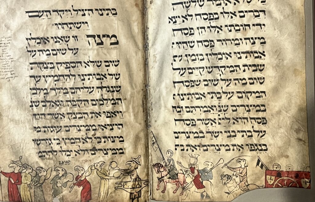
The Birds’ Head Haggadah

The oldest extant illustrated Haggadah text, dated to the early 1300s (and now in the Israel (now in the Israel Museum, although the exact provenance remains murky like so many Jewish items), takes its name from its most immediately striking feature: nearly all the human figures bear birds’ heads rather than human faces. Non-Jewish figures — Egyptians, angels — are instead shown with blank circular discs where faces should be. The zoophilic imagery has attracted a remarkable range of explanations: halakhic anxiety about depicting human faces too completely; a visual encoding of relative spiritual status; and, at the least plausible extreme, the claim that the birds’ beaks are an anti-Semitic caricature of the Jewish nose inserted by a hostile illustrator.

Birds Head Haggadah, Exodus Scene

Epstein critically examines these theories, ultimately adopting a more nuanced position that acknowledges the halakhic dimension without attributing the imagery to a single cause. As discussed in our earlier review, the most illuminating aspect of his analysis is his attention to an anomaly previously dismissed as carelessness. In the Exodus scene depicting the Israelites fleeing and Pharaoh’s army in pursuit, most figures conform to expectations: Israelites with birds’ heads and Egyptians with blank discs. However, two figures in the pursuing army also have birds’ heads. Epstein, prompted by his ten-year-old son’s observation, suggests these figures represent Datan and Aviram, members of the erev rav who chose to remain with the Egyptians. The presence of birds’ heads is intentional, signifying that even the sin of siding with oppressors does not erase Jewish identity. This artistic choice introduces themes of the wicked son, belonging, apostasy, and the potential for return, all of which are particularly resonant in the context of the Seder.

This approach exemplifies Epstein’s methodology: treating anomalies not as errors to be dismissed, but as interpretive keys to deeper meaning.

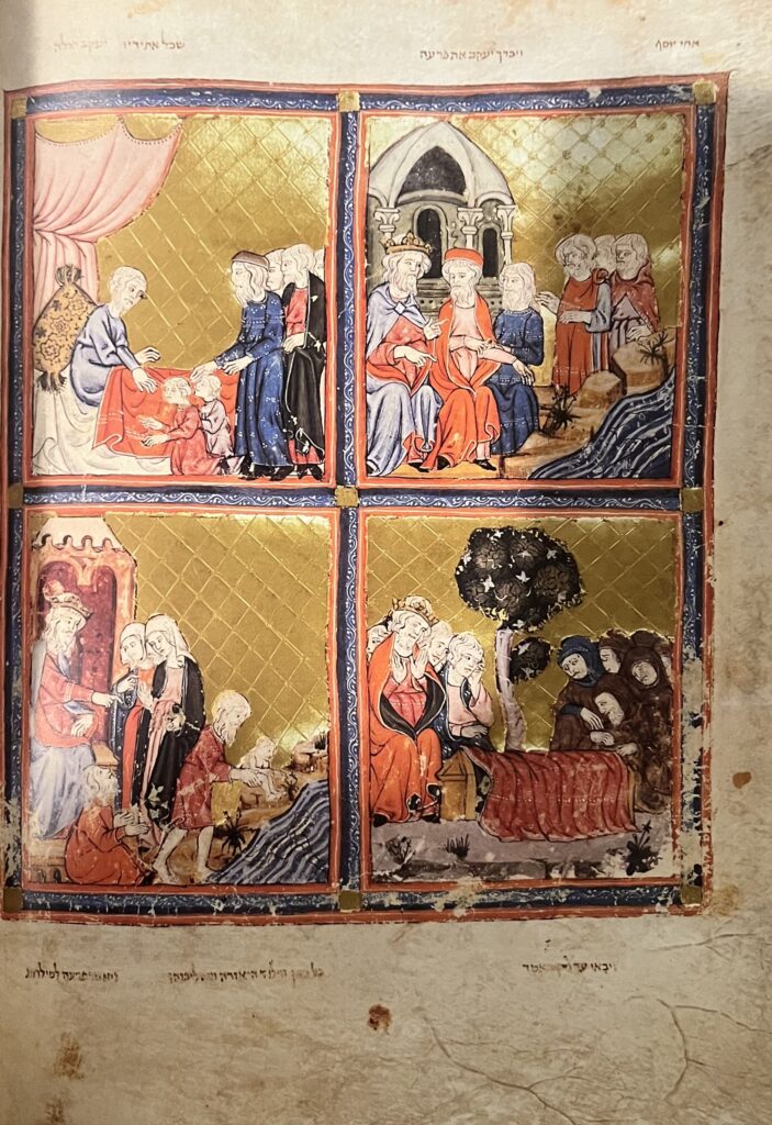
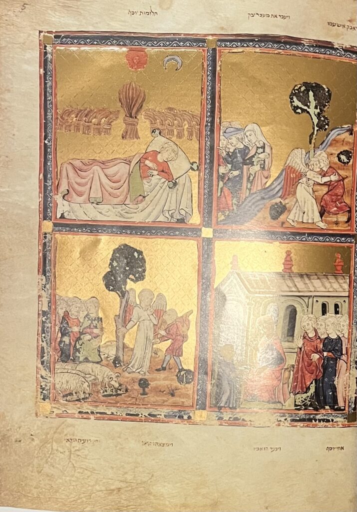
The Golden Haggadah

The Golden Haggadah, a Sephardic manuscript from around 1320 distinguished by its extensive use of gold borders and embellishments, illustrates a key structural distinction within the manuscript Haggadah tradition. In Ashkenazic manuscripts, illustrations are integrated throughout the text, appearing in margins and between passages, and typically serve to comment on or extend the Haggadah narrative, such as scenes of Pesach preparations, the search for chametz, or the baking of matzah. In contrast, Sephardic manuscripts concentrate pictorial content before the text in a visual preamble: a series of full-page panels, arranged two or four per page, that trace Jewish history from the patriarchal era or creation through the Exodus, preceding the Haggadah text itself. These images function as a visual overture rather than direct illustrations of the liturgy.

While the Golden Haggadah adheres to Sephardic conventions, Epstein demonstrates that its imagery is more sophisticated than a straightforward chronological sequence. The illustrator establishes a network of visual connections across panels separated by generations, particularly through the motif of water. Water is depicted in scenes such as Jacob before Pharaoh, the drowning of Israelite boys in the Nile, the rescue of infant Moses, and Moses drawing water for Jethro’s daughters. In each instance, the depiction of water, its color, movement, and spatial relationship to the figures, is distinctive and cross-referential, encouraging viewers to interpret these scenes collectively rather than in isolation. The resulting theological argument centers on themes of divine providence, measure-for-measure justice, gratitude, and salvation as continuous threads throughout history. This constitutes visual midrash: interpretive commentary conveyed through imagery, fulfilling the Seder’s purpose of provoking reflection.


The Rylands Haggadah, Its Brother, and the Marror That Wasn’t an Artichoke

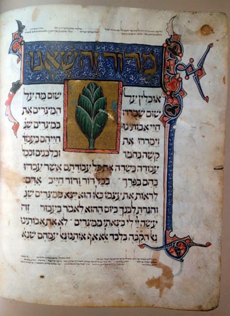
The third and fourth manuscripts analyzed by Epstein—the Rylands Haggadah (currently housed at the John Rylands Library in Manchester) and the manuscript referred to as the Brother to the Rylands—are Sephardic codices discussed together in his work. The term “Brother” was introduced by Bezalel Narkiss due to the notable visual similarities between the two manuscripts; Katrin Kogman-Appel has since argued that the so-called Brother likely predates the Rylands and served as its model. For the purposes of this discussion, both manuscripts represent a shared visual tradition, and the direction of influence is less significant than the insights they collectively provide.

Rylands Brother Haggadah

These manuscripts prompted a particularly instructive methodological episode in recent Haggadah scholarship, which unfolded in real time in the comments section of this blog in 2012 and was subsequently documented by Leor Jacobi. The central question was whether depictions of marror in the Rylands, the Brother, and the Sarajevo Haggadah represent an artichoke. David Golinkin had cited these illustrations as evidence that artichokes were used as marror in medieval Catalonia. Upon encountering this question on Erev Pesach 5772, wrote immediately to Epstein, who replied within the hour:

I don’t believe the Sephardic mss show an artichoke, rather they depict an entire head of romaine lettuce. The way to prove or disprove this would be to compare contemporary or roughly contemporary botanical mss.

When the same identification appeared in a post on this blog, Epstein returned with the fuller statement quoted above — “a manuscript is NOT a mirror” — and added the crucial clarification about representational logic:

Also, because a head of Romaine is SHOWN in the haggadah it doesn’t mean that there was a head of (possible unchecked-for-bugs) Romaine on the table. Every image is not a snapshot, but a representation — a combination of the real, the general, the ideal and the symbolic. Showing the head is a way of REPRESENTING Romaine — it says, “We use a type of lettuce that grows with leaves together in a head like this.” It does NOT necessarily mean “We use complete heads of Romaine at the Seder, like this.”

This logic warrants careful consideration. A manuscript illuminator aiming to depict marror must clearly indicate the species. Depicting the entire head of romaine lettuce—leaves clustered in a recognizable form—serves as an effective visual shorthand for this type of lettuce. Illustrating individual romaine leaves would make them nearly indistinguishable from other leafy vegetables. Thus, the whole head functions as the visual vocabulary for the species, rather than as a literal representation of the serving. The same reasoning applies to artichoke identification: if an artist intended to depict an artichoke, the distinctive globed, thistle-shaped head would be unmistakable. The Sarajevo Haggadah’s depiction of veined leaves bound at the base with a cord, as Epstein observes, aligns with characteristics of lettuce rather than artichoke.

Jacobi’s account adds another layer of insight: Epstein posits that artists of later manuscripts (the Rylands and Brother, likely produced after the Golden Haggadah) may have copied a lettuce image from an earlier model and, interpreting the veined and slightly “spiky” leaves, mistakenly identified it as an artichoke. Patrons did not correct this, as they recognized that artichokes were not used as marror and thus interpreted the image as romaine, regardless of the artist’s intent. These images illustrate the challenges of visual transmission when botanical knowledge is limited, but they do not provide evidence of actual Seder practice beyond confirming that romaine was regarded as the standard marror species in Sephardic communities, a fact already established by textual sources.

Rylands Haggadah

The Barcelona Haggadah introduces additional complexity: its marror illustration appears to have been added by a post-medieval artist who, relying on earlier Haggadah images as models, no longer understood the original intent, resulting in a stylized hybrid that is neither distinctly artichoke nor lettuce. As Evelyn Cohen observes, some manuscripts left the marror space blank, indicating that the image was occasionally tailored to the patron’s local practice. This underscores the non-monolithic nature of the visual tradition and the influence of artist-patron relationships on the final product.


In summary, there is no textual or visual evidence that artichokes were ever used as marror. Romaine lettuce, which becomes increasingly bitter as it is chewed—beginning with a mild taste and culminating in pronounced bitterness at the spine, thus symbolizing the intensification of Egyptian servitude—is far better supported as the intended species and is almost certainly what these images depict.

The Printed Haggadah: The Same Logic

The interpretive methodology applied to medieval manuscripts is equally relevant to the printed tradition.The four foundational printed Haggadot—Prague 1526, Mantua 1560, Venice 1609, and Amsterdam 1695—established a visual vocabulary that influenced nearly every subsequent illustrated Haggadah for centuries thereafter. As we have discussed at length in earlier posts (see here, here, and here), these Haggadot draw from both manuscript precedents and the broader visual culture of their respective eras, exhibiting the same patterns of intentional borrowing and creative transformation observed in medieval manuscripts.

The Mantua 1560 Haggadah, the first illustrated Italian Haggadah, exemplifies this dynamic. Its depiction of the Wise Son is modeled unmistakably on Michelangelo’s prophet Jeremiah from the Sistine Chapel ceiling. However, while Michelangelo’s Jeremiah is bareheaded, the Haggadah’s Wise Son wears the Pileus Cornutus, the conical hat mandated for Jews by Christian law (and likely the beginning of the custom of universal Jewish headcovering). Thus, a figure from the Vatican’s most prominent sacred space is appropriated, marked with a symbol of Jewish social subordination, and reimagined as an embodiment of Jewish wisdom at the Seder table. This reflects both dependence and subversion.

Mantua, 1526, The Wise Son

A similar complexity is evident in the title page’s distinctive helical “barley-sugar” pillars. While these are sometimes attributed to their prominent use at St. Peter’s Basilica, suggesting Christian architectural borrowing, the more probable source is local: the Cortile della Cavallerizza at the Palazzo Ducale in Mantua, designed by Giulio Romano and completed around 1540. The printer Ruffinelli appears to have incorporated these pillars throughout his Mantuan publications as a regional identifier, functioning not as a Christian symbol but as a marker of local identity, akin to a colophon. What may appear as Christian iconography is, in fact, civic geography repurposed as a printer’s device.

Prague Haggadah, Kiddush

The warning against treating images as direct records of practice is relevant here as well. R. Shlomo Hakohen Kook criticized the Prague 1526 Haggadah for depicting the wine cup held in the left hand and grasped by the stem rather than cupped at the base, but both critiques conflate artistic representation with ritual documentation. The left-handed depiction results from the woodcut printing process, which produces a mirror image of the original block; copyists working from printed exemplars, rather than the original block, further reversed the image, consistently yielding left-handed figures. This reflects printing history, not halakhic instruction. The issue of cupping the cup is another anachronism: this practice became widespread only after the publication of the Shelah, which appeared more than a century after the Prague Haggadah. Thus, the woodcut cannot be faulted for omitting a custom that did not yet exist.

What We Can and Cannot Learn

The illuminated Haggadah is a remarkable historical source, but its value depends on the questions posed to it. These manuscripts and early printed books are not objective records of ritual practice; rather, they reflect the choices of communities, shaped by artistic conventions, available models, patron preferences, and the expressive possibilities of the visual vocabulary of their era. When interpreted thoughtfully, they reveal the inner imaginative life of the communities that produced them: their understanding of the Exodus, their self-conception, the theological claims embedded in their liturgical texts, and their engagement with and adaptation of surrounding visual cultures.

This constitutes an exceptionally rich body of evidence, surpassing any attempt to treat the images as mere snapshots of Seder table contents. However, extracting meaningful insights requires art-historical expertise, contextual historical knowledge, and a readiness to embrace interpretive ambiguity—qualities that distinguish the approach exemplified by Epstein from earlier traditions.

Readers who have not yet encountered The Medieval Haggadah: Art, Narrative & Religious Imagination (Yale University Press, 2011) — reviewed here when it appeared here — would do well to remedy that before this Pesach. And to spend a few more minutes at the Seder with the pictures. Additionally, Epstein’s recently released book, People of the Image: Jews and Art,  similarly tackles these topics, including discussions of Haggadah illustrations and, like his The Medieval Haggadah, is among the best in the genre. A review of the book is forthcoming.

Related posts: our 2012 review of Marc Michael Epstein’s The Medieval Haggadah: Art, Narrative & Religious Imagination (here); Leor Jacobi on the artichoke controversy and how to read manuscript marror illustrations (here) and earlier discussions about the vegetable here and here; halakhic implications of Haggadah illustrations (here); and our discussions of the Prague 1526 Haggadah (here here, and here), and for our examination of printed illustrations see “The Mother Haggados: Models for Modern Analysis of Printed Jewish Illustrations.”


Depicting Difference: The Tower of Babel and the Language of Sacred Art

Depicting Difference: The Tower of Babel and the Language of Sacred Art

“For form is only the manifestation, the shape of content.”
Ben Shahn, The Shape of Content, p. 72

Genesis chapter 11 presents the narrative of the Tower of Babel, detailing how, contrary to the divine directive to disperse and populate the earth, the descendants of the flood’s survivors congregated in a single city and commenced construction of a substantial tower. God intervened to prevent further cooperation among them by disrupting their shared language, thereby introducing linguistic diversity, which ultimately ceased the building process and resulted in the broad dispersal of the population.

The account of the Tower of Babel offers a unique context for exploring what characterizes an image—and, by extension, a work of art—as Jewish. In Christian artistic traditions, from medieval illuminations to Renaissance paintings, the tower is often portrayed as a symbol of pride and serves as a cautionary emblem against human ambition. In contrast, Jewish philosophy and visual culture do not treat the tower as an important iconographic motif or as a warning against aspiration. Where the story does appear in Jewish art, it offers an alternative interpretation, and in certain instances, it recasts the tower motif in a more positive light.

The Architecture of Arrogance: Bruegel’s Tower and the Christian Moral Imagination

A painting of a tower of babel AI-generated content may be incorrect.

Figure 1: Pieter Bruegel, The Tower of Babel, Kunsthistorisches Museum, Vienna

Among the most celebrated representations of the Tower of Babel is Pieter Bruegel the Elder’s painting housed in Vienna’s Kunsthistorisches Museum (we previously discussed another painting from the museum, Samuel van Hoogstraten’s Old Man at a Window, and whether it is a Jewish painting, its subject a famous Rabbi). Measuring over three feet wide and five feet high, this work features a monumental spiral structure composed of arches and tiers that ascend unevenly into the clouds. The immense scale of the tower stands in stark contrast to the small human figures depicted throughout—hundreds of workers engaged in various tasks. Bruegel’s paintings are notable for their comprehensive and detailed portrayal of subjects. (This site allows you to zoom in on all the details.) In this scene, each trade and stage of construction is rendered with meticulous attention; some laborers transport massive stone blocks along ramps, while oxen-pulled carts bear heavy loads of building materials. Human-powered treadwheel cranes lift supplies upward, and scaffolding constructed from poles, planks, and ropes clings to the sides of the tower. Masons apply mortar and lay bricks, carpenters reinforce beams, and overseers direct operations, attempting to manage the complexity and activity inherent in such an undertaking.

In the foreground, King Nimrod, adorned in elaborate robes and a crown, oversees the construction as the principal architect of the tower. He reviews architectural plans with his attendants while laborers kneel. Surrounding him, foremen gesture towards the ascending walls, effectively conveying his directives to the assembled workforce. Beyond the imposing structure of the tower, ships are visible entering the harbor, their masts prominent on the horizon.

Bruegel often used allegory in his work. By integrating contemporary construction methods and maritime elements into the depiction of the ancient story, he placed Babel in the context of his own time. The painting presents examples of human innovation alongside the risks associated with ambitious endeavors, making its observations applicable from the 16th century to the present day.[1]

A painting of people working on a tower AI-generated content may be incorrect.

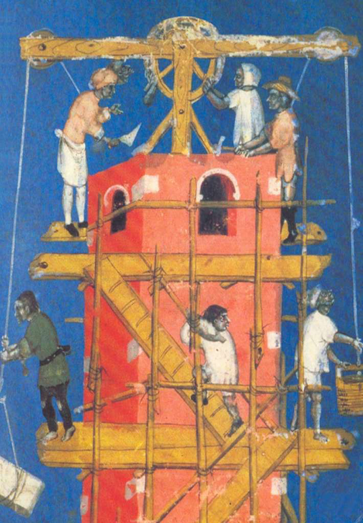
Figure 2: 13th Century Manuscript of Rudolf von Ems Poetry

A letter l with a tower and people working AI-generated content may be incorrect.

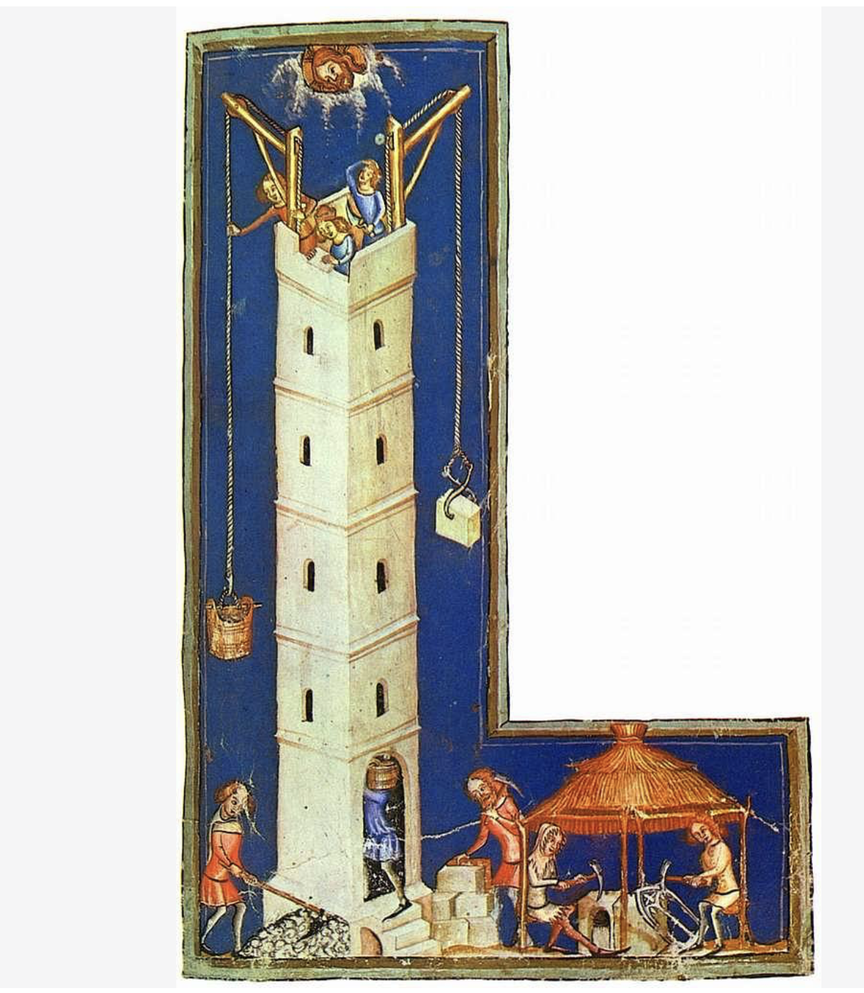
Figure 3: 14th Century York Manuscript

Earlier artistic portrayals commonly focused on Babel’s height and grandeur. Medieval manuscripts and Church paintings often depicted it as upright, rectilinear, and monumental, resembling a fortress or cathedral spire. In contrast, Bruegel presents the tower as unstable, leaning, and showing deterioration at its foundation, while construction continues at the upper levels. The structure appears to challenge natural order by being built atop a mountain and using brick, which leads to rock formations that affect its stability. Bruegel incorporates Roman arches reminiscent of the Colosseum, suggesting parallels to historical architecture that had fallen into decline by the time of his visit in 1560. Some areas are already inhabited; for example, a woman is seen hanging laundry. The residents appear unaware of the structural issues beneath them, blinded by their hubris. Nimrod’s prominence in the foreground, with the workers genuflecting to him and his plans that he holds in his hands, further emphasizes the fetishization of human ambition.

At the time, Bruegel’s audience didn’t have to look far to see a potential Babel in the making: Antwerp was booming, expanding, and building like never before, and its populace risked falling into the sin of pride. In 1563, when Bruegel painted the Tower of Babel, the city was Europe’s busiest port and a magnet for wealth, with goods and materials streaming in daily through the Scheldt River. Massive new fortifications were under construction to secure the city’s growth, while the Cathedral of Our Lady still stood unfinished, its single soaring spire a symbol of grandeur halted midstream. Cranes, treadwheels, scaffolding, and teams of laborers were familiar sights on Antwerp’s skyline, all details Bruegel carefully folded into his painting. Even the ships visible in the harbor of his Babel recall Antwerp’s bustling docks, tying the biblical story directly to his contemporaries’ lived experience. For Bruegel’s viewers, the tower was not just a monument to ancient pride but a mirror of their own city’s dazzling ambition and its underlying fragility.

Bruegel does not show the dramatic aftermath, the confusion of tongues, and the scattering of peoples across the earth. Instead, he arrests the narrative at the moment of construction, filling the canvas with the feverish activity of workers and the looming mass of the tower itself. In doing so, he lets the architecture bear the weight of the story: the leaning walls, the buckling arches, and the crumbling base foreshadow the enterprise’s futility. The punishment is absent because the tower already embodies it, an image of human ambition that carries within itself the seeds of its own destruction.

Bruegel’s legacy is twofold. On the one hand, he fixed Babel’s appearance for centuries: spiraling, leaning, and crumbling, the visual template repeated in paintings, engravings, church murals, and biblical illustrations well into the modern era. From 16th-century Flemish workshops to 18th-century Bibles, from church frescoes to Romantic illustrations, and even into 20th-century literature and contemporary art, Bruegel’s leaning Tower of Babel has been endlessly reimagined as the enduring image of human ambition and collapse.[2] On the other hand, he reshaped its meaning. Earlier images celebrated human pride by showing the tower upright and impregnable. Bruegel’s version, and the generations of artists and authors who followed, transformed it into a parable of fragility, a monument doomed to collapse even as it rose.

Buildings Fall Books Endure: The Jewish Reading of Babel

Within the Jewish exegetical tradition, the story of Babel carries a different emphasis than in Bruegel’s Christian retelling. The tower itself is a bit player in a larger story, a catalyst and not the focus, less important than the human decision it symbolizes. In Genesis 9:1, God commands Noah’s descendants to “be fruitful, multiply, and fill the earth.” Yet instead of dispersing across the world, humanity chooses to settle in one place and build a city and tower “lest we be scattered abroad upon the face of the whole earth” (Gen. 11:4). In this reading, the sin is not arrogance against heaven but resistance to God’s plan of dispersal. The tower becomes a narrative device, a means of dramatizing humankind’s determination to remain unified, sedentary, and secure.[3]

Seen from this perspective, the confusion of languages and scattering of peoples is not so much a punishment as a necessary correction. The multiplicity of tongues is God’s way of ensuring that His will for humanity, for it to spread, diversify, and populate the earth, is carried out. The Jewish interpretation, therefore, reads the story as a lesson about human attempts to thwart divine design, not Bruegel’s Christian vision, which centers on pride and monumental ambition. What matters is not the tower’s collapse but humanity’s refusal to scatter, and the way God ultimately enforces the order of creation.

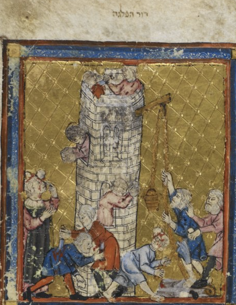
This contrast is confirmed by the way Jewish tradition titles the episode “Dor Haflagah,” meaning “the Generation of Division,” rather than “Migdal Bavel,” the Tower of Babel. (Sanhedrin 10:3; Baba Metziah 4:2). The Hebrew name shifts attention away from architecture altogether and toward the human drama: the refusal to scatter, the divine act of dividing languages, and the dispersal across the earth. In other words, where Christianity made the tower a visual icon, Judaism made the generation itself the lesson.[4]

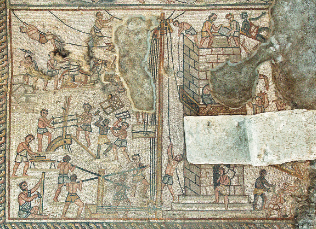
This approach was not only in Jewish exegesis but also in Jewish art. There are only five identified examples of the tower in Jewish art, but in all of them, it is illustrated in a uniquely Jewish manner.

A mosaic of people in different poses AI-generated content may be incorrect.

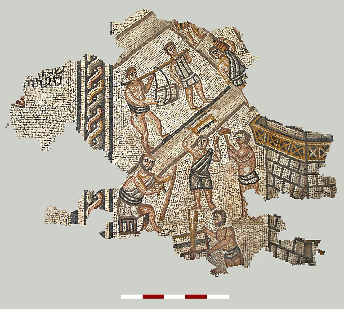
Figure 4: Tower of Babel, Khirbet Wadi Hamam Mosaic, c. 3rd century, source.

A mosaic of people working on a building AI-generated content may be incorrect.

Figure 5: Tower of Babel, Huqoq Synagogue, c. 5th Century

The earliest two examples are synagogue mosaics, a third-century synagogue in Wadi Hamam, and a recently discovered fifth-century mosaic on the floor of the Huqoq Synagogue in northeastern Israel. Only a part of the Wadi Hamam scene has survived, though it is the largest intact biblical scene found. It shows workers and a tower on the left. In the center, two workers are hitting each other. The Huqoq mosaic is larger and illustrates all stages of construction, including detailed depictions of hoists, levers, and various chiseling and cutting tools. At the center of the scene, two workers are engaged in conflict—one wielding a hammer and the other a saw.[5] Similarly, three medieval manuscripts feature this theme; in two, the depiction of violence is the central focus, while in the third, it forms part of a broader image, akin to the mosaic. [6]

A close-up of a painting AI-generated content may be incorrect.

Figure 6 Golden Haggadah, fol. 3r

Although these examples feature the tower, they can be distinguished from the Christian perspective. Firstly, the labeling of the images aligns with Jewish tradition, specifically referencing Dor Haflagah. Secondly, Bruegel’s comprehensive visual representation notably omits any mention of violence. The interpretation that linguistic confusion led to violence is exclusive to Jewish sources, appearing in Genesis Rabba and various other texts, but not in Christian writings.[7] Given that the mosaic dates to the third century, this seems to potentially point to an earlier codification of Genesis Rabba than is currently assumed or that this approach was already was an oral legend.[8] The only known medieval Christian manuscript featuring a descent into violence, The Bedford Book of Hours, has prompted one scholar to assert that it “is undoubtedly based on a Jewish legend.”[9]

While Jewish manuscript culture preserves the uniquely Jewish interpretation of the iconography of the Tower of Babel, Jewish print culture would transform Bruegel’s symbol of pride and sin into a fortress of divine protection.

The Soncino family was the first great dynasty of Hebrew printers, active in northern Italy from the late 15th to the early 16th century.[10] Originating from the town of Soncino in Lombardy and operating intermittently between roughly 1483 and 1527, they established presses in a succession of Italian cities, including Soncino, Brescia, Fano, Pesaro, and Rimini, as well as in Turkey. The founder, Joshua Solomon Soncino, and his nephew, Gershom ben Moses Soncino, expanded the enterprise into one of the most respected printing houses of Renaissance Italy. Gershom issued one of the earliest dated Hebrew books, a Talmudic tractate printed at Soncino in 1484. This work, with its unique layout, is the first of its kind to become canonized, combining the source text with two surrounding commentaries, and is itself a work of art. Their editions combined typographic precision with decorative sophistication equal to the best contemporary Latin and vernacular presses, and their name became synonymous with the art of Hebrew printing itself. They did not just print for a Jewish audience, but also printed over 100 non-Jewish titles, outdoing their Jewish output of 64 titles.

SEFER IKKARIM (BOOK OF PRINCIPLES), RABBI JOSEPH ALBO, RIMINI: GERSHOM SONCINO, 1522 | Sacred Splendor: Judaica from the Arthur and Gitel Marx Collection | 2019 | Sotheby's

Figure 7: Joseph Albo, Sefer Ikkarim, Rimini, 1522

The Soncino family was active from 1483, but in books printed from 1522, first in Rimini and subsequently in Salonika and Constantinople, Gershom incorporated a new printer’s mark – essentially a printer’s coat of arms.[11] This first appeared in R. Joseph Albo’s Sefer Ikkarim and depicts a traditional Renaissance-style solid stone tower rising above a crenellated wall, accompanied by the verse ‘מִגְדַּל עֹז שֵׁם יְהוָה, בּוֹ יָרוּץ צַדִּיק וְנִשְׂגָּב” “the name of the Lord is a mighty tower; the righteous runneth into it, and is set up on high,’ (Proverbs 18:10) on the left and right sides of the image. Gershom chooses to highlight the tower, unlike other possible symbols such as the rainbow, clouds of glory, or King David, which could have served a similar purpose.

Figure 8: Kol Bo, Rimini, 1525, Gross Family Collection

In the Sefer Kol Bo, published in Rimini circa 1525 and considered Gershom’s most distinguished work from that period, a prominent introductory statement appears above the tower: “In You I place my heart and you will help me, and I will raise my heart and with song I will praise you: ‘the name of the Lord is a strong tower; the righteous runs into it, and is safe.’” This clearly presents the tower as an icon of divine protection and intervention. Notably, Gershom’s tower does not correspond with any physical structure in Soncino or Rimini; instead, the tower symbolizes a spiritual rather than an earthly construct.[12] There is one small, but somewhat strange, detail about Gershom’s tower: the doors are latched on the outside, making the locks useless. This oddity reinforces that the tower is divine, as it does not need a locked door. We reenact this belief annually during the Pesach seder. Gershom’s tower, rooted in Mishlei rather than Bereishit, represents divine protection in contrast to retribution. For a Jewish printer deeply engaged with Renaissance book art, this choice offered a thoughtful reinterpretation, reclaiming the tower as a symbol of resilience and trust in God’s safeguarding of the Jewish community people.[13]

The story of the “tower,” whether Bruegel’s collapsing monument or Soncino’s enduring emblem, reminds us how difficult it is to define what makes art “Jewish.” The same image can signify pride or faith, sin or sanctity, depending on the hands and the heart that shape it. Jewish art, then, is not confined to subject or style, but often lives in subtler places — in the design of a page, the mark of a printer, or the choice of a verse. Ultimately, even art speaks in different languages.

Notes: 

  1. For background on the creation of the painting see Margaret A. Sullivan, Bruegel and the Creative Process, 1559-1563 (Ashgate: England, 2010), 191-204. For a direct comparison of the painting with the biblical narrative see Ruth Dorot and Edna Langenthal, “Pieter Bruegel the Elder’s The Tower of Babel (1563). From Art to Architecture,” Journal Education Culture and Society, 2, (2023), 380-400.

  2. See Diána Kulisz, “The Tower of Babel Motif in the Art of the Low Countries,” in Mesopotamia Kingdom of Gods and Demons, ed. Zoltán Niederreiter, (Budapest: Museum of Fine Arts, 2024), 424-439.
  3. See Umberto Cassuto, A Commentary on the Book of Genesis, Part II, trans. Israel Abrams, (Jerusalem: Magnes Press, 1974), 225-226. Abarbenal, however, interprets the section much more in line with Bruegel’s themes. See Nehama Leibowitz, Studies in Bereshit, trans. Aryeh Newman, (Jerusalem: World Zionist Organization), 95-97.
  4. See Cassuto, id. at 203.
  5. See Karen Britt and Ra’anan Boustan, “Artistic Influences in Synagogue Mosaics: Putting the Huqoq Synagogue in Context,” BAR, May/June 2019, 40-41. They note that these are the only two known examples of synagogue mosaics to depict the Tower of Babel.
  6. The Golden Haggadah, Bezalel Narkiss ed. (England, 1996) 24-25; Marc Michael Epstein, The Medieval Haggadah: Art, Narrative & Religious Imagination (New Haven: Yale University Press, 2011), 157-158.
  7. For a collection of the various sources see M.M. Kasher, Torah Shelemah, vol. 1, 515, no. 60 and 517 no. 73.
  8. See Anat Reizel, Introduction to Midrashic Literature, (Tevunot: Alon Shevut, 2011), pp. 105–106.
  9. See Mira Friedman, “The Tower of Babel in the Bedford Book of Hours,” in The Old Testament as Inspiration in Culture, Jan Heller, ed. (Trebenice: 2001), 113-114.
  10. See generally, A.M. Haberman, Perakim be-Toldoth Hamdpissim ha-Ivrim (Jerusalem: Rubin Mass, 1978),15-101; Moses Marx, “Gershom Soncino’s Wander Years in Italy, 1498-1527” in HUCA XI (1936), reprinted as a stand alone work with many examples of Soncino illustrations, in 1969, by the Society of Jewish Bibliophiles.
  11. Abraham Yaari, Hebrew Printers’ Marks: From the Beginning of Hebrew Printing to the End of 19th Century (Jerusalem: Hebrew University Press, 1943), 4-5, 123-124. Gershom once used a different mark with a tower in the 1505 Fano edition Mashal ha-Kadmoni. Id. 124.
  12. Yaari, Printers Marks, 124.
  13. Gershom’s prayer may have been tied to a conflict with a Jew who had converted to Christianity. In the end, perhaps because of this conflict, although it remains unclear, Gershom was forced to flee Italy soon after. See Marx, “Wandering Years,” 55-59.


Ten Commandment Representations in Hebrew Manuscripts & Books: Artistic Approaches to Theological Issues in Judaism

Ten Commandment Representations in Hebrew Manuscripts & Books: Artistic Approaches to Theological Issues in Judaism

Dan Rabinowitz

Today, the Ten Commandments or Decalogue[1] are among the most prominently featured symbols associated with Judaism. The Decalogue is represented by two tablets, generally connected and rounded at the top. This representation occupies a central place within synagogue architecture, often displayed on the exterior or interior of the edifices and frequently above the ark itself, which is regarded as the most sacred element within the building. However, it is noteworthy that these practices only began to emerge in the 16th century. The exact origins of this practice remain unclear, but it is likely that they were influenced by the Christian adoption of the Ten Commandment tablets in art as representative of Judaism. Some scholars suggest that this may not be an instance of benign cultural exchange but might have its roots in anti-semitic legislation, which mandated that Jews wear badges shaped like the Ten Commandments with rounded tops. This imposition may have influenced Jewish consciousness, potentially resulting in eventual self-association with this symbol.[2]

Historical evidence indicates that the ancient Jewish community used of other symbols such as the lulav, shofar, menorah, ark, scroll, and etrog, but not the luchos. The absence of the luchos is unsurprising when one considers the inherent difficulties of accurately replicating them. There is substantial ambiguity surrounding the exact proportions and shape of the tablets. Consequently, accurate reproductions were improbable, preventing their adoption as a common, recognizable symbol. Apart from the Israelites in the desert who witnessed the Sinai revelation, the tablets were not publicly displayed but remained housed within the ark. The fact that the luchos were kept in the ark and never removed suggests that they were intentionally not intended for public display.

In contrast to other Temple implements that are meticulously described, the details of the luchos are only generally mentioned as being made of stone and numbering two. This lack of elaboration has resulted in uncertainty even regarding the inscriptions on the stones and their shape. Today, it is widely accepted that each tablet contained five commandments and can be sourced to the Mekhilta DeRebi Yishmael, Yisro (Horovitz-Rabin, 233-234); however, according to the prevailing opinion in the Talmud Yerushalmi (Shekalim 6:1; Sotah 8:3), each tablet contained the entire Decalogue. Additionally, Rav Saadia Gaon asserted that one tablet recorded the version given in Exodus, while the other contained the version from Devarim.

It was not until the early rabbinic period that there was an explicit discussion regarding the shape of the luchos. The two Talmuds are inconsistent as to the exact dimensions and shape of the tablets (and both versions appear in midrashic literature). According to the TY, the tablets were rectangular, six tefachim in length and three in width. The TB describes them as square, six by six. Some attempt to reconcile the two Talmudic versions, there is clearly no consensus are single traditional regarding the shape.[3]

Beyond the challenges in determining and reproducing accurate divisions and shapes, there is a theological concern with their display. The Mishna records that the recitation of the Decalogue was part of the daily service in the Beis haMikdash. Evidence of this practice is found in the Nash Papyrus, dating between the second and first centuries BCE. In that document, the Ten Commandments appear before the Shema. Although the Nash Papyrus is likely either tefillin or a mezuzah, it seemingly confirms inclusion in the liturgy even outside of the Temple.[4] Nonetheless, the liturgical practice was abolished by Rabban Gamaliel II of Yavne. The rationale for the abolition was that some sect, the Minim, had elevated the Decalogue above the rest of the Torah, and the continued public recitation might imply acceptance of that position.[5] It is worth noting that even when the Decalogue was incorporated into the liturgy, there is no mention of it being displayed.

None of these sources mention the most common shape, tablets with rounded tops. According to one theory, this shape was borrowed from the Roman writing tablet, the diptych, which consisted of two tablets hinged together. Regardless of the original source, the rounded-topped tablets became the standard in Christian art from at least the 12th century. Since Jews adopted the luchos as a symbol much later, roughly in the fifteenth to sixteenth centuries, they chose the most commonly recognized version, which features rounded tops.[6] 

The earliest extant depiction of the luchos appears in the Dura Europos Synagogue fresco, where Moshe is holding a scroll. While Dura Europos does not settle the issue of the shape of the tablets, it does begin to reveal some details about how the luchos iconography has evolved over time to address what can be referred to as the “minim conundrum.” The conflict between the Torah recording God delivering just the Decalogue at Sinai, whereas Jews believe that the entire Torah was given at Sinai.

Illuminated Manuscripts and the Ten Commandments: Resolving the Issue of the Minim

Many manuscripts, including Haggadahs, prayer books, and Bibles, feature imagery related to the Decalogue episode. Beyond merely illustrating the text these illustrators intentionally depicted the scene to address and resolve the minim issue and link the delivery and reception of the Decalogue with the entirety of the Torah. For example, many Ashkenazic Haggadahs include the Decalogue scene, typically accompanying the Dayenu, although two include it later in the liturgy. [7] The earliest, known as the Birds Head (dating to the beginning of the 14th century), depicts two fingers emerging from the cloud, presenting two rounded-topped tablets to Moshe. Immediately below, Moshe appears again transferring the tablets, now five, to two figures, presumably Aaron and/or Yehoshua. The dual tablets have been converted into five, referencing the Five Books of the Torah.[8] The Birds Head Haggadah’s metamorphosis during the transmission process of the two tablets into five is the only example of this solution in any Jewish (or non-Jewish) manuscripts.[9]

Figure 1: Birds Head Haggadah, fol. 23r, Israel Museum

A similar rereading of the Giving of the Law occurs in the thirteenth-century Parma Machzor. Unlike the Birds Head, which transforms the two tablets into five in their delivery, the Parma Machzor, however, depicts God giving Moshe three tablets, presumably alluding to the three books of Tanakh, the entire corpus of the Torah.[10]

Figure 2: Parma Machzor (Biblioteca Palatina, MS Parm. 2887)

Beyond transforming the tablets into more than the two mentioned in the Torah, other forms of iconographical methods were used to address the minim issue. Writing material underwent significant changes throughout the centuries. It was initially etched onto stones, like the luchos, then papyrus (like the Nash), and eventually, using animal skins that are much more resilient than papyrus, it was transformed into scrolls. Finally, “the most revolutionary invention in the history of the book” – the codex – was created at the beginning of the Common Era and became commonplace by the third century CE.[11] The codex, which we recognize as a book today, consists of individual pages written on both sides and addresses the major limitations of the scroll: the difficulty of quickly moving from one section to another and the fact that only one side could be used. Christians were the first to adopt this form sometime in the third century CE. Jews, however, adopted the book or codex much later than most other cultures, likely only in the ninth century.[12] This is unsurprising, as the scroll was not merely a device for Jews, but was imbued with special holiness.

These two forms, the scroll and codex, were used to address the minim issue. In these instances, they assumed the role of the entire torah as contrasted with the tablets, recording just the Decalogue. Scrolls are substituted for the tablets in at least two Haggadahs from the late fifteenth century (c. 1470-1480): the Nuremberg II and the Yahuda.

Figure 3: Second Nuremberg Haggadah (Center for Jewish Art)

Figure 4: Yahuda Haggadah (Center for Jewish Art)

In both, Moshe holds up an open scroll with wooden poles in a manner familiar from the hagbah ceremony. Likewise, in the well-known illuminator Joel ben Simon’s c. 1470 Machzor, now referred to as the Rothschild Weill Machzor, Moshe lifts the scroll. In a later Haggadah, known as MS 1388 Paris (1583), Moshe is holding a partially open scroll, though it is not raised like the other examples.[13] 

Figure 5: Rothschild Weill Machzor (Center for Jewish Art)

A similar image appears in the Ulm Machzor, c. 1430; however, Moshe is receiving it directly from God, echoing the approach of the Parma Machzor that there was no transformation, rather the delivery itself was the entire Torah.

Figure 6: Second Darmstadt Haggadah 9v (Center for Jewish Art)

The codex is similarly employed to address the minim issue. In the Second Darmstadt Haggadah (here), Moshe appears at the top right, beneath the shofar. He is holding two connected rectilinear tablets, hinged at the bottom. A man, dressed differently than Moshe and likely Aaron or Yehoshua, appears at the bottom right holding two separate rectilinear tablets, which are clearly sourced from Moshe. Finally, a group of Israelites appears in the bottom center of the page. The leader is now holding a book. This transforms the tablets into a book or Torah. The connection between the tablets becomes clearer as the person holding the book points to Aaron/Yehoshua and the tablets, indicating that the book’s source is the tablets and ultimately what Moshe received directly from God. Therefore, collectively, the page illustrates the transmission and transformation of the Luchos, from the ten into the Torah – received from God by Moshe, which was then handed off to Aaron and finally to the Jewish people.

Figure 7: Detail Second Nuremberg Haggadah (Center for Jewish Art)

There is perhaps another example of the codex that addresses the minim issue. In the Laud Machzor, c. 1290, the illustration for the piyyut recited on Shavous, Adon Ammani, the upper register has an angel delivering two separate rectilinear tablet while on the right side the Israelites receive a single item with a loop at the bottom. Unlike the Birds Head or other manuscripts that has the transformation into the Torah during the transmission stage; here, the only item the Israelites received was this single item with the loop. What is this unusual single panel with a loop? It may be a a codex. Manuscripts and codices were originally kept in cabinets, armaria, but in the late 13th and early 14th centuries they were more commonly placed on desks, and the practice of chaining books to prevent theft began (see here). Perhaps the loop in the Laud Machzor is a ring of a chained codex and another provides another example of using the codex to address the minim issue.

Figure 8: Laud Machzor 127r (Bodleian Library, MS Laud Or. 321)

Hebrew Book Illustrations & Anti-Jewish Representations

Illustrations in printed books, however, do not appear to be concerned with solving the minim issue. To the contrary, some iconography in printed books can be read to diminish or even undermine not only the torah’s transmission but even the continued applicability and viability of the Decalogue. Printed illustrated Hebrew books depict either Moshe receiving or transmitting the tablets or simply Moshe and the tablets without context. Of the four printed mother Haggadahs that served as models for nearly all subsequent printed illustrated Haggadahs, only one, Amsterdam 1695, depicts ma’mad har sinai. Unlike the other illustrations in that edition, which are modeled after Mathis Merian’s Bible, this illustration was borrowed from other Amsterdam Hebrew prints. As we have previously discussed, while the engraver clearly used Merian as a model he deliberately altered the images to suit the Jewish text rather than their original Christian source. Merian’s imagery for ma’amad har Sinai was entirely at odds with the Jewish view, and therefore, the illustrator sought an alternative source. Merian only depicts the sin of the Golden Calf and not the delivery or transmission of the Decalogue/Torah. That aligns with Christian theology that focuses on the sins of the Jews, rather than the monumental and exceptional example of God speaking directly to the Jews and imparting his Torah.

Figure 9: Amsterdam Haggadah, 1695 (Center for Jewish Art)

The Amsterdam Haggadah used the imagery that first appears on the titlepage of the 1679 Amsterdam Humash and reused on many subsequent editions of the Humashim from Amsterdam and other cities. Here, the mountain is in the middle and Moshe is still on top, receiving the tablets. They are square, and one is held in each of his hands. The illustration does not depict Moshe delivering the Torah or tablets; therefore, it does not address the tension between the Decalogue and the torah. Nonetheless, arguably implicitly, the inclusion of the image on a title page of a Humash, obviates the need to include additional imagery for the minim issue – Moshe receiving the tablets is literally attached and is the precursor to the entire Torah.

Figure 10: Humash, Amsterdam, 1679 (Gross Family Collection)

While the Decalogue scene does not appear in the other mother Haggadahs, Moshe with the luchos is used as one of the border figures in the Venice 1609 Haggadah. Moshe is carrying two connected round-topped tablets and has a light emanating from his forehead. This illustration of Moshe and the luchos is among the most common title page illustrations in Hebrew books.

Figure 11: Title Page Shu”t Rashba, Hanau, 1610 (Gross Family Collecdtion)

It first appears adorning the titlepage of Shu”T Maharil, Hanau, 1610. However, that image was clearly borrowed from a non-Jewish source. Moshe has horns, with rounded topped tablets, and is flanked by Aaron wearing a bishop’s mitre and holding a censer.[14] There is another nuance to the image that may also specifically Chrisitan, and more important theologically than whether Moshe had horns or light emanating from his head. Unlike the Jewish sources discussed above, Moshe does not hold the tablets aloft. Rather, they are standing on the ground, his hand on top. This aligns with the Christian view of the Decalogue; after Jesus, it was relegated to a secondary role or was even superseded by the New Testament. The depiction in Shu”T Hashiv R’ Eliezer, published in 1749 in Neuwied, Germany, presents a particularly striking variation. In this volume, Moshe’s hand is shown flat, seemingly serving to drive down the tablets into the ground rather than grasping them, as seen in the Hanua prints. Additionally, unlike other works that either show some of the text on the tablets or leave them blank, Hashiv depicts the tablets filled with lines, effectively obscuring or erasing any text.

Figure 12: Shu”t Hashiv Reb Eliezer, Neuwied, 1748

The unique nature of Hashiv’s title page is amplified when compared with to similar title pages, one may have even served as the a model for Hashiv. Critically, that title page includes subtle yet significant modifications. For example, David Gans, a disciple of Maharal, in his work Sefer Nitzahon, published in Altdorf in 1644, created one of the most exquisite Hebrew title pages. It features a similar depiction of Moshe as seen in Hashiv, with his hand resting atop the tablets that include some lines, resembling Hashiv. However, these tablets prominently display the Hebrew “Aseres ha-Dibros,” clearly underscoring their importance.

Figure 13: Sefer Nitzhon, Altdorf, 1644

Another contrary example is Yefeh Anaf, by R. Shmuel Jaffe, Frankfurt a.d. Order, 1696, which depicts a Jewish Moshe with rays emanating from his head, holding round-topped tablets with the beginning of each directive in Hebrew.

Like the three manuscripts discussed above, there is another title page that features Moshe with a scroll instead of tablets. This title page, which appears in a number of different Amsterdam books, for example, Sefer Shenei Luchos ha-Bris, Amsterdam, 1698, Yad Yosef, Amsterdam, 1700, and Eshlei Ravrevei, Amsterdam, 1711, is an amalgamation of four biblical figures, each symbolizing one of the four crowns: Torah (Moshe), priesthood (Aaron), kingship (Dovid), and a good name (Shlomo).

Figure 14: Shnei Luchos ha-Bris, Amsterdam, 1698

A later Amsterdam edition of the Humash combines all three Amsterdam illustrations on the title page. The 1827 Amsterdam Humash features Carl Christian Fuchs’s engraved title page. At the top is the image of Moshe accepting the two square tablets. Moshe appears below on the left, holding round-topped tablets with lines representing the text, and in the center is a crown of Torah. Fuchs includes another Amsterdam illustration at the bottom of the page, this one from the 1695 Haggadah, which depicts the temple.

Figure 15: Humash, Amsterdam, 1827

There is another unique depiction of the tablets on an early 19th-century title page. In the third edition of Mendelsohn’s Humash, Fürth, 1801-1803, Moshe and Aaron flank the title page. However, Moshe, with rays, holds only his staff. In the central image, the ark of the covenant is present, and the two tablets, with rounded tops, are superimposed in the foreground.

Figure 16: Derech Selulah, Fürth, 1802 (Gross Family Collection)

One printed book, however, R. Yosef Ergas’ Shomer Emunim (Amsterdam, 1736), may be a unique example that specifically addresses the minim issue. This work, which discusses the legitimacy of Rabbinic Judaism, includes a representation within a circular design surrounded by laurel leaves at the center of the upper register. Initially, the figure appears to be Moshe holding the luchos. However, the accompanying legend identifies the figure as “Rabbenu ha-Kodesh,” Rabbi Yehudah ha-Nasi, the compiler of the Mishna and a key figure in rabbinic Judaism. This suggests that the Mishna – Rebi Yehuda’s text – is synonymous with the luchos.

Figure 17: Shomer Emunim, Amsterdam, 1736 (Moreshet Auctions)

This interpretation is further supported when compared to the title page model for Shomer Emunim, David Nieto’s Matteh Dan, Kuzari ha-Sheni, (London, 1724). This work also defends rabbinic Judaism and depicts the figure labeled “Rabbenu ha-Kodesh” encircled in the upper register, but he is holding a book with the inscription “Mishna.” The printers of Shomer Emunim modeled the title page on Matteh Dan, yet went further in visually equating the Mishna with the Decalogue.

Figure 18: Matte Dan, London, 1714 (Moreshet Auctions)

Except for the Amsterdam prints, title page illustrations consistently show round-topped tablets, unlike Hebrew manuscripts where tablet shapes vary. This likely stems from printing developing after Christian art standardized the round-topped representation. Table 1 summarizes twenty-two manuscripts depicting the tablets, with no consistent shape linked to a specific era or region. In one instance both rounded and rectilinear shapes in the same manuscript.[15] In the Sarajevo Haggadah, the tablets appear on two separate panels (panels 30 and 32): once when Moshe receives and conveys the Decalogue, and a second time in the scene depicting what may be the Tabernacle, Solomon’s Temple, or the Messianic Temple.[16] In the first instance, the tablets are rounded, while in the second, they are rectilinear. It is conceivable, though admittedly improbable, that the original designs were rounded and depicted in the first panel. However, in the second panel depicting the temple, when the decision was made to construct the ark with a square shape, the tops may have been removed to ensure a better fit.

The Ultimate Message of Har Sinai

One final manuscript illustration is notable not only for the shape or material of the tablets, but for the broader message it conveys. The entire nation was present at ma’amad Har Sinai, including men, women, and children. The Dresden Machzor, circa 1290, depicts Moshe receiving the tablets on the upper right of the panel. On the left side of the top register, Moshe delivers them to a kneeling woman, with no men depicted. This representation indicates that the Torah was given to and applies to everyone equally. The shape itself conveys a universal message. The luchos feature rounded tablets within a rectangular frame, symbolizing that everyone fits within Judaism’s broad parameters.

Figure 19: Dresden Machzor, c. 1290 (MS Dresd. A.46A, 202)

Table 1: Manuscripts & the Shape of the Tablets

Square/Rectilinear

Rounded

Scroll

1. Laud Machzor (Southern Germany, c. 1290, Bodleian, Laud Or. 321, fol. 127v) Birds Head Haggadah (Southern Germany, c. 1300, Israel Museum, MS 180/57, fol. 23) Nuremberg II Haggadah (1470-1480, Schocken Library, MS 24087)
2. Rothschild Machzor (Florence, 1492, JTS, fol. 139) Sarajevo Haggadah (Spain, 14th Century, Sarajevo Museum) Yahuda Haggadah (mid 15th century, Israel Museum, MS 180/50)
3. Tripartite Machzor (Southern Germany, c. 1320, British Library, MS. Add. 22413, f. 3r) Parma Machzor (13th century, Western Ashkenaz, Parma, Biblioteca Palatina, MS Parm. 2887, fol. 101v) Rothschild Weill Machzor (c. 1470, NLI, MS 804450, fol. 203)
4. Schocken Bible (Southern Germany, c. 1300, Schocken Library, MS. 14840, fol. iv) Dresden Machzor (1290, Mscr. Dresd. A.46.a, fol. 408) MS 1388 Paris (1583, Bibliothèque Nat., MS 1338, fol. 14r)
5. Regensburg Pentateuch (Regensburg?, c. 1300, Israel Museum, MS 180/52, fol. 154v) Ulm-Treviso Siddur (1450-1453, Parma, Biblioteca Palatina, MS Parm. 2895, fol. 271)
6. Sarajevo Haggadah (Spain, 14th Century, Sarajevo Museum) Floersheim Haggadah (1502, Zurich, Floersheim Collection, fol. 15).
7. First Leningrad Bible Egypt, (?) 929, fragment (Leningrad Public Library, MS II 17)
8. Parma Bible (Parma, Biblioteca Palatina, MS Parm. 2710, fol. 3r)
9. King’s Bible (Catalonia, Spain, 1384, MS King’s 1, f. 3v)
10. Catalan Bible (Catalonia, Spain, third quarter of 14th century, MS Add. 15250, f. 3v)
11. Harley Catalan Bible (Catalonia, Spain, c. 1350, MS Harley 1528, f. 8r)
12. Darmstadt Haggadah II (Universitäts-und Landesbibliothek, Darmstadt, Cod. Or 28, fol. 9v)

[1] Although these terms are inaccurate because the Torah does not refer to them as commandments, huqqim, mitzvos, or mishpatim, rather aseres hadivarim or aseres hadibros, nonetheless, as that is the most widespread description we use that term.
[2]
See generally, Gad Ben-Ami Sarfatti, “The Tablets of the Covenant as a Symbol of Judaism,” in The Ten Commandments, As Reflected in Tradition and Literature Throughout the Ages, ed. Ben-Zion Segal (Jerusalem: Magnes Press, 1985)(Hebrew), 353-388; Ruth Mellinkoff “Round-topped Tablets of the Law,” Journal of Jewish Art I (1974): 28–43.

Almost immediately after the luchos were displayed in synagogues, some argued that their display contravened the injunction against elevating the Decalogue above the rest of the Torah. The first to raise this issue was Rabbi Yom Tov Lipmann Heller. He describes how one synagogue in Prague displayed them and equates the display with the public reading, subsequently banning the practice. Rabbi Heller, who served as the rabbi of the Altneu Synagogue (Old-New Synagogue), incorporated other symbols within the building. The walls bear various abbreviations corresponding to verses that describe the decorum and purpose of prayer. The ark is flanked by two lions at the top, and the luchos do not appear anywhere within the synagogue. Rabbi Heller was most likely referring to the Maisel’s Synagogue which, today, displays the luchos above the ark. This synagogue was originally built in the 1590s. However, since it burnt down in 1689 we cannot be certain that the design of the ark was the same during Rabbi Heller’s lifetime. Whether or not this was the synagogue Rabbi Heller referenced, it serves as an example of how his opinion never gained traction even in Prague. Indeed, the Maisel’s Synagogue also displays the Decalogue on the exterior of the building, as does the Baroque Synagogue (originally built in 1622/23, also destroyed in the 1689 fire). The Klausen Synagogue’s building was completed in 1694, and its ark is topped by the luchos. For more information, see Prague Synagogues (Jewish Museum in Prague: 2011), which includes photographs of the synagogues and descriptions of their respective histories.

For a discussion of the issue of Decalogue displays in synagogues see Yechiel Goldhaver, Minhagei ha-Kehilos, vol. 1 (Jerusalem: 2005), 45-48n1, who collects examples throughout Europe of synagogues with the luchos displays as well as sources discussing the propriety of the practice.

Regading contemporary sources that discuss what shape to use for the luchos, rounded, square or rectangular, see Reuven Chaim Klein, “Square versus Rounded,” available here. Of note is the opinion of R. Yisroel Yaakov Fisher, Chief Rabbi of Badatz Eidah Chareidis, who argues, the contra-historical position, that the original tablets were rounded. Indeed, according to Fisher, there were rounded at the top and bottom.
[3]  See Chaim Kenefsky, Baraysa d’Melehes haMishkan, Da’as (Beni Brak, 1996), 38, and Meir Ish Shalom, Beritah, 43; see also Menahem Silber, “Aron ha-Edus ve-Luchot ha-Bris: Tzurotom u-Tavnesam,” in Sefer ha-Zikhron le-Rebi Moshe Lifschitz, ed. Rafael Rosenbaum (New York: 1996), 236-42; see also, Midrash Devarim Rabba, ed. Saul Liebermann (Jerusalem: Shalem, 1992)122n2.
[4] See Ephraim Urbach, “The Place of the Ten Commandments in Ritual and Prayer,” (Hebrew), in Ten Commandments, ed. Segal, 128.
[5] See Urbach, “Place,” 132-136, 138-142; Von V. Aptowitzer, “Bemerkungen zur Liturgie und Geschichte der Liturgie,” MGWJ 74 (1930), 104-115. Both also attempt to identity of the sect of the minim.
[6] See Mellinkoff, “Round-Top.”
[7] See generally, Sarit Shalev-Eyni, “Receiving the Law: Visual Language and Communal Identity in Medieval Ashkenaz,” Gesta 55(2), (Fall 2016), 239-255. Shalev-Eyni discusses many of the examples below.
[8] See Marc Michael Epstein, The Medieval Haggadah: Art, Narrative, and Religious Imagination (Yale Univ. Press, New Haven, 2011), 90; Metzger, Haggadah, 303. Metzger demonstrates that the second figure is also Moshe. Id.
[9] Metzger, Haggadah, 303.
[10] Shalev-Eyni, “Receiving of the Law,” 246-249.
[11] Anthony Grafton, “From Roll to Codex: A Christian Initiative,” in Crossing Borders, Hebrew Manuscripts as a Meeting-place of Cultures, ed. Piet van Boxel and Sabine Arndt (Bodleian Library, Oxford, 2012), 15.
[12] Grafton, “Roll,” 20.
[13] Metzger, Haggadah, 305.
[14] Regarding the image of the horned Moshe see Ruth Mellinkoff, The Horned Moses in Medieval Art and Thought (University of California Press: Berkeley, 1970. For a collection of articles discussing the depiction of Moshe throughout history and reproductions of many examples, see Moïse Figures d’un Prophète, ed. Juliette Braillon, (Musée d’Art et d’Histoire du Judaïsme: Paris, 2015).
[15] The Sarajevo Haggadah is the only Haggadah manuscript from the Sefard tradition that depicts the Giving of the Torah. While the Sephardic manuscripts precede the Haggadah text with the Biblical Cycle from Genisis to Exodus, the remaining Haggadahs end before the episode at Mount Sinai. See Metzger, Haggadah, 302.
[16] See Shalom Sabar, The Sarajevo Haggadah History & Art (Sarajevo: 2018), 233-235; 239-241. Sabar only offers Solomon’s Temple or the Messianic Temple. Nonetheless, it is equally possible that this panel simply depicts what follows the Giving of the Law, the construction of the Tabernacle.


The Mother Haggados: Models for Modern Analysis of Printed Jewish Illustrations

The Mother Haggados: Models for Modern Analysis of Printed Jewish Illustrations

There is a long tradition of illustrating Haggados, dating back to at least the early Middle Ages. Likely only a small portion of those manuscripts has survived. However, most have been reprinted, and their imagery has been meticulously analyzed and cataloged. These manuscripts can broadly be divided into two categories based on their places of origin: Sephardic or Ashkenazic countries. The former includes the creation cycle and the Exodus story prior to the Haggadah text, while the latter incorporates the imagery into the text. Within these categories, and with the exception of “brother” or “sister” manuscripts, no single manuscript necessarily influenced subsequent ones. Of course, common manuscript imagery appears in many of these manuscripts, with the hunting scene being the most ubiquitous.

Illustrations in printed Haggados, however, are different. They can be traced back to four “mother” Haggados, each the first in its respective region, representing the three main geographical areas of Jewish settlement and centers for printing Hebrew books: Prague, 1526 (Eastern Europe); Mantua, 1560 (Italy); Venice, 1609; and Amsterdam, 1695 (Western Europe). These specific Haggados were reprinted many times, with the illustrations, motifs, and themes appearing in them—sometimes collectively and at other times singularly—finding their way into nearly all subsequent illustrated Haggados. Some of these illustrations reflect influences from manuscripts, and all three were impacted by the broader non-Jewish culture and geographical iconography (though not directly related to the text itself). For example, an Italian Haggadah shows Avraham crossing a river in a gondola, while Prague incorporates Gothic architecture for the Egyptian cities. Additionally, we can sometimes identify specifically Christian iconography or direct borrowing from Christian sources in these and later Haggados. Occasionally, this involves using an image that carries no specific Christian connotations, while in other instances, the usage is clearly identifiable as specifically and uniquely Christian.

While these Haggados are discussed by many scholars, at best they analyze a few images, and even in many instances, they fail to fully account for the nuance of the images. Instead, they focus on external influences or some exotic element of the images. This form of analysis is no longer in vogue, and as it relates to Hebrew manuscripts, it has seen a substantial correction, most notably in the recent works of Marc Michael Epstein and Katrin Kogman-Appel on Hebrew manuscripts.[1] We hope to make a small contribution to redirecting the narrative regarding the imagery of printed Hebrew Haggados. What follows is not intended to be a comprehensive analysis of all printed illustrated Haggados. Indeed, we do not discuss Prague 1526, as we have dealt with that edition on a few previous occasions (here, here, here, here, here, here, and here). Rather, we hope it serves as a minor contribution in applying the current methodology used for Hebrew manuscripts to the Hebrew book.

Mantua 1560: Many Cooks in the Kitchen

The Mantua 1560 Haggadah is the first Italian-illustrated Haggadah, published by Giacomo Rufinelli and it is available here from a copy in the Braginsky Collection (the NLI recently exhibited the manuscripts from Collection, with a companion book, Encounters with Beauty). The woodblock images were overseen and possibly even executed by Yitzhak ben Shmuel Bassan. However, since they are unsigned, the artist is uncertain. Yet, however, as we will see, there may have been multiple artisans involved in creating the woodblocks. Bassan served as the shamash in the first synagogue established in Mantua by Yitzhak Porto.

Mantua 1560 is the first illustrated Haggadah to include a title page. The convention of title pages became standard in Hebrew books only in the early middle period of the 16th century; see our discussion here. Like many Jewish and non-Jewish title pages, it frames the page with architectural elements, such as arches and pillars. These pillars are unique. They are not traditional columns but helical (twisted) pillars, referred to as barley-sugar pillars.

While at first blush, Rufinelli’s incorporation might seem associated with a distinctly Christian structure, closer examination reveals that the printer’s usage served a different purpose, one explicitly aligned with his publishing house. This style is most well-known for its use in St. Peter’s Basilica in Rome, which was constructed in the 4th century by Constantine the Great and this style is claimed to be derived from the famed pillars of the Solomonic temple, the yachin and boaz pillars (although no Jewish sources describe these as helical). These pillars supported the dome above the main altar. The original Basilica was demolished in the early 16th century and rebuilt at the end of that century. It was most famously reproduced by the school of Raphael in “The Donation of Constantine,” completed around 1524, and adorns the ceiling of Sala di Costantino, one of the four Raphael rooms within the Vatican Palace. Nonetheless, Rufinelli most likely used these pillars not to evoke St. Peter’s but for a more local reason, specifically to identify his books as Mantuan in provenance. The local Cortile della Cavallerizza in the Palazzo Ducale in Mantua, designed by Giulio Romano and completed around 1540, predates Rufinelli’s incorporation of these pillars in his books (they appear in the Haggadah and others). The second elevation is notable for its barley-sugar pillars, an early example of the Mannerist school of architecture and among the Palazzo’s most unique and recognizable features.

Cortile della Cavallerizza

Perhaps, in Rufinelli’s mind, these pillars symbolized Mantua, and he treated them as akin to a printer’s device expressing familial or other aspects of the printer. Indeed, while Italianate books in the 16th century regularly incorporated architectural elements into title page designs, we have not located any books that utilize the Solomonic pillars, despite their history and symbolism in Italy, other than Ruffinelli’s Mantuan prints.[2]

Another image from this Haggadah originates from the Vatican Palace: the depiction of the prophet Jeremiah that Michelangelo painted on the ceiling of the Sistine Chapel. Jeremiah, seated in a contemplative pose with his hand on his beard and legs crossed, is used to illustrate the wise son in the Haggadah. Nevertheless, the image takes on a unique Jewish twist in the Haggadah version. Jeremiah is no longer bareheaded; instead, he wears a Pileus Cornutus, or Jewish hat, the cone-shaped headgear commonly mandated by Christian law.

Mantua, 1560

The first edition of the Maxwell House Haggadah (we discussed the history of the first edition here) also reproduces a well-known Renaissance image of Rembrandt. It includes Rembrandt’s Sacrifice of Isaac, now in the St. Petersburg Museum.

Maxwell House Haggadah, New York, 1932

The illustration of the final son, the one who cannot ask, is also of non-Jewish origin. In this instance, it comes from a biblical illustration by the noted illustrator, Hans Holbein the Younger, and appears in Icones Historiarum Veteris Testamenti, first published in 1538 (page 88). The image is used in a different context, Psalms 53:2, for a fool, but in the Haggadah, it illustrates the son who does not even know how to ask.

Mantua, 1560

Holbein, Icones Historiarum Veteris Testamenti

Determining the source of the remaining images, as well as the number and identity of the artists involved in the production of this Haggadah, is challenging. A close examination of the style and quality of the images suggests that at least three artists contributed. Artist A’s work features detailed, technically accurate German-style drawings, while Artist B’s illustrations resemble almost childlike line drawings that lack perspective and depth. The third artist, Artist C, produces illustrations that are not as crude as those of Artist B, as they possess a sense of perspective. Yet, they are also not executed as well as those of Artist A.

Artists A and B appear on the first page of the Haggadah. In the upper right-hand corner, there is a detailed and precise depiction of a man searching for hametz, dressed in a Germanic style, belted and wearing a beret, with the ceiling and fence rendered with perspective. At the bottom center left is a simple line drawing of the matzah baking scene. The men and women wear Italianate clothing, with the men in unbelted tunics and cloth caps covering their ears or in flat hats, and the women in low-cut dresses with exaggerated shoulders. There is no depth, as the men on the far left overlap on the same plane as the women kneading the dough. Similarly, the two people at the table in the right-center, using the “redler” (dough docker) to mark the matzah, also lack perspective.


Artists A and B are again juxtaposed on facing pages, featuring two images depicting the killing of Jewish babies. On the right page, we see the midrashic image of Pharaoh bathing in the babies’ blood, while the left page shows the act of casting the babies into the water. Here, as well, the illustration on the right side portrays the participants with realism, whereas the left displays simple line drawings. The woman on the far right of the left page, with her hands raised, contrasts sharply with the despondent woman at the far right of the right page, where the anguish of having her child torn from her arms is powerfully conveyed.

Artist C demonstrates intermediate technical skills between those of Artists A and B. Two similar images of the family at the seder demonstrate the distinction between Artists B and C. Artist B’s work consists of line drawings, offering little to no shading or depth on a single plane, whereas Artist C’s piece presents a crowded scene where each figure wears a unique dress, showcasing multiple perspectives and well-rendered depth of perception.

A comparison between two figures, both seated in similar chairs and holding comparable objects, effectively represents the distinct styles of Artists A and C. Rabbi Eliezer, characterized by a disproportionate head and a simpler chair. The king image, however, holds a topped goblet with filigree on the bottom and is seated beneath an elaborate copula. All of the features are well-proportioned and executed within a smaller and more challenging format. These distinctions suggest that the two seated men cannot be the work of the same artist.

Artist C is evident in Moshe leading the Israelites out of Egypt. The large group of Israelites is well drawn (no Artist B line drawings), but Moshe, particularly his head, is not rendered as well as the figures in Artist A’s works.

Similarly, the most recognizable image from this Haggadah, which shows the Messiah on a donkey with Elijah following, displays the hybrid style of Artist C. The Messiah, donkey, Elijah, and especially the figure with the bow and arrow are clearly less refined than those of Artist A, but not as simplistic as Artist B.

None of the Haggadah’s images are signed. One clue to the influence of Artist C is seen in his illustration of Avraham crossing the river. His boat of choice is a gondola, suggesting that Artist C may have Venetian origins.

The gondola also makes a brief appearance in another of Artist C’s images, titled “Building Pitom and Ramses.” There is a small gondolier crossing the river visible at the top center of the image.


Artist A’s city of origin, or where he may have spent time, cannot be determined from his drawings. The wise son, Jeremiah, is depicted by Artist A, but, despite the origins of this illustration in the Sistine Chapel, we cannot identify Artist A as Roman, nor confirm that he viewed the image firsthand in Rome. It is more plausible that he encountered the images only through drawings, whether printed or otherwise. A comparison of the beard in the Haggadah, with its long, wavy hairs, aligns much more closely with this drawing, now in the Metropolitan Museum of Art, printed in Mantua (although its dating is disputed), rather than with Michelangelo’s bushy, untamed beard in the Sestina.[3]


If, indeed, there are three artists, we can tentatively associate the images with their artists as follows:

Artist A: King on chair (p. 2, 3,36, 37, 42, 70), Jeremiah (p. 9), praying man (p. 9, 14), four sons (p. 10-11), Rosh Hodesh (p. 11), Pharoh bathing in blood (p. 20), Aaron with staff (p. 24), angel with sword (p. 24), R. Yosi (p. 26), King pointing finger (p. 27), Israelites escaping Egypt with Egyptian pursuing (p. 28-29), Paschal lamb (p. 32), matzah (p. 33, 40), maror (p. 34, 38, 40),.

Artist B: matza baking (p. 1), family seder (p. 4, 42), children thrown into the river (p. 21).

Artist C: hare hunt (p. 3), enslaved Israelites building (p. 6, 35), Avraham on gondola (p. 13), young woman (p. 18), Pitom and Ramses (p. 19), R. Eliezer (p. 28), Egyptians drowning (p. 31), Moshe leading the Israelites (p. 38), family seder (p. 41), Elijah entering Jerusalem (p. 45).

Venice, 1609 An Egalitarian Haggadah?

The third “mother” Haggadah was conceived by Israel Zifroni, a printer, editor, and typesetter, and published by Giovanni di Gara in Venice in 1609 (briefly discussed here and here).[4] The images are unsigned and it is unclear if they were executed by Zifroni or he just oversaw their production. There were three editions: in Judeo-Italian, Judeo-German, and Ladino.5 On the title page, Zifroni invokes the verse from Psalms 148:12: “‘Youths and maidens, elders and boys, will praise the name of the Lord,’ who inspired me, Zifroni, to bring this crown of beauty to light, so that no eye will be satiated by its forms. Here, one can always find novelties; these were not done in vain, but with intention and purpose. These will prolong the story, for your eyes withhold my glory and my deeds related to it.” In this epigraph, Zifroni alludes to two unique aspects of the illustrations in his edition: its egalitarianism, as it is for everyone, and the deliberate nature of the illustrations, meant to provide additional commentary to the text and fulfill the obligation that “whoever adds in the retelling is praiseworthy.”

While Zifroni surely intended that the Haggadah be used for all age groups, one of the “novelties” in the illustrations is a focus on a female audience. This inclusivity, emphasizing images depicting women, repeatedly appears throughout the Haggadah. Additionally, there are scenes that do not include women, in previous Haggadahs, and it is unclear from the text if women participated. Nevertheless, Zifroni incorporates them into the narrative.[6]

Zifroni’s intentional and distinct approach is already evident from the title page imagery, which contains six images divided between the processes of searching and burning hametz and matzah baking. The people depicted conducting these processes are exclusively women, with no men present. This gendered approach sharply contrasts with the Prague 1526 and the Mantua 1560, which depict a man searching for Hametz.

Mantua, 1560

Prague, 1526

Similarly, while the baking scene at the bottom of the page is very similar to that of Mantua 1560, nearly all the men depicted are now women. Aspects of the process in Mantua were entirely male, whereas in Zifroni’s they are now exclusively female.

Venice, 1609

Mantua, 1560

In Mantua, the kneading depicts three men, while in Zifroni’s there are three participants as well, but one is a woman. Mantua shows two men mixing the dough, whereas Zifroni’s features two women. Mantua has two men shaping and puncturing the dough, while in Zifroni’s there are two women. Even in the scene at the top of the page depicting the harvesting and checking of wheat, where the heavy labor involved could easily be portrayed as exclusively male, Zifroni still includes one woman at the table checking the wheat.

Zifroni’s biblical scenes, when possible, include women. For example, in the scene above depicting Avraham crossing the river in the Prague and Mantua Haggadahs Avraham is shown alone, accompanied only by the rower in Prague (second image below) and the gondolier in Mantua (third image below).

This aligns with the verse in the Haggadah, “that I took Avraham your forefather over the river,” which does not mention anyone else. By contrast, in this seminal scene in the formation of the Jewish people, Zifroni did not limit himself to the literal text. His illustration references the biblical story that includes Sarah. Thus, she is portrayed in the gondola, along with two other women at the dock about to board, while no other men, aside from Avraham, are present, not even Lot. This multitude of women sharply contrasts with the scene on the right, depicting idol worship, where the genders are reversed; here, there is just one woman, and the rest are men.

Another “novel” illustration related to the Israelites time in Egypt. The Talmud offers two reasons why women are obligated to the same degree as men in reciting the Haggadah: they too were included in the Exodus miracle, and, according to Rabbi Avira, they were not just participants, they were the catalyst for the Exodus (Sotah 11b). There are at least three episodes that demonstrate the integral part women played: Shifrah and Pu’ah, women’s roles in the exponential reproduction of the Israelites, and Pharaoh’s daughter saving Moshe. All three feature prominently in Zifroni’s images. While infanticide is illustrated in Prague and Mantua in two panels, one showing the gruesome murder to drain their blood for Pharaoh’s bath and the other showing them being cast in the river, neither Haggadah shows the multiplication of the Israelites. Yet, in Zifroni’s work, in addition to one panel of the babies being cast in the river, he includes two that illustrate the population explosion, specifically highlighting the unique and nearly exclusive role of women.

The first shows four women nursing and raising the children, both alluding to the midrash teaching that Jewish woman in Egypt birthed sextuplets. On the right, one woman is nursing two children while another four are clamoring for sustenance. In the middle, the three other women tend to six children. Two men appear far to the left, only partially depicted with most of their bodies cut from the scene (perhaps alluding to their male parts, their only relevant part in the story). Additionally, as we previously discussed in the article, “Separate Beds,” this printed Haggadah is unique in representing Jewish abstinence. Like the other images, it displays an awareness with rabbinic literature. 

Indeed, this scene is repeated and expanded upon on the next page. Again, a woman nursing six children, this panel now incorporates the earlier part of the story, which emphasizes that the women encouraged their husbands, even after a brutal day of enslavement, to spend time together. This alludes to the Talmudic passage that uses the verse in Shir HaShirim (8: 5), stating that they procreated under the apple tree. The Nile River is included in this scene, not to illustrate infanticide, but to show the women bathing in preparation for their meeting with their husbands.

Even the panel that depicts infanticide is unique in that the largest and most prominent portion of the scene shows Pharaoh’s daughter saving Moshe. Additionally, Shifrah and Pu’ah appear before Pharaoh on the left, unlike any earlier illustrations that omit them entirely.

Contrasting the earlier Haggadahs illustration of the scene with the Israelites safely on the side of the sea and the Egyptians drowning highlights the central role that women play in Zifroni’s version.

In his depiction, the center of the frame shows Miriam playing instruments and singing with the women, while Moshe and the rest of the men are relegated to the right of the panel. In Mantua, (the two images below) Miriam is merely part of the larger group, identifiable only upon close examination.


In Prague, the scene is exclusively male. Likewise, in the scene of the Israelite encampment in the wilderness, Zifroni was careful to include Miriam and her well.

Another scene where there was no need to include women is Avraham meeting Malki Tzedek, where a woman appears at the far right of the panel.

There are other scenes where women take center stage. When eating the matzah, the women at the center distribute it to the men, seemingly indicating that the women are leading the seder. Both Prague and Mantua, show only a lone man.

Mantua, 1560

Women are central in the scene of the Four Questions. Their prominence is particularly noticeable as the image on the following page depicts Rabbi Eliezer and other sages, with him in taking center stage.

Similarly, when Avraham greets the three angels, both he and the angels are shifted to the left of the frame, while Sarah, in the tent, occupies the center.

Finally, most radically, although it is not entirely clear as the top of the head is obscured behind the letter, the wise “son,” upon close examination, it is perhaps a woman. Unlike the other “sons” this child is wearing a skirt whereas the men and boys are in pants!

In conclusion, one prominent and exceptional thematic element in Zifroni’s illustrations is the significant role of women. This leaves little doubt that he intended to portray and elucidate the Haggadah through deliberate images that appeal to and highlight both the feminine and the traditional masculine role in the Exodus.

Amsterdam 1695, A Judeo-Chrisitan Haggadah or an Exemplar for Haggadah Illustrations?

One of the most striking examples of Christian iconography in the Hebrew book is the 1695 Haggadah printed in Amsterdam and illustrated with copperplates by the convert Jacob Bar Abraham. This marks the first use of that technique in a Hebrew book, which allows for a much more refined and precise presentation of images. The Haggadah also includes a fold-out map, though it may not be the first example in a Haggadah.[7] Bar Jacob was originally from the Rhineland and may have even been a Christian preacher.[8] He was not the only convert involved in Amsterdam Jewish printing. According to Yaari, there were at least six others.

These images were used as a template for at least four 18th and 19th-century Haggados in Amsterdam, as well as hundreds of editions printed in Germany and Eastern Europe, and even as far afield as Iran, India, and North Africa.[9] There are at least five 18th-century manuscripts that also utilize Bar Jacob’s images.[10] Despite their popularity throughout the European Jewish world, the source of his images is non-Jewish. Thirteen of the fourteen illustrations in this edition, and six of those on the title page, do not come from any of the three other “mother” Haggados. Instead, these illustrations are sourced from the biblical images created by the Christian artist Matthaeus (Mathis) Merian the Elder.[11] They first appeared in his Icones Biblicae, published in Basel in 1625, and were subsequently incorporated into the most popular Bibles in the Rhineland

Bar Jacob’s source was first identified in 1931, a fact acknowledged by subsequent analyses of this edition. Some critiques are highly critical of Bar Jacob’s model, with one scholar going so far as to assert, without any corroborating evidence, that “there was fierce opposition” to Bar Jacob’s edition.[12] These scholarly critiques generally question the appropriateness of using Christian biblical imagery, the lack of direct relevance of this imagery because it was not designed for the Haggadah, and the failure to follow the “traditional” imagery found in other “mother” haggados. Despite the great scrutiny to which this edition was subjected, the most obvious Christian element that appears in just one of the fourteen images went unnoticed scholars.[13] And in fact, upon close examination, these scholars’ complaints are easily refuted. While Bar Jacob’s source was Merian, he transformed those images to fit the Haggadah, and with one exception, they fall well within the bounds of accepted Jewish imagery and further enhance and clarify the text of the Haggadah.

The six biblical images at the top of the title page predate the Exodus story, which triggered some complaints of them being non-conformist and irrelevant.[14] Yet, this criticism fails to acknowledge the widespread Sefardic manuscript convention, dating back at least to the 14th century, of prefacing the Haggadah with biblical imagery that documents the precursor events to the Exodus. The Sarajevo Haggadah but one of many examples. Indeed, most Jews in Amsterdam in 1695, particularly the wealthier individuals who were likely the target audience for what was presumably an expensive Haggadah, were of Sefardic origin. Some scholars identified examples of borrowing images and motifs from Medieval manuscripts in other “mother” haggados, but they overlook this when it comes to Bar Jacob.

Perhaps the most consistent criticism relates to the disconnect between biblical images and the Haggadah liturgy. Since Merian’s images were designed for the Bible, they do not necessarily correspond directly to the words of the Haggadah. While some parts of the Haggadah reference the biblical story, Merian did not illustrate those specific narratives. To address this limitation, Bar Jacob discovered alternative images and adapted them for the Haggadah. Importantly, Bar Jacob did not merely “cut and paste.” He modified Merian’s images as needed to align with and, crucially, to clarify through illustration the Haggadah and its themes. Since these subtle modifications do not align with traditional scholarly criticism, most remain unmentioned. Although we lack the space to cover all of Bar Jacob’s images and his distinct approach, we will revisit this later. One scholar points out that “the most egregious” example is Bar Jacob’s illustration of the rabbis in Benei Brak. Being that this story post-dated the Bible by many centuries, none of Merian’s images were intended for this scene. Instead, Bar Jacob used Merian’s image of Joseph and his brothers, provoking this scholar’s ire.

From the Gross Family Collection


This is another example of a surface-level examination of printed illustrated Haggadah images. A close look at the image demonstrates that, rather than being an egregious usage of Merian, it perfectly illustrates Bar Jacob’s approach to transforming the image to suit the Haggadah and express the nuance of the text. In adapting Merian’s image, Bar Jacob modified it in three significant ways, all of which render it especially suitable to clarify the text of the Haggadah.

The purpose of the story of the rabbis in Benei Brak is to provide a historical example of people meaningfully discussing the Exodus story all night. The rabbis were so engrossed in conversation that they were unaware that the time for this obligation had ended, and that they were now required to express the Exodus in a different and common format, reciting the Shema. The nocturnal nature of the story is a central element. Thus, in Bar Jacob’s version, the chandelier, which in Merian’s version is unlit, is lit. To further emphasize the fact that this took place at night, Bar Jacob includes two lit candles in the foreground.

Second, the Benei Brak story is predicated on the fact that the rabbis were unaware that the sun had risen. Thus, as opposed to Merian’s version, where Joseph and his brothers are dining in a room with large open windows, Bar Jacob’s version has opaque windows, indicating that the rabbis became aware that the sun had risen only when their students interrupted the discussion. The windows also allow Bar Jacob to avoid the visible church with a cross atop the steeple that is seen through the large opening in Merian’s version.

Third, Bar Jacob has removed the two dogs, a common Christian artistic motif, from the foreground. The Talmud is anti-canine. Indeed, Rabbi Eliezer, one of the sages listed in the Haggadah, stated that “one who breeds dogs is like one who breeds pigs!” Needless to say, it would be highly inconsistent with the text of the Haggadah to retain dogs in the illustration.

The final modification is in the participants’ headgear. In Merian’s version, only Yosef’s head is covered, with a royal turban. Bar Jacob’s version has all the rabbis wearing head coverings. Beyond a possible Jewish halachic requirement to cover one’s head while engaged in Torah study, a close examination of the headgear fundamentally changes the scene’s dynamic. In Merian, the brothers genuflect to who appears to be an Egyptian royal figure. In the Haggadah, all the rabbis are equal in their obligation. This is made clear in the previous statement of the Haggadah, which states that all, whether wise, knowledgeable, and even those proficient in the entire Torah, are equally obligated to discuss the Exodus story all night. Bar Jacob retained a figure at the head of the table, yet his importance is deemphasized because he wears the same hat as the rabbi on his left.

Bar Jacob’s awareness of the limitations of Merian’s illustrations is evident in the one illustration in the text that is not from Merian. Merian’s illustration of Moshe receiving the Torah depicts Aaron meeting Moshe and the Israelites worshipping the Golden Calf. Thus, Merian’s focus is on sin rather than the spiritual importance of receiving the Torah. Therefore, Bar Jacob chose a different image, one that appears in many Amsterdam Bibles (see here, here and here), showing the Israelites celebrating the event.

Yet, there is, one image that seemingly includes an obvious Christian element: a cross. While somewhat unclear due to its minuscule size, Bar Jacob’s depiction of the Temple appears to have a cross on the front of the building’s roof. Bar Jacob did, however, modify the image in another way to clarify the text. Marien’s version features many people outside and inside the Temple. But the text of the Haggadah discussing the Temple is a prayer for the future, and Bar Jacob presented the Temple as empty, symbolic of the fact that Jews today do not have a Temple to visit. We pray that in the future, we will all be among those in its courtyards.

From the Gross Family Collection

Surprisingly, this is not the only instance of a cross in a Hebrew book. For example, in the 1747 Hamburg edition of Mahram Schiff, the bottom image includes two prominent crosses. Likewise, the bottom left image of the 1668 Amsterdam edition of Nahlas Shivah, which uses “Moshiach Bar David Ba” to denote the year, shows a cross in the background.

Finally, we must discuss two additional Haggados, both of which have been repeatedly praised as beautiful examples of illustrated printed Haggados. Unfortunately, upon close examination, they clearly display Christian iconography in an entirely unnecessary and highly problematic manner. The first, Basel 1816, praised by Steinschneider and described as containing “pleasing” woodcuts is the most troubling. In 1997, this edition was even reprinted and colorized to mark the centennial of the first Zionist Congress held in Basel. For centuries, some have claimed a connection between Jesus’ Last Supper and the Pesach seder. Yet, Jews today would reject the notion that they are reenacting the Last Supper. But in the Basel Haggadah the text regarding the three items that one must eat on Pesach is illustrated with the image of Jesus at the Last Supper, surrounded by the Apostles!

The final “Christian Haggadah” is described by Yerushalmi as “undoubtedly the most distinguished illustrated edition produced in Europe during the 19th century,” and the images “welcome a freshness of design.” Alexander Marx praised its “refined artistic taste,” and that the illustrations are “dignified and pleasing and make this edition outstanding among its contemporaries.”[15] Despite these compliments, in truth, most of the images are not fresh but are copies of previous images from the “mother” Haggados, specifically the 1609 Venice Haggadah. In many instances, this “distinguished” edition eliminates the nuance and meaning of those earlier images. In some cases, the images are nonsensical. Finally, many of the designs suffer from blatant non-Jewish imagery.

From the Gross Family Collection

For example, the Venice Haggadah uniquely enhances the image of the Israelites’ encampment with Miriam and her well as part of the theme of emphasizing women’s role in the Exodus. In the Trieste Haggadah, Miriam and a group of women appear in the bottom far right. However, the women seem to be worshipping her as some sort of deity, with one woman bowing to her. The Venice Haggadah includes the scene of Yaakov meeting Lavan after fleeing Lavan’s home. It features four tents in the background, each with one of Yaakov’s wives, as they play a critical role in that story – Lavan’s complaint is that he did not have the opportunity to say goodbye to them, and then Rachel has a calamitous interaction with Lavan. Yet, in the Trieste Haggadah, there are five (!) empty tents.

Finally, in the most egregious image that is not modeled after any of the prior Haggados, Moshe appears before the burning bush, with God depicted as a man with a beard. Of course, direct depictions of God are prohibited. Unfortunately, this is not the only example in Hebrew books depicting God’s face. The title page of the first edition of Minhas Shai, 1742-1744, also includes such an image. However, it appears that, unlike the illustrator of the Trieste Haggadah, the illustrator of that title page was a non-Jew. This is evident from the fact that the artist was unfamiliar with Hebrew, as the letters are crude and obviously copied. Likewise, since the illustrator of the Kaufmann Haggadah was a non-Jew, in the scene with the burning bush God is depicted as a man.[16]


From the Gross Family Collection

The Moss YaKNeHZ: History and Historic Imagery

The four “mother” haggados are not the only examples of thoughtful illustrations in printed haggados. A contemporary work by David Moss, who remains active with his studio in the Artist Colony in Jerusalem, is an exceptional piece that creatively combines the history of illustrated Haggados in both manuscript and print. The original manuscript has been recently acquired (at Sotheby’s auction) and donated to the National Library of Israel, where it is now on display (see here). If one cannot visit, they can still enjoy it in the comfort of their home. Originally, a small number of exact reproductions were produced; however, those are long out of print. Still, copies of a beautiful two-volume reproduction remain available—one volume contains the manuscript, while the other offers explanatory notes. This edition is admittedly missing a few original elements, but it retains many of the most critical aspects, including the papercuts and fold-out pages, leaving most of Moss’s genius still apparent. One version merely reproduces the Haggadah in a flat format, and we recommend splurging for the two-volume version.

As this year’s Pesach begins on Saturday night, we will use Moss’s accompanying illustration of the procedure unique to that evening as an exemplar of his approach. This procedure, referred to by the Talmud by the acronym YaKNHaZ, translates to the order of operations for the blessings: Yayin (wine), Kiddush, Havdalah, and Zeman (the Shehechiyanu blessing). Moss depicts this section with 12 boxes, 11 containing coins adorned with eagles, and the final one showing a hare jumping out of the frame. This illustration references manuscripts, one of the “mother” haggadot, and its subsequent expression, Jewish history more broadly.

Upon closer inspection, the hare makes an appearance not only in the final box but also is present in each of the boxes with eagles, where it is grasped in their talons. The scene of a hare hunt is common in both non-Jewish and Jewish manuscripts, yet in many instances, it is simply aesthetic and disconnected from the text. However, in the Prague 1526 Haggadah, it becomes directly associated with the text. YaKNHaZ sounds similar to the German phrase “Jagen Has,” which means chasing or hunting hares. The Prague illustrator includes an image of hares fleeing from the hunter and seemingly running headlong into a net. In the next illustrated Haggadah, printed in Augsburg in 1534, which mainly uses the Prague illustration, the hare hunt appears on two panels, transforming the narrative from merely evocative of the procedure to becoming symbolic of the Exodus story. The first panel is a copy of the Prague illustration; yet, rather than the hares succumbing to their pursuer, the second panel shows them jumping over the net to safety. The hunter is no longer just a hunter, and the hares are not mere animals of prey. Instead, the hunter symbolizes those who seek to persecute the Jews, while the hares represent God’s promise that the Jews will ultimately prevail against their adversaries.

Moss’s research uncovered that many historically anti-Semitic governments employ the eagle as their symbol. The eleven panels reproduce these symbols. To illustrate those governments’ animosity toward the Jews, the hares are clutched in the birds’ talons. Yet, akin to the optimism of the Augsburg illustrator, the final frame depicts the hare escaping.

In the accompanying commentary, Moss explains that this image proved to be the most controversial in his Haggadah because eagle imagery is not limited to the past. Instead, it is now most associated with the United States. Until recently, one could comfortably distinguish the United States from its eagle predecessor, as it uniquely granted Jews equal rights from its inception. However, during these unprecedented times, one hopes that Moss’s imagery does not turn out to be prescient.

[1] Marc Michael Epstein, The Medieval Haggadah: Art, Narrative & Religious Imagination (New Haven: Yale University Press, 2011); Katrin Kogman-Appel, Illuminated Haggadot from Medieval Spain (Penn State University Press, 2006).
[2] No examples appear in the various collections of Italian books from that period. See, e.g., Harvard College Library Department of Printing and Graphic Arts Catalogue of Books and Manuscripts, Part II: Italian 16th Century Books, Vols. I-II.
[3] See Boorsch and Lewis, The Engravings of Giorgio Ghisi (Metropolitan Museum of Art, 1985), 164-165 (available here).
[4] Regarding Zifroni see Marvin Heller, “Ambrosius Froben, Israel Zifroni and Hebrew Printing in Freiburg im Breisgau,” in Studies in the Making of the Early Hebrew Book (Brill, Leiden, 2008), 131-150.
[5] This edition was analyzed by Bezalel Narkiss in a 1974 reproduction, Tovia Preschel, in the 1973 Diskin Orphan House reproduction, and Ursula Schubert, Jewish Book Arts, 1994, and discussed by Yerushalmi in his Haggadah and History. None mention the uniquely feminine nature of this edition. Instead, they mainly locate it within the Prague and Mantuan traditions, or identify manuscript precursors, or highlight a few additions.
[6] This discussion is largely informed by and indebted to Epstein’s close analysis of the Golden Haggadah. See Epstein, Medieval, 129-200.
[7] See Isaac Yudlov ed., The Haggadah Thesaurus: Bibliography of Passover Haggados (Jerusalem: Magnes Press, 1997) n20; Rehav (Buni) Rubin, Portraying the Land: Hebrew Maps of the Land of Israel from Rashi to the Early 20th Century (Jerusalem: Yad Izhak Bar-Zvi, 2014) (Hebrew), 83-99. For a detailed discussion of the map, see Rubin, id. and David Stern, “Mapping the Redemption,” Studia Rosenthaliana 42-43 (2010-2011), 43-63.
[8] See Abraham Yaari, Studies in Hebrew Booklore (Mossad Harav Kook, Jerusalem, 1958)(Hebrew), 250-251. Habermann asserts without any evidence that while still in the Rhineland Bar Jacob was convinced by Jewish friends, possibly those involved in printing, to convert to Judaism. See A.M. Habermann, The Illustrated Haggada (Safed: Museum of Printing Arts, 1963), 22. Unfortunately, we have very few details regarding his time in the Rhineland, and no information regarding his decision to convert.
[9] See Shalom Sabar, “From Amsterdam to Bombay, Baghdad, and Casablanca: The Influence of the Amsterdam Haggadah on Haggadah Illustration among the Jews in India and the Lands of Islam,” in, The Dutch Intersection.  The Jews and the Netherlands in Modern History (Leiden:  Brill, 2008) ed. Yosef Kaplan, pp. 279-300 and illustrations pp. 498-517.
[10] See, e.g., Oppenheim Haggadah (1719), Cecil Roth Oxford Haggadah (1753), Babad Haggadah (1769), Tel Aviv Haggadah (1771), and Pressburg Haggadah (1777).
[11] Rahel Wischnitzer-Bernstein, “Von der Holbein Bibel zur Amsterdam Haggadah,” MGWJ 75, (1931), 269-286. The Haggadah’s two other images, Moshe and Aaron, flanking the title page, are sourced from the Yiddish translation of Tanakh by Yekuseil Blitz, published in Amsterdam in 1676-78. The Haggadah is not the only Jewish text that was influenced by and adopted Christian illustrations. See Heyd, Milly, “Illustrations in Early Editions of the Tsene-U’rene — Jewish Adaptations of Christian Sources,” Journal of Jewish Art 10 (1984) 64-86.
[12] Ursula Schubert, Umanut ha-Sefer ha-Yehudit (Tel Aviv, Kibbutz Hameuhad, 1994), 50.
[13] This was finally noticed in 2002. See by F. Wiesemann in ‘Kommt heraus und schaut’– Jüdische und christliche Illustrationen zur Bibel in alter Zeit [Katalog zur Ausstellung, Universitäts und Landsbibliothek Düsseldorf) (Essen 2002), p. 30 (cited by Stern, “Mapping the Redemption,” 53n12.
[14] Schubert, Umanut, 48.
[15] Alexander Marx, “Illustrated Haggadahs,” in Jewish History and Booklore (New York: Jewish Theological Seminary, 1944), 275.
[16] Gabrielle Sed-Rajna, ed., Kaufmann Haggáda (Budapest, 1990), 19; Kogman-Appel, Illuminated Manuscripts, 235 n9.


A Young Man Holding a Torah Scroll and a Young Woman Holding a Book: The Life and Afterlife of Two Illustrations

A Young Man Holding a Torah Scroll and a Young Woman Holding a Book:
The Life and Afterlife of Two Illustrations

By Rachel Manekin

Rachel Manekin is Professor Emerita of Jewish Studies at the University of Maryland. Her area of specialization is the social, political, and cultural history of Galician Jewry. She is the author of The Jews of Galicia and the Austrian Constitution: The Beginning of Modern Jewish Politics (Zalman Shazar Center for Jewish History, 2015, Hebrew), and most recently, The Rebellion of the Daughters: Jewish Women Runaways in Habsburg Galicia (Jerusalem: Magnes Press, 2024; Hebrew). Her previous essay at The Seforim Blog was in Rachel Manekin and Charles (Bezalel) Manekin, “The Ḥafetz Ḥayyim’s Statement on Teaching Torah to Girls in Likutei Halakhot: Literary and Historical Context,” The Seforim Blog (27 May 2020), available here.

The 1922 illustration below of a young man holding a Torah scroll has gained a new life within the context of recent Bais Yaakov scholarship and a partial image of it appears on the main page of the Bais Yaakov Project website.[1]

This article calls into question this use of the illustration and shows that it has no connection to the Bais Yaakov movement, or Orthodox women, at least in interwar Poland. The article first traces the origin of the illustration and the context in which it was used after its first publication, and then examines the campaign proposed in 1933 to mobilize Bais Yaakov students in Poland to support financially the writing of a Torah scroll. Finally, the article presents an interwar illustration of a young woman holding a book with a tall Hanukkah menorah in the background. The latter was used as a symbol of Bais Yaakov in Viennese publications in the German language, but never appeared in Polish Yiddish publications of the Bais Yaakov movement. The article suggests a possible reason for that.

The illustration of the young man holding the Torah scroll appeared first on a postcard, one in a set of ten “art postcards” drawn by Uriel Birnbaum, the son of the general secretary of Agudath Yisrael, Nathan Birnbaum. The postcards were produced by the Viennese Tseirei Agudath Yisrael organization (Agudas Jisroel Jugendgruppe) and sold for fundraising purposes. The price of each set was 500 krone. Indeed, in May 1922 the Austrian Orthodox weekly Jüdische Presse published advertisements for this set.[2]

In 1924 the Viennese Menorah Journal published two of the postcards in a long article dedicated to Uriel Birnbaum.[3]

Each postcard had a black and white illustration of a Biblical theme with a Biblical verse under it. One can see the original envelope and some of the postcards (including the youth with the Torah scroll) in an advertisement published on February 28, 2023, on the website of Kedem Auction House:[4]

The postcard with the illustration of the youth holding a Torah scroll as if rescuing it from the whirlwind in the background (perhaps symbolizing the First World War) appears with the verse from Jeremiah 1:7, “Do not say I am a youth, for to whomsoever I shall send thee thou shalt go and whatsoever I shall command you thee thou shalt speak” (אַל תֹּאמַר נַעַר אָנֹכִי כִּי עַל כָּל אֲשֶׁר אֶשְׁלָחֲךָ תֵּלֵךְ וְאֵת כָּל אֲשֶׁר אֲצַוְּךָ תְּדַבֵּר). The import in this context is that one should not excuse himself from obeying God’s commandment, interpreted here as spreading Torah study, by claiming to be a youth.

The youth is wearing a long kapota reaching his feet, as did many at the time, and his head, especially the back of it, is all colored in black and so one cannot see the skullcap. Still, it is obvious that this is a young male, not only because of the Biblical verse under it, but also because it is absolutely inconceivable that a female carrying a Torah scroll would appear in an Agudath Yisrael sponsored postcard in the 1920s (or, for that matter, today).

After its original publication as a postcard, the illustration was used always in the context of male Torah study. To the best of my knowledge, it first was featured in the 1925 booklet of Keren ha-Torah (חוברת של קרן התורה) which included several other of Uriel Birnbaum’s postcard illustrations.[5] The illustration appears at the top of a rabbinical appeal (קול קורא) that was published in the wake of the First Assembly of Agudath Yisrael (1923) to support Keren ha-Torah. It stretches over several pages and is signed by major Agudah rabbinical figures of the time, with the afetz ayim and the leaders of the Czortków and Ger Hasidic dynasties appearing first. The illustration was edited to include only the image and not the Biblical verse. Keren ha-Torah was established during the First Assembly in the purpose of supporting yeshivas, many of which collapsed during the First World War.

It should be noted that contrary to claims in recent scholarship on Bais Yaakov, there is no evidence that the First Assembly of Agudath Yisrael in 1923 mentioned the Bais Yaakov schools, and the published reports of the assembly included nothing about the support of religious education for girls.[6] During the 1924 meeting of the Central Council of Agudath Yisrael in Kraków, several delegates called for actual steps to be taken by Keren ha-Torah to support Bais Yaakov schools. Indeed, after major rabbinical figures supported this idea, the participants at a special meeting in the winter of 1925 drew up a plan to financially support the establishment of a teachers’ seminary and improve professionally the Bais Yaakov school system, all under the leadership of R. Dr. Shmuel Leo Deutschländer, the director of Keren ha-Torah. It was only during the Second Assembly of Agudath Yisrael (1929) that Bais Yaakov was mentioned.[7]

Birnbaum’s illustration of the youth with a Torah scroll later appeared in Luach Blätter der Agudas-Jisroel Jugendgruppe-Wien, the periodical of the Viennese Tseirei Agudath Yisrael, for the year 1931, this time with the Biblical verse.

A 1937 publication of Keren ha-Torah also included this illustration, albeit without the Biblical verse. It appeared on the title page of the first chapter which was dedicated to the discussions on male Torah education in the Second Assembly of Agudath Yisrael (1929).[8]

The same 1937 publication included a chapter with supplements the largest of which discussed in detail the Bais Yaakov schools. The heading of this chapter had an illustration of a young woman holding a book to which we will return below.

First, however, I wish to discuss the aforementioned campaign for writing a Torah scroll which was introduced in a Bais Yaakov Journal article in the Hebrew month of Iyar, 1933, titled: “The ‘Yehudis’ Camp’s Own Torah Scroll Will Be Written Through the Students of the Bais Yaakov Schools in Poland.”[9]

The article describes the plan for purchasing letters by Bais Yaakov students for a Torah scroll to be written for the Yehudis summer camp.[10] Camp Yehudis, according to articles published in the 1933 journal, was the first permanent summer camp built for Orthodox children, boys and girls. The journal includes two photographs of children in the camp, one of boys and another of girls.

Clearly, this summer camp was not intended exclusively for Bais Yaakov girls as can be seen also in a photograph kept in the YIVO archives of boys in the camp playing chess.[11]

The plan to have Bais Yaakov students raise money for writing a Torah scroll was proposed by Yoel Unger, a Warsaw Agudah activist and the director of one of the Bais Yaakov schools in the city. Unger was in charge of the Yehudis association,[12] and it was he who came up with the initiative to build a summer camp. Indeed, the camp was built in 1931 in the village of Długosiodło, 73 km north-east of Warsaw.[13] In the years prior to that, the Yehudis association rented camp facilities for the summer, first in 1929 in Marązy and then in 1930 in Otwock. The aim of the summer camp was to provide children, many of whom came from impoverished families, with an opportunity to enjoy fresh air and water as well as physical exercises in a country setting. In doing that, it followed what was already a norm for non-Orthodox Jewish organizations in interwar Poland. In later years the summer camp added a sanatorium for children who were at risk of tuberculosis.[14]

The number of girls in the new camp exceeded the number of boys,[15] perhaps because boys went to cheder also in the summer months.

Why was obtaining a Torah scroll necessary for a summer camp for children that apparently did not even have its own synagogue?[16] The girl campers, according to Esther Goldshtof, prayed on Friday night and on Sabbath morning in the forest surrounding the camp while sitting on benches.[17] It is not clear from the articles in the Bais Yaakov Journal whether the boys – all younger than 13 – did the same or whether they prayed in the town’s synagogue. Of course, one could place a Torah scroll in one of the rooms and have the boys pray and hear the Torah reading there. But it is more likely that Unger intended to use the money raised also for the camp itself, which struggled with a deficit because of the high expenses of running it.[18] Only a small number of children paid the full tuition, while the rest received a discount or went there for free.[19] The camp did receive financial support from the Viennese Keren ha-Torah, the Warsaw Jewish community, German Jewish organizations, the American Joint, as well as some large donations from rich Jews. Small donations from individuals also helped as those apparently accumulated to large sums.[20] In addition, Bais Yaakov raised money from their students to support the camp, mostly with the help of teachers in the three Bais Yaakov schools in Warsaw and some from Bais Yaakov schools in Rzeszów, Sosnowiec, Częstochowa, Wolbrom, Szydłowiec, Bychawa, Płock, Bełchatów, and Pińczów. Those were small sums amounting to 10-60 zlotys.[21]

This was the context of Unger’s somewhat ambitious plan to recruit Bais Yaakov teachers to raise money for writing a Torah scroll, as explained in the 1933 Bais Yaakov Journal article.

Reaching Bais Yaakov teachers would be relatively easy since one could use advertisements in the Bais Yaakov journal to which all teachers were required to subscribe, or contact Bais Yaakov schools directly, the addresses of which were kept in the central Bais Yaakov office in Kraków. There was no parallel journal or a central office with the addresses of all cheders and Talmud Torahs. The 1933 Bais Yaakov Journal article explained that “the mitzvah of writing a Torah scroll, which only individuals are able to fulfill, will be done now through the Bais Yaakov students with their own efforts.” Unger refers here to the positive commandment obligating every individual Jew to write a Torah scroll for himself or hire a scribe to do it for him. Since this is an expensive endeavor, it is allowed to pay for it in partnership with others.[22] At the same time, the article added, the money collected would also support Bais Yaakov students who cannot afford the camp tuition. Clearly, Unger himself explained that the money raised was meant not only for writing the Torah scroll.

Unger proposed that the Yehudis association would send to all Bais Yaakov schools signature forms with a picture of a Torah scroll. The price of purchasing a letter to be written in the scroll would be 25 groshen (pennies), and the names of all those who purchased a letter would be inscribed in a special book. However, each Bais Yaakov student would need to purchase a letter and sell at least one additional letter. A student who sold at least ten letters would receive gratis an additional letter in her name. The teachers responsible for selling 200 letters would have their names etched forever on a special board, and in addition they would be able to have a whole word in the Torah scroll on their name with a great discount.

But Unger proposed even more than this. The day that the writing would commence would be declared a holiday (יום טוב) in all Bais Yaakov schools. On this day the teachers would deliver lectures about the mitzvah of writing a Torah scroll,[23] and organize celebrations and special programs. When the writing of the Torah scroll would be completed – scheduled for 15th of the Hebrew month of Av – a three-day Siyum celebration would take place in Długosiodło with the participation of all Bais Yaakov teachers, students’ delegations, the central administrations of Yehudis and the Bais Yaakov schools in Warsaw, Kraków, and Łódź. Unger also proposed that at the time of the Siyum celebration a special conference for Bais Yaakov teachers and operatives (‘askanim) would take place in Długosiodło to discuss all the problems of the movement. It is to be expected, he wrote, that the Bais Yaakov teachers would understand the important significance of this campaign, which would for sure be a wellspring of joy and enthusiasm for Bais Yaakov children and would unite them into one family that owned its own Torah scroll. It would also help the camp financially and enable it to develop so it could accept more children in need. “That is why our teachers,” Unger envisioned, “will work for the campaign with energy and dedication.” Unger added that in the following days the Yehudis association would send out the first circular with instructions regarding this important campaign.

But this ambitious and elaborate plan never came to pass, as is clear from two articles published in the Agudah newspaper, Dos Yudishe Togblat, a month after the death of Sarah Schenirer, which provided an opportunity to relaunch the project.[24] The first article, written by Abraham Mordechai Rogovy, who was involved in many aspects of Bais Yaakov, reports that the Education Center (מרכז החינוך) of Agudath Yisrael has now proclaimed for Benos and Bais Yaakov girls a campaign of writing a Torah scroll for the summer camp to memorialize Sarah Schenirer. The initiator was Yoel Unger, who had already made a name for himself as an expert fundraiser. Rogovy does not mention purchasing letters or fulfilling the mitzvah of writing a Torah scroll (the word “mitzvah” does not appear at all), but rather that there is not a more beautiful monument for Schenirer “than a Torah scroll written in partnership (בשותפות) with tens of thousands of Jewish religious girls.” The life-ideal of Schenirer, he continues, was always to connect Jewish girls to the Torah, so that their entire being and every thread of their gentle souls would feel the connection of Israel and the Torah (ישראל ואורייתא). He also writes that “there is no better manifestation of the wish to remain loyal to the teachings of Sarah Schenirer a”h than to join a common Torah campaign that should include all the Benos and the Bais Yaakov students,” or that the “Torah campaign will be transformed into a great manifestation of the Benos and Bais Yaakov idea.” Interestingly, there is no mention of the role of Bais Yaakov teachers; rather Rogovy calls on the (male) ‘askanim of Bais Yaakov and the (female) activists of Benos “to throw themselves with energy in the collection.” According to Rogovy, the writing of the Torah scroll is expected to start on 33 of the ‘Omer )May 21) and be completed on the 15th of Av (August 14). Like Unger’s original plan, Rogovy also talks about a “grandiose” Siyum celebration after which everyone will travel to Schenirer’s tombstone in Kraków, where they will announce that a Torah scroll in her memory was completed.

The second article presents an undated letter that Schenirer wrote to Bais Yaakov girls, presumably following Unger’s 1933 article in the Bais Yaakov Journal, encouraging them to buy letters for the Torah scroll. The article explains that although the project was not carried out then “for various reasons” it has now been renewed by the initiators. “‘Keren ha-Torah’ with Agudath Yisrael are about to write a Torah scroll named after Sarah Schenirer, may she rest in peace.”

Schenirer’s letter, which has hitherto been unnoticed, reveals an important point not indicated in any of the articles cited above, namely, the audience for the Torah scroll. Ascribing to the Warsaw ‘askanim the establishment of the Yehudis summer camp, Schenirer explains that they thought that the boys who benefit from the camp should have a Torah scroll of their own so they would not have to use a Torah scroll that was already donated to some “bais midrash” [in the area]. By buying letters, Schenirer writes, the girls would not only be “fulfilling the mitzvah of writing a Torah scroll,” but also be participating in writing a Torah in which it is written עֵץ חַיִּים הִיא לַמַּחֲזִיקִים בָּהּ וְתֹמְכֶיהָ מְאֻשָּׁר. In short, Schenirer saw the goal of the project to provide a sefer Torah for the boys in the camp, and to involve girls in the mitzvah of its production by buying letters.

While the article does not explain why the first campaign never got off the ground, one may speculate that the sum collected just was not enough for the project. (Schenirer writes in the beginning of her letter that she knows that more than one will complain about being asked again for money, especially at such difficult time.) Perhaps the initial project was frowned upon by some parents or rabbis. After all, the idea that Bais Yaakov girls would be fulfilling the mitzvah of writing a Torah scroll made little sense since according to most religious legal opinions, women are exempt from this mitzvah, not to mention that most girls were minors.[25] Indeed, Unger’s 1933 article does not mention rabbinical support for his proposal. The second initiative avoided, as we have seen, mentioning buying letters or referring to it as the mitzvah of writing a Torah scroll, and instead talked simply about a “collection.”

Apparently, the second initiative did not materialize either; had a Torah scroll in memory of Schenirer been written, it would have surely been reported in the Bais Yaakov journal or in Dos Yudishe Togblat.

We now come to the illustration mentioned above of the young woman holding a large book with a tall Hanukkah menorah in the background that is found in the 1937 Keren ha-Torah publication.[26]

In fact, this illustration had appeared already in 1935 on the title page of a Keren ha-Torah booklet containing a report written by Deutschländer on the activities of the central office of the Bais Yaakov schools.[27]

Although the publications where this illustration appeared do not have the name of the artist, the style of the illustration suggests that it might also have been Uriel Birnbaum.

The unusually large book that the young woman is holding and the tall menorah in the background are not explained. We may speculate that the young woman in the illustration portrays a Bais Yaakov teacher as a modern “Judith”, a heroine who saves the Jewish people. Whereas the classical Judith held in her arms the head of the decapitated enemy general, Holofernes, this Judith holds a book (ספר, בית ספר). European artists have painted the scene of Judith carrying the head of Holophernes for centuries.

Connecting the illustration to Judith would explain the Hanukkah menorah in the background, for in the Jewish medieval tradition, Judith was associated with Hanukkah.[28] Moreover, Sarah Schenirer, who established the first Bais Yaakov school, records in her 1933 published memoir that she was inspired by the sermon delivered by R. Moshe David Flesch in Vienna on the Sabbath of Hanukkah which described the greatness of Judith and called contemporary Jewish women to take as an example the historical Jewish women heroines.[29] Schenirer subsequently wrote a dramatization of the story of Judith for girls.[30]

Starting on December 13, 1920, after Schenirer and her students staged the play in the Orthodox Warsaw avazelet high school during a visit there, the published version was advertised on the front page of the Warsaw daily newspaper of Agudath Yisrael, Der Yud, for several weeks (first as the most beautiful present for “children” and later as a present for “girls”).

However, the above illustration of the young woman did not appear in the Bais Yaakov Journal or in any other Polish Agudath Yisrael publication. The illustrator for the Viennese publication was apparently unaware of the modesty requirements in the Polish Bais Yaakov movement, especially the style of the dress and the length of the sleeves. In illustrations of women and girls appearing in textbooks for school age Bais Yaakov students, the women were portrayed with long sleeves reaching the wrist.[31]

* * *

To sum up: we began by mentioning that Birnbaum’s illustration of the young man holding the Torah scroll appears prominently in recent academic forums where Bais Yaakov is discussed.[32] We have claimed that this illustration was neither appropriated nor used by the Bais Yaakov movement in any of its publications. In fact, it is inconceivable that it would do so. But it is understandable why some today would like the illustration to have been of a woman, or at least be relevant to women. Such an interpretation accords nicely with the narrative in recent scholarship that Bais Yaakov provided Orthodox women in Poland, for the first time, the opportunity to have a strong connection with Torah study. The same is true of the aforementioned proposed campaign to write the Torah scroll. That interpretation bolsters the contemporary reading of the Bais Yaakov movement in interwar Poland as a movement that brought Torah to women by involving them in the mitzvah of writing a Torah scroll and by teaching them classical texts and commentaries (albeit not of the Talmud) in the Kraków seminary. In various writings I have shown this reading to be mistaken.[33]

In fact, the Bais Yaakov movement was from its inception a deeply conservative movement of religious revival aimed at Polish Orthodox girls and young women, in an age when various ideologies (Zionism, Socialism, Bund, etc.) competed for their attention. Through mostly supplementary education and youth activities, the movement promoted a model of a Jewish woman that emphasized piety and modesty in dress, and that educated girls to accept with pride and joy their traditional roles as Orthodox women. This is why it enjoyed and benefited from broad rabbinic support from the outset.[34] The small number of zealous Hasidic leaders who opposed the Bais Yaakov schools did so only after Agudath Yisrael, their ideological foe, took it under its auspices. It also explains why of all the Polish and Lithuanian innovations in Orthodox Jewish female education during and after the First World War (e.g., the Warsaw avazelet high school or the girls’ Yavneh high school in Telz), Sarah Schenirer’s afternoon school in Kraków, which taught young girls prayer, strict Orthodox observance, and Biblical stories, was adopted by the Polish Agudath Yisrael as the model for the development of the Bais Yaakov school network. The Bais Yaakov teachers’ seminary provided the teachers for these schools. Schenirer, a pious woman with a burning zeal for bringing Jewish women back to Orthodoxy, played a major role as the public face of the movement, primarily as its chief promoter in the towns and Polish countryside, and as the “spiritual mother” of the movement.[35] But the portrait of her as instituting women Torah study for its own sake, or of encouraging life-long study of Torah, a portrait that accords with modern progressive sensibilities, does not stand up to sober historical inquiry.[36]

Notes

[1] The illustration appears as a frontispiece of a chapter in Naomi Seidman, Sarah Schenirer and the Bais Yaakov Movement: A Revolution in the Name of Tradition (Liverpool: Littman Library, 2019), 226.
[2] Jüdische Presse, May 12, 113; Jüdische Presse, May 19, 120.
[3] Menorah: jüdisches Familienblatt für Wissenschaft, Kunst und Literatur, May 1924, 17. See also Der Israelit: Ein Centralorgan für das orthodoxe Judentum, October 6, 1930, 22.
[4] See the auction site here.
[5] Shabtai Scheinfeld (ed.), Ḥoveret shel Keren Ha- Torah, Vienna 1925, 24. For a digitized copy see https://hebrewbooks.org/43310.
[6] For a detailed discussion on this issue see Rachel Manekin, “Torah Education for Girls in the Interwar Bais Yaakov School System: A Re-Examination,” Zion, vol. 88, no. 2 (2023): 219-262, esp. 238-244, 238n71 (Hebrew). In 1929 Leo Deutschländer recounted that “just a few months” after the First Assembly, Keren ha-Torah took up its task “according to five main directions,” the fifth of which was to establish and expand the Bais Yaakov organization of schools for girls. If that is the case, then the decision of Keren Ha-Torah to support the Bais Yaakov schools was taken at its first founding meeting on December 25, 2023. But no practical steps were taken until the September 1924 meeting of the Central Council of Agudath Yisrael in Kraków.
[7] Der Israelit: Ein Centralorgan für das orthodoxe Judentum, Blätter, September 19, 1929, 2, §2c.
[8] Programm und Leistung: Keren Hathorah und Beth Jakob 1929-1937: Bericht an die dritte Kenessio Gedaulo, London/Vienna 1937, 5.
[9] See Naomi Seidman’s blog post, “When Bais Yaakov Girls Commissioned a Sefer Torah,” available here. The illustration of the youth with the sefer Torah (including the Biblical verse) accompanies the blog post giving the impression that it is part of the original 1933 article on the campaign. The following corrects inaccuracies in the blog post and adds details concerning the proposed campaign that did not come to fruition. Cf. Seidman, Sarah Schenirer and the Bais Yaakov Movement, 166.
[10] “An-eigene sefer-torah far der kolonye ‘yehudis’ vert gishribn durch di shilerins fun di beis yakov shuln in Poyln” (The ‘Yehudis’ camp’s own sefer Torah will be written through the students of the Bais Yaakov schools in Poland), Bais Yaakov 104 (1933), 15-16.

[11] YIVO Archives, ID: RG 120 / yarg120po705.01, “Description: Dlugosiodlo, 1920s-1930s. Boys playing chess at the Yehudia summer camp for religious children. Photographed by Leo Forbert.” The description erroneously calls the camp “Yehudia”.
[12] The Yehudis association was founded in 1928 for the purpose of religious education of girls. Among its aims it listed also the establishment of summer camps for girls from religious schools and ensuring that poor children attend school. Its organizing committee included Alexander Zusha Friedman, Yoel Unger, Yehudah Leib Orlean, and others. See “Oyfruf funem ferband far relig. yudishe techter ertsihung in varsha ‘yehudis’” (call of the association for a religious education for girls in Warsaw “Yehudis”), Der Yud, April 2, 1928, 4.
[13] “Gilaygt a yesod… fun der gruntshtayn chagigah in dlugashadle” (placing a foundation… about the cornerstone celebration in Długosiodło), Bais Yaakov 69 (1931), 2-3. Gershon Eliezer Friedenson, who wrote the article, says that when he visited the socialist Medem sanatorium five years earlier he was ashamed and jealous for not having a truly-Jewish similar institution. See also “Fayerleche grunt-shtayn leygn fun der ershter ortodoksisher zumer-kolonye ‘yehudis’ in dlugat-shadle” (the festive cornerstone placing of the first orthodox summer camp ‘Yehudis’ in Długosiodło), ibid., 14; “Der fayerliche chanukat-habayis fun der ershter ortodoksisher zumer-kolonye ‘Yehudis’” (The festive opening celebration of the first Orthodox summer-camp ‘Yehudis’), Dos Vort, June 26, 1931, 4.
[14] See the article in a Yiddish newspaper on a visit of journalists organized by the camp, “A bezuch in der chasidisher… ‘medem-sanatarye’ in dlugashadle” (A visit in the chasidic ‘Medem-sanatorium’ in Długosiodło), Unzer Białystoker Expres, January 13, 1939, 14. ‘Medem’ was the famous Tsysho sanatorium for children named after the Bundist leader Vladimir Medem. The article, which praises the camp and includes two photographs, also mentions the physical exercises as well as the play and the songs performed by the girls for the journalists. See also the photographs published in the art section supplement, Forverts, March 26, 1939.

[15] A[lexander] Z[usha] Friedman, “Di arbit far der zumer kolonye ‘Yehudis” in licht fun tsifern” (the work for the summer camp ‘Yehudis’ in light of numbers), Bais Yaakov 104 (1933), 9-11.
[16] An article by Unger written after the camp was built lists the rooms in the building in the following manner: six rooms for sleeping, a dining hall, an office, a lounge for the [female] teachers, an isolation room [for the sick], two washrooms, pantry, kitchen with separate facilities for milk and meat dishes, wardrobe room, porches, “etc.” Had there been a synagogue in the building it would have certainly been listed. see Yoel Unger, “Fir yohr ‘yehudis’ arbit” (four years of the ‘Yehudis” work), Bais Yaakov 104 (1933), 5-6, especially 6.
[17] Esther Goldshtof, “Dos leben oyf unzere kolonye” (the life in our camp), Bais Yaakov 104 (1933), 8.
[18] The deficit in the summer of 1933 amounted to 8,000 zloty, and in addition the camp needed to complete things like running water and electricity, see A[lexander] Z[usha] Friedman, “Di arbit far der zumer kolonye ‘yehudis” in licht fun tsifern” (the work for the summer camp ‘Yehudis’ in light of numbers), Bais Yaakov 104 (1933), 11.
[19] Twenty-five children paid full tuition in 1931 and 100 in 1932. 310 children received a discount in 1931 and 180 in 1932 while 55 children went for free in 1931 and 75 in 1932, ibid., 9-10.
[20] “Der fayerlicher chanukat-habayit fun der ershter ortodoksisher zumer-kolonye ‘yehudis’” (the festive dedication celebration of the first Orthodox summer camp ‘Yehudis’), Dos Yudishe Togblat, June 22, 1931, 5.
[21] “Reshimeh fun menadvim letovas der ‘yehudis’ kolonye in dlugashadle”, (a list of contributors for the benefit of ‘Yehudis’ camp in Długosiodło), Bais Yaakov 104 (1933), 15-16.
[22] For the mitzvah obligating individuals to write a sefer Torah and the question whether it applies also to women see the article by R. Eliezer Melamed, available here; and the sources presented by Barry Gelman, here.
[23] This mitzvah is not about the laws of the Torah scribe or about the mechanisms of inscribing a Torah, but rather about the mitzvah that applies to each individual Jew.
[24] A[braham] M[ordechai] Rogovy, “Di heyntige hatcholah (tsu di shloyshim fun froy scheniere a”h) (Todays beginning: at the shloshim of Mrs. Schenirer, may she rest in peace), Dos Yudishe Togblat 169, April 2, 1935, 3; “A brief fun Sarah Schenirer a”h tsu di Bais Yaakov kinder vegen koyfn otiyos in der sefer-Torah far der ‘yehudis’ kolonye (A letter from Sarah Schenirer, may she rest in peace, to the Bais Yaakov children regarding buying letters in the Torah scroll for the Yehudis camp), Ibid., 6. The issue number is different on every page, but the correct date and issue number is as written on the front page.
[25] According to the “Sha’agat Aryeh” there is no reason to exempt women, see Aryeh Leib Gintsburg, Sha’agat Aryeh, 69-70 (https://hebrewbooks.org/14616), but his is a minority opinion.
[26] Programm und Leistung: Keren Hathorah und Beth Jakob 1929-1937: Bericht an die dritte Kenessio Gedaulo, London/Vienna 1937, 295.
[27] L[eo] Deutschländer, Tätigkeitsbericht der Beth Jacob Zentrale, Vienna 1935.
[28] On Judith, see Kevin R. Brine at al. (eds.) The Sword of Judith: Judith Studies across the Disciplines, open access, 2010, especially chapter 2, “The Jewish Textual Traditions” by Deborah Levin Gera.
[29] Sarah Schenirer, Gezamelte Shriftn, New York 1955, 9. This is the American edition (with some corrections to the original Polish 1933 edition) available online, see https://hebrewbooks.org/41613.
[30] The image below comes from the Moreshet auction house, which can be accessed here.
[31] See Eliezer Gershon Friedenson at al., Yiddish loshn: ilustrirte alef-bais un layen-buch far ershtn shul-yor, Lodz 1933.
[32] Cf. the website of the 2023 international conference on Bais Yaakov held at the University of Toronto, available here. The illustration also adorns the cover of the conference program, available here.
[33] See, for example, Manekin, “Torah Education for Girls.”
[34] The claim that Bais Yaakov was “controversial among the Orthodox at the outset,” and that Schenirer herself aroused orthodox opposition initially, is made among others by Seidman, Sarah Schenirer and the Bais Yaakov Movement, 5; its basis is the author’s interpretation of a story circulating in Bais Yaakov when she was a student there: “When she [Schenirer] would walk around the towns of Poland in her efforts to found Bais Yaakov schools, Jewish boys would throw stones at her. She would bend down, pick up the stones, and say to her assailants, ‘From these stones will I build my school.’”

According to Seidman’s interpretation of the story, Schenirer “was seen by some in the Orthodox community as a dangerous innovator, and had thus faced opposition (stones), which she turned into support (schools).” Seidman cites for this E. G. Friedenson’s 1936 children’s anthology about Schenirer, Di mamis tsavoah: Zaml-buch far kinder un yugnt (The Mother’s Last Will: An Anthology for Children and Youth), 35-36. However, the story in Friedenson, which appears in the chapter on “Stories and Bon Mots” (mayselach un gute verter) and not in the chapter on “Life and Deeds,” differs significantly: “Mrs. Schenirer once visited a shtetl accompanied by its teacher. At that time, the idea of Bais Yaakov was not yet well known and fully developed as today, and its leaders and teachers were mocked at. When Sarah Schenirer had arrived in the city, a few young rascals (לאבוזיס; the Yiddish term comes from the Polish łobuz, ‘rogue’. See also Alexander Harkavy’s Yiddish dictionary for לאבוסעס) threw stones into [the classroom] (איר ארנגיווארפן) and one stone hit the teacher who, because of this, felt upset. We will have not just one stone – Schenirer said with a smile – they will throw stones and we will build with the stones our Bais Yaakov.” For a Hebrew translation see Em be-Yisrael, vol. 2, Yechezkel Rotenberg (ed.), Bnei Berak 1960, 41-42.

The story, apparently the first time to appear in print, and which may or may not have any basis in fact, refers to one incident in which ignorant rascals threw stones into somewhere, presumably, the school, and struck a teacher – providing Schenirer in the story with an occasion for a bon mot. Decades later, the story appears to have morphed into a tale of “violent opponents” throwing stones at Sarah Schenirer herself. See Chava Weinberg Pincus, “An American in Cracow,” in Daughters of Destiny: Women who Revolutionized Jewish Life and Torah Education, compiled by Devora Rubin, Brooklyn 1988, 189-208, esp. 200: “It was her courage and idealism that made her pick up the rocks thrown at her by violent opponents to Bais Yaakov. Rocks in hand, she would turn to her talmidos saying, ‘We will take these rocks and turn them into bricks with which we will build Bais Yaakow’.” See Shoshanah Bechhofer, “Identity and Educational Mission of Bais Yaakov Schools: The Structuration of an Organizational Field as the Unfolding of Discursive Logics,” Ph.D. Dissertation, Northwestern University, 2005, 121-122.

Clearly, לאבוזיס are not simply “Jewish boys,” nor can they represent Orthodox opposition to Schenirer as a “dangerous innovator,” since such opposition to her did not exist, even among the zealots who opposed Bais Yaakov as an Agudah project.
[35] Schenirer’s travel to towns throughout Poland was aimed to convince local Agudah askanim to spend the money needed to open an afternoon Bais Yaakov school (housing and salary for the teacher, an appropriate space for the school, school expenses, etc.), as well as to convince parents to send their daughters to the school. As described in Yehudah Leib Orlean’s eulogy after Schenirer’s death, convincing ‘askanim was not always easy, although the people felt for her and the gedolei yisroel understood her, both placing their greatest trust in her. See Bais Yaakov journal 125 (1935), 6, and in Hebrew translation Em be-Yisrael, vol. 3, 49-50. According to Schenirer, many parents did not understand the importance of the Bais Yaakov education or were satisfied with sending their daughters to the school for one year, just enough for them to learn to pray and write in Yiddish. Even then, girls were occasionally late or missed school with all kinds of excuses. Other parents thought it was too difficult to attend two schools. See Sarah Schenirer, Tsu vos darf men Bais Yaakov shulen? Populare agitatsye-broshur far’n Bais-Yaakov-gedank )’Why Does One Need Bais Yaakov Schools? A Popular Agitation Brochure for the Bais Yaakov idea’), Warsaw 1933, 25-31. The brochure includes a proclamation by Agudath ha-Rabbanim signed by many rabbis (among them Ḥayim Ozer Grodzinski, Zalman Sorotzkin, and Aharon Walkin) calling parents not to send their daughters to Jewish secular schools, which were “akin to Molekh” (e.g., the Tarbut schools), but rather to Bais Yaakov. Clearly, such an endorsement was needed not to support Schenirer herself, but rather to convince parents of the importance of sending their daughters to Bais Yaakov. It should be noted that annual statistics of Bais Yaakov students do not take into account the number of years they attended the school.
[36] See Manekin, “Torah Education for Girls.” The memorial issue of the Bais Yaakov journal published after Schenirer’s death which includes about three dozen articles about her written by different personalities and students, praised her dedication, idealism, enthusiasm, piety, warmth, charity, modesty, and teaching yidishkeit rather than her learning or teaching Torah, something that was not even mentioned. One of the articles emphasized her simplicity (פשטות), explaining that “when she decided to devote her efforts to the education of girls, she did not make herself important as dealing with the problems of the education of daughters, did not aggrandize her mission, did not try to win personalities for her plan; in general, she avoided any advertisement or propaganda noise, but rather simply sat down to learn yidishkeit with children with seriousness and honesty, so her path did not only not arouse opposition (because of the fear of teaching girls Torah etc.), but on the contrary, it only aroused great satisfaction and approval of all circles.” See A. Y. Lipmanovitch, “Der Koyech fun Pashtus” (the power of simplicity), Bais Yaakov 125 (Iyar/Sivan 1935), 18.