On the Maxwell House Haggadah

Appendix by Dan Rabinowitz:
In addition to the censored reproductions discussed in the post and the one provided by Elliott Horowitz, we provide an additional example in this ever growing genre. One of the more well-known series that reproduce facsimile haggadot are those published on behalf of the Diskin Orphan Hospital Ward of Israel. As a fundraiser, they publish and distribute a different reprint of an earlier haggadah both print and manuscript. (See here discussing the Washington Haggadah reprint that led to accusation of heresy ). The first haggadah reprinted in this series is the Prague 1526. But, there are numerous errors and significant omissions in this reproduction. First the title, “The First Known Printed Passover Haggadah by Gershom Kohen Prague 5287/1527.” This edition of the haggadah is not the first known printed haggadah, that is likely circa 1486, by Soncino (see Yerushalmi, Haggadah & History, plates 2-3; Issakson, no. 29), and the first illustrated is the 1512 Latin. In the introduction written by Dr. Aaron Rosmarin, he offers that Prague 1526 is “the oldest printed Hagadah graced with woodcuts.” Again that is wrong. The 1486 haggadah already includes a handful of woodcuts.
Instead, at best, Prague 1526 is the first fully illustrated haggadah for a Jewish audience. The title also contains an error regarding the secular date, giving it at 1527. Rosmarin compounds this error. First he hedges on the secular year, when he explains that this editions was “printed by Gershom ben Shlomoh ha-Kohen and his brother Gronem in Prague 1526/27” but then zeros in on exactly when it “was completed on Sunday, the 26th of the month of Teves, 5287 (in January 1527).” It was December 30, 1526 and not some time in January 1527.
Additionally, regarding the nude image accompanying Ezekiel 16:7 that is omitted in its entirety. Although this omission (as well as a two other seeming non-offensive images) is not noted in the introduction, Rosmarin is careful to explain (without irony) that the 1526 edition contains some minor textual variants and omits the songs Ehad mi Yodeh and Had Gadyah, therefore this facsimile is not being reproduced to be used at the seder as “there are Hagadahs in abundance” for that purpose. Instead, the reason for reproducing Prague 1526 is because “this Hagadah is of great value for its art and uniqueness.”
A Few Comments Regarding The First Woodcut Border Accompanying The Prague 1526 Haggadah
The Prague 1526 edition of the Haggadah is one of the most important illustrated haggadot ever published. It is perhaps the earliest printed illustrated haggadah for a Jewish audience and served as a model for many subsequent illustrated haggadot.[1] The earliest printed haggadah with illustration was published in 1512 in Latin and for a non-Jewish audience. That haggadah contains six woodcuts, and was intended as a response to the infamous anti-Semite Pfefferkorn’s screeds against Judaism.[2]The woodcut accompanying the first page shows three Jews around the seder who have four cups in front of them. Although the Talmud explicitly states that one is not required to have four distinct cups of wine, presumably the image is a crude method of indicating the four-fold nature of the wine during the seder rather than prescribing custom.
The Prague 1526 edition was published by Gershom and his brother Gronom Katz on Sunday, 26th of Tevet 5287 or December 30, 1526.[3] This detailed publication information does not appear on the title page, rather it appears at the end of the book and is referred to as a colophon. The colophon is a manuscript convention that was incorporated into earlier printed books. The Prague 1526 edition does not have a title page at all. At that time, the usage of the title page was only in its early stages.[4]
As with non-Hebrew titles, the title page developed over time, both in terms of content as well as usage.[5] The first Hebrew title page is that of the Sefer Rokeah published in Fano in 1505.[6] But that title page is really one of the more basic forms of the title page, known as a “label title page” providing only the title and author and no other ornamentation or information.[7] In that same year, an edition of Abarbanel’s Zevah Pesach was published in Constantinople. This edition was the first to contain a border with the title and author, but no place or date of publication.[8] The first Hebrew book containing all the elements of a traditional title page, border, title, author, place and date is likely the 1511 Pesaro edition of the Talmud published by Soncino.[9]
Traditionally, the Hebrew title page is referred to as a “sha’ar” or gate. The theory behind this description is that many title page borders are comprised of “gates,” the most common are the pillars that adorn many Hebrew books and are assumed to be those at Saint Peter’s Basillica in Rome. Their inclusion in Hebrew books is perhaps linked to the (discredited) notion that the Catholic Church maintains certain portions of the Jewish Temple, and these pillars were actually in the Temple. The first Hebrew book to use an architectural border is Daniel Bomberg’s edition of the Jerusalem Talmud published in 1522.[10]
Returning to the Prague 1526 haggadah, as mentioned previously, this edition was copiously illustrated, including the first page of the book. This is not the first example of Hebrew printed illustrations. The earliest illustration to appear in a Hebrew book is that of a lulav and a handful of other explanatory images accompanying the Rome edition of the Sefer Mitzvot Gedolot dated to before 1480.[11]
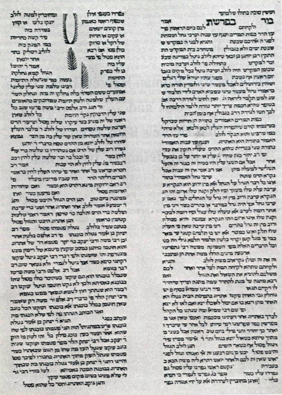
The first fully illustrated Hebrew book was published in the incunabula period as well, it is Isaac ben Solomon Ibn Sahula’s Meshal ha-Qadmoni, printed in Italy, circa 1491, by Gershom Soncino.[12]
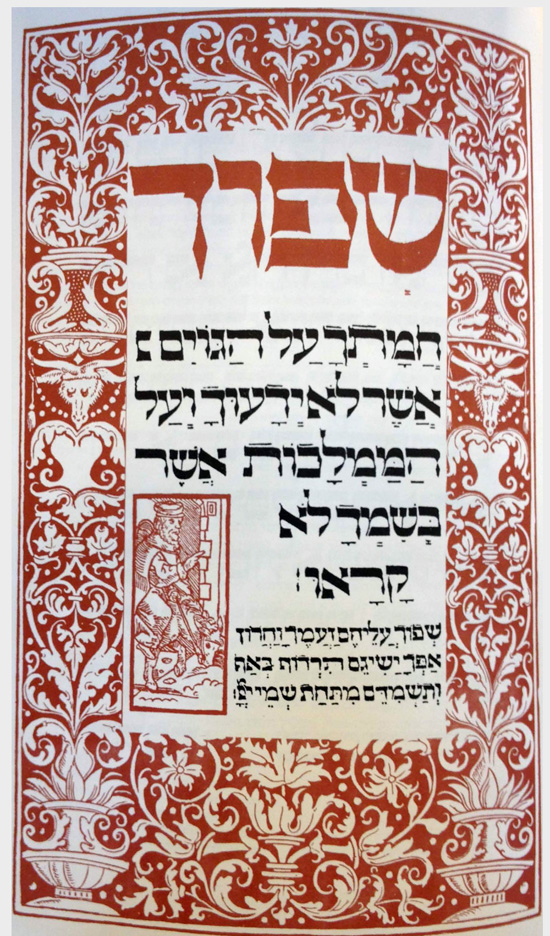
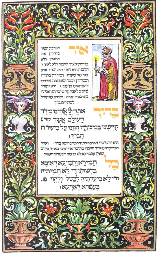
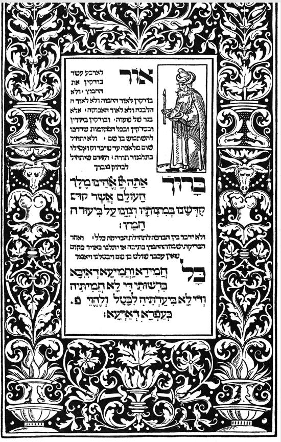
The border surrounding the first page of the Prague 1526 incorporates both Jewish as well as non-Jewish elements. First, it is obvious that a Jew had a hand in the border as, in the inset, it displays someone performing bedikat hametz (searching for the bread) where he is using the traditional implements of a candle and chicken feather. The outside border is less Jewish, and as many have noted, appears to be a copy of Italian/German renaissance borders. The two most likely candidates for models for Prague are the border first used in the 1518 edition of Sacri Doctoris by Raymond Lulli (available here) or a border first used in 1519 for Paolo Ricci’s, Lepida et litere in Augsburg and reused in an Augsburg 1522 edition of Erasmus, Ad reverendum (available here). Although we cannot pinpoint exactly which of these, if any, served as a model, what is clear is that among the images included in this border are bare-breasted women.
The use of bare breasted women to illustrate the haggadah is not limited to Prague. Both Charles Wengrov and Elliot Horowitz have pointed to earlier manuscript antecedents for Prague’s usage of such illustrations.[13] Aside from the printed example of the Prague 1526 Haggadah, this convention continued in manuscripts as well illuminated after 1526. There are at least four such 16th century examples.[14] Additionally, and contrary to Horwitz’s contention that Spanish Jews were less accepting of such displays,[15] the Sarajevo Haggadah, which originated in Spain around 1350, includes two panels of Adam and Eve both depicting a bare-breasted Eve.
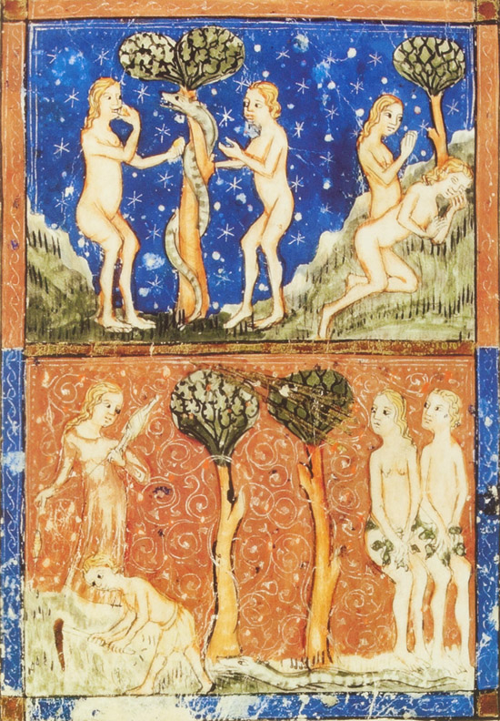
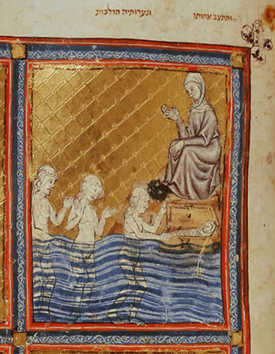
Likewise, the Golden Haggadah, 1320 Spanish manuscript includes the same form of illustration of the Adam and Eve scene. Additionally, the Golden Haggadah includes images of nude bathers when it depicts Miriam standing from afar to see what will become of baby Moses.[16]
III. Censorship in Modern Reprints of Prague 1526
These historical antecedents notwithstanding, recent reprints of Prague 1526 have not been as accepting. This initial border has been altered to airbrush and removes the bare breasts. In 1989, a facsimile edition of Prague 1526 was published with the commentary of the Prague rabbi, Rabbi Yehuda Loew (Maharal). This border has been “touched up.”
Similarly, in 1998, a colorized facsimile edition of Prague 1526 was published. Although the publishers took great pains to provide color where before there was black and white, they also altered this border.
Oddly enough, although they found this image offensive, they decided to reproduce it in two other places in this reprint even though this image only appears once in the original. Here is the original:
Not only is the first border altered, but other instances of bare breasts have been removed; most notably the image accompanying the verse from Ezekiel 16:7 “I made you grow like a plant of the field. You grew up and developed and became the most beautiful of jewels. Your breasts were formed and your hair grew, you who were naked and bare.”
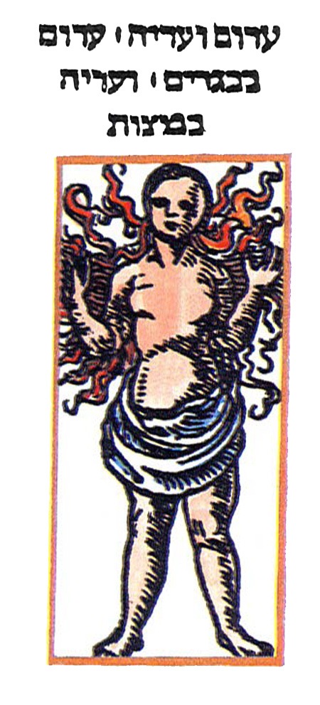
(As discussed previously here a later, Venice 1609, edition also altered this page.) Again in 2001, a facsimile of Prague 1526 “published by the Religious Council of Efrat in honor of the settlement’s twentieth anniversary . . . . two illustrations are surreptitiously deleted: the bare breasted woman” accompanying the verse from Ezekiel.[17] Most recently, in 2009, the airbrushed image of this woman was reproduced in The Schechter Haggadah: art, history; commentary.[18]
[1] There may be an earlier illustrated print haggadah, however, only 12 leaves of this haggadah are extant making it difficult to date (or identify the country of origin). For a bibliography regarding this fragment haggadah see Y. Yudlov, Otzar haHaggadot, Magnes Press, Jerusalem:1997, entry 9; and most recently, Eva Frojmovic, “From Naples to Constantinople: The Aesop Workshop’s Woodcuts in the Oldest Illustration Printed Haggadah,” in The Library, Sixth Series, Vol. XVIII, No. 2, June:1996, pp. 87-109.
[2] See R. Cohen, Jewish Icons: Art & Society in Modern Europe, University of California Press, CA:1998, pp. 21-22; see also Y.H. Yerushalmi, Haggadah; History: A Panorama in Facsimile, Philidelphia:1978, plates 6-8.
[3] Aside from the edition discussed herein, there is at least one copy of another haggadah that is also published by Cohen in Prague that same year. While both versions are substantially similar, some of the images and borders have been changed. Relevant for our purposes, is that the image accompanying “Sefokh” which is a full
page border with images of bare breasted women, has been replaced with a more innocuous border found elsewhere in the haggadah. See Yudlov, Otzar, entry 8; A. Ya’ari, Bibliography of the Passover Haggadah,
Bamberg & Wahrman, Jerusalem:1960, entry 7; Rabbi Charles Wengrov, Haggadah & Woodcut: an Introduction to the Passover Haggadah Completed by Gershom Cohen in Prague, Shulsinger Bros., New York:1967, pp. 78-9.
[4] The first Prague imprint to include a separate title page is in a 1526 edition of Yotzrot published by Cohen. See Wengrov, Haggadah & Woodcut, p. 82 n.238.
[5] Although, with regard to the adoption of the title page, Jews appear to adopt this convention at or near the time as society at large, that was not the case with other literary advances. While the majority of the western world adopted the codex and discarded the scroll some time in the third century, the first recorded Jewish reference to the codex does not occur until the late
eighth or the early ninth centuries. See Anthony Grafton, “From Roll to Codex: A Christian Initiative,” in Crossing Borders, Hebrew Manuscripts as a Meeting-place of Cultures, ed. Piet van Boxel & Sabine Arndt, Bodleian Library:2012, pp. 15-20.
[6] A.M. Habermann, Title Pages of Hebrew Books, Museum of Printing Art, Safed:1969, pp. 8-9.
[7] For a discussion of the development of the title page as well as the different types, i.e., label, border, end-title, see M.M. Smith, The Title-Page its early development 1460-1510, The British Library & Oak Knoll Press, London & Deleware:2000.
[8] See M.J. Heller, The Sixteenth Century Hebrew Book: An Abridged Thesaurus, Brill, Leiden & Boston:2004, vol. I, pp. 6-7.
[9] The border used for the Pesaro Talmuds first appeared in Decachordum Christianum (The Christian Ten String Harpsichord) published in Fano, 1507 by Gershom Soncino. See M.J. Heller, Printing the Talmud, pp. 104-117 Additionally, see Heller’s discussion, id. p. 113, regarding Soncino’s reuse of the Dechachaordum‘s frames. In reality, although the frames were originally cut for Decachordum, they were first used on Gershom’s edition of Bahya ibn Pakua’s commentary on the Torah, published four months prior to Decachordum. See M.J. Heller, The Sixteenth Century Hebrew Book: An Abridged Thesaurus, Brill, Leiden & Boston:2004, vol. I, p. 41; Smith, The Title-Page, supra, pp. 47-59 (discussing the use of the blank title page).
[10] See A.M. Habermann, “The Jewish Art of the Printed Book,” in Jewish Art, An Illustrated History, ed. Cecil Roth [revised ed. by B. Narkiss], New York Graphic Society Ltd., Connecticut:1971, pp. 167-68. In Habermann’s earlier work, Title Pages of Hebrew Books, p. 9, he erroneously asserts that the earliest works to include architectural title pages were Soncino’s Melitza le-Maskil and Bomberg’s Tanach, both published in 1524/25.
[11] See Joshua Bloch, “The Library’s Roman Hebrew Incunabula,” in Hebrew Printing & Bibliography, ed. Charles Berlin, New York:1976, p. 140. For a description of this work see S. Iakerson, Catalogue of Hebrew Incunabula from the Collection of the Library of the Jewish Theological Seminary of America, JTS, New York & Jerusalem:2005, entry 7.
[12] See A.M. Habermann, “The Jewish Art of the Printed Book,” supra, at 169. Habermann appears to argue that this is first printed Hebrew book containing illustrations, is incorrect. As discussed above, the first was the Rome edition of Sefer Mitzvot Gedolot. He is not alone in this error. Ursula Schubert makes the same error. See Ursula Schubert, Jewish Book Art, From the Renaissance until Emancipation, [Hebrew], Kibbutz hami-Uchad, Tel Aviv:1994, p. 27. Habermann, id., notes that the great Hebrew bibliographer, Mortiz Steinschneider, was tricked with regard to one of the illustrations contained in Meshal
ha-Qadmoni. Steinschneider, in a discussion about the alleged Christian origins of these illustrations, called attention to the fact that in one of them contains a monk wearing a crucifix. But, in the interim we have learned “that this last embellishment was a
practical joke played by a Christian scholar. . . [the crucifix] having been added by [a later] hand!” Regarding the history and origins of the images included in Meshal ha-Qadmoni, see César Merchán-Hamann, “Fables from East to West,” in Crossing Borders, pp. 35-44; Ursula Schubert, Jewish Book Art, pp. 27-8.
[13] Rabbi Charles Wengrov, Haggadah & Woodcut, p. 47 nn.112-13;Elliot Horowitz, “Between Cleanliness and Godliness,” in Tov Elem: Memory, Community & Gender in Medieval & Early Modern Jewish Societies, ed. E. Baumgarten, et al., Bialik Institute, Jerusalem:2011, *38-*39.
[14] Mendel Metzger, La Haggada Enluminée, E.J. Brill:1973, plate LIV, nos. 303-305; Chantily Haggadah, Musée Condé, Ms.
732, fol. 13, reproduced in Index of Jewish Art, eds. B. Narkiss & G. Sed-Rajna, Jerusalem-Paris:1976, vol. I, card no. 36.
[15] Horowitz, “Between Cleanliness,” at *38, (“One suspects that a Spanish Jew coming to Germany in the early 15th century would have been equally surprised to see an image of a naked woman” in a Hebrew manuscript.).
[16] The Golden Haggadah, ed. Bezalel Narkiss, Pomegranate Artbooks, California:1997, figs. 17 & 24.
[17] Id. n.37. Horowitz only notes the 2001 example of censorship of Prague 1526, and apparently is unaware of the earlier
examples. Additionally, he chastises the Efrat reproduction for erroneously indicating a 1527 publication date. Efrat is not only in erring regarding the secular date. The first facsimile edition (Berlin:1925), which includes a scholarly introduction, full title
is: “Die Pessach Haggadah Des Gerschom Kohen Gedruckt Zu Prag 5287/1527.” Perhaps one can excuse the error as, in reality, it was completed on the eve of 1527, December 30, 1526.
[18] The Schechter Haggadah: Art, History & Commentary, [illustrations selected and annotated by David Golinkin], Schechter Institute of Jewish Studies, Jerusalem:2009, p. 36, fig. 16.1.
This post is part of a series of posts regarding illustrations adorning manuscript and print Haggadot. Our first post dealt with a new work on the topic and can be viewed here. In this post we will focus upon the some of the Halachik implications of these illustrations. In many Ashkenazic manuscripts, the Passover illustrations begin chronologically earlier than the Seder. Many begin with the preparation of the matzah. For example, in the Second Nuremberg Haggadah[1], (the manuscript is online here) a 15th century Ashkenazic haggadah, contains ten scenes devoted to the matzah process. A similar haggadah, likely illustrated by the same artist, also includes numerous matzah baking scenes. All of these, however, begin with the bringing of the grain to the miller. This is in contrast to today’s practice whereby the matzah producing process begins earlier, with the cutting of the wheat.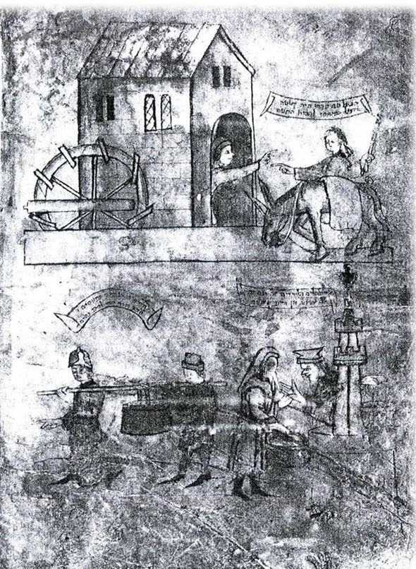 (All images may be clicked for larger viewing.)
That is, for many today, matzah shmurah means shmurah (watched) from the time of harvest and not from the time of grinding. But, in reality the reason for the illustrations beginning where these haggadot do, is simply because they reflect the practice in Ashkenaz, based upon the R. Ya’akov ben Asher, the author of the Tur, that only from the time of grinding is it necessary to “watch” the grain. Matzah Shmurah in Ashkenaz in the medieval period meant grain which had been watched from the time of grinding not cutting.[2] Turning to a Sefardic custom, the Barcelona Haggadah, produced after 1350, is the earliest record of the custom to place the Seder Plate on someone’s head during the recitation of Ha Lahma Ania (Ashkenazim remove the plate from the table).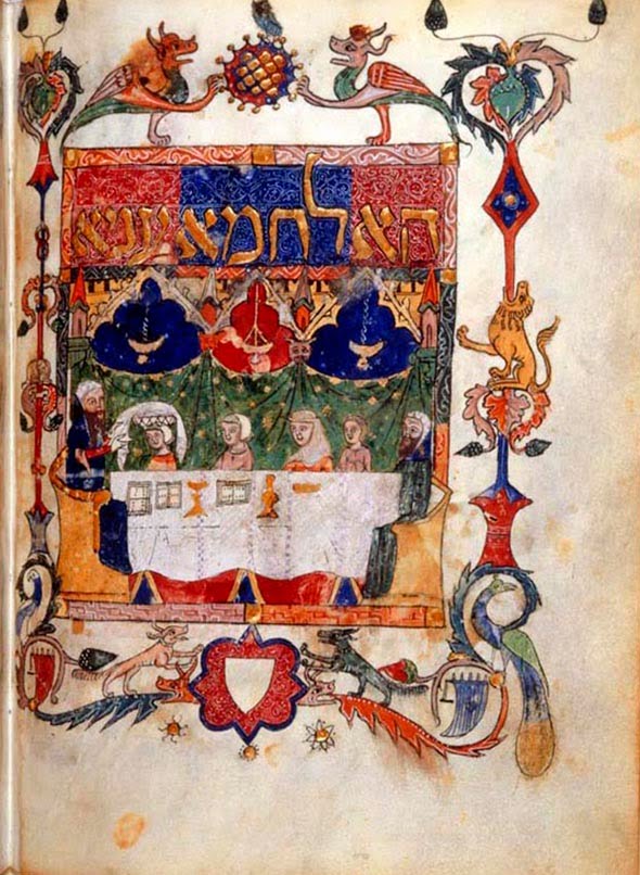 Only some three hundred years later is this custom mentioned in printed sources. Additionally, there is a difference between the Sefardic and Ashkenazic haggadot regarding what the Seder Plate actually was, with the Ashkenaz depicting a plate, whereas the Sefardic manuscripts depict a basket.[3]
When it comes to marror and what vegetable that is, we have at least two different types depicted in various manuscripts. In the Brother to the Rylands Haggadah, marror is depicted as an artichoke, as is in the case with the Sarajevo Haggadah.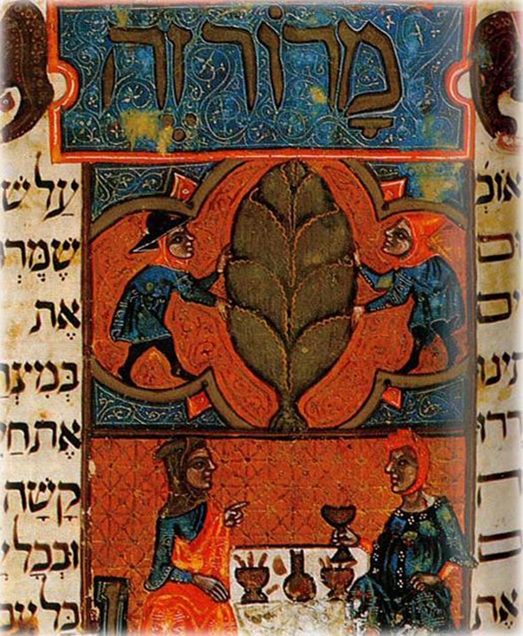
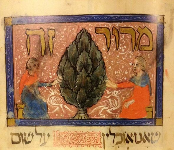
While in many manuscripts, marror is a leafy vegetable.[4]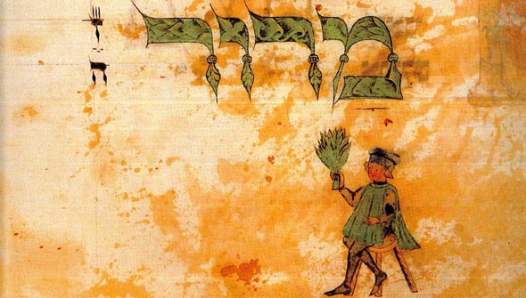
Setting aside the issue of what marror is, another custom related to marror can be found in both printed and manuscript haggadot. In the Prague, 1526, the first illustrated printed haggadah, there is a picture of a man pointing at his wife with the legend, “there is a custom that a man points to his wife when mentioning marror based upon the verse Ecclesiastes 7:26 “Now I find woman more bitter than death.”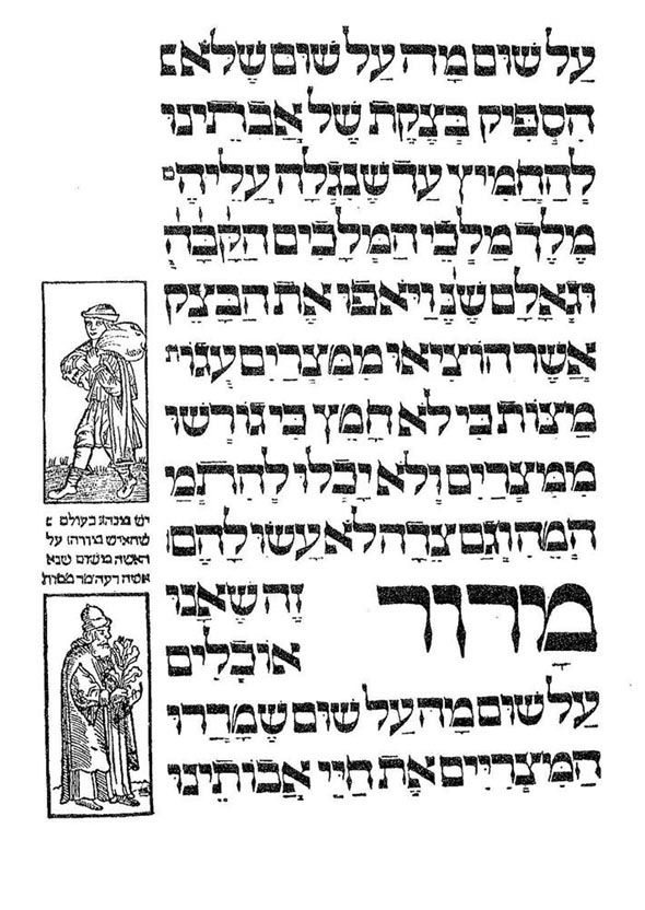 A.Y. Hyman the scholar of Jewish liturgy was appalled when he came across this. In his autobiography, he claims that there is no basis whatsoever for this “custom.” Hyman is wrong.[5] If you look at the Brother to the Rylands Haggadah you can see that it shows this custom. As does the Washington Haggadah.
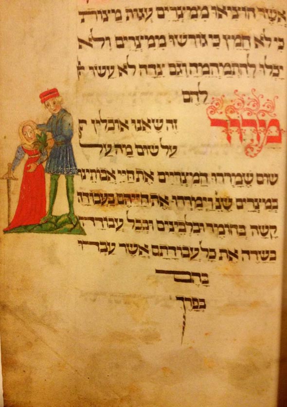 Likewise, the Rothschild Miscellany shows the same custom.
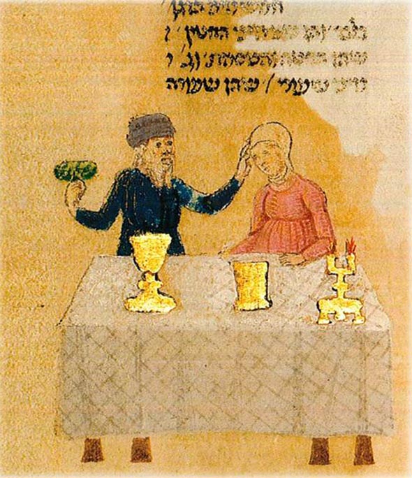
It’s worth noting that the Rothschild Miscellany shows another custom at the time, mid-14th century, that of mixed dancing.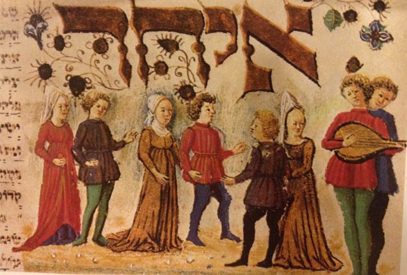
The mixed dancing is that of couples, husband and wives dancing with each other, and not that of unmarried men and women dancing[6] In Italy, where this manuscript was composed, mixed dancing was apparently common during this period.[7] Returning to the gesturing at one’s wife at marror, in the Hiluq and Biluq Haggadah this custom takes on a somewhat more humorous dialogue with the wife no longer passive but instead returns the compliment. In that haggadah it includes speech balloons and they record the following: The husband states “touching marror I must recall that this one, too is bitter [as gall].” To which the wife replies, “It is you [my husband] is one of the causes of bitterness as well.” After which, we have a play on the 13 attributes of Rabbi Yishmael and the haggadah provides that “the third comes between them [perhaps the marror itself] and makes a stink” – or in Hebrew ve-yavo ha-shlishei ve-yakhriach benehem.[8]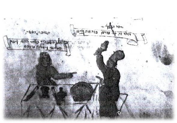
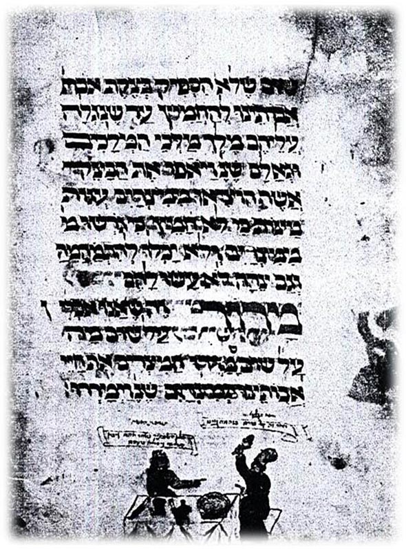
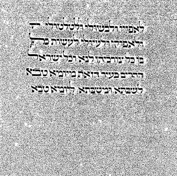
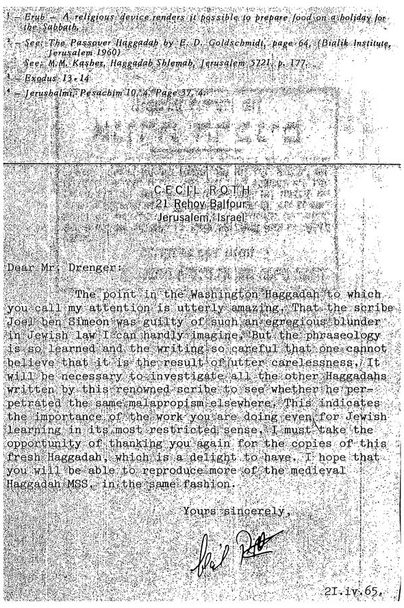
Similarly, in some Ashkenazic haggadot manuscripts, they show the the husband and wife pointing at one another.[9] Finally we get to a halachik error in a manuscript haggadah. The Washington Haggadah was written by a scribe calledJoel ben Simon. This haggadah was first printed as part of the Diskin Orphan House haggadah series in 1965. The Library of Congress didn’t publish its facsimile edition until 1991, and last year another facsimile edition of this haggadah was published as well.[10] Although this haggadah was written close to 300 years prior to Diskin publishing it, until that time a significant scribal error escaped notice. Specifically, in the text for eruv tavshilin rather than just saying “with this eruv I am allowed to cook from Yom Yov for Shabbat,” it continues and says “and on Shabbat for Yom Tov.”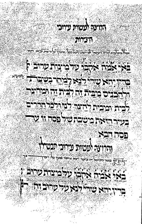
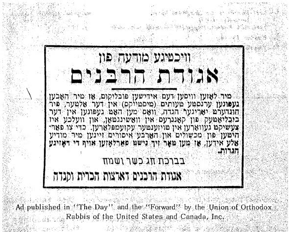
Needless to say this did not escape the eagle eyes of some who feared that someone may use this haggadah (we note that contrary to the other reproductions mentioned, the Diskin version is a poor copy) and inadvertently think it is permissible to cook on Shabbat. So, the ever wise Aggudat ha-Rabbonim took out ads in the Yiddish daily, Der Tag, and the Forward to let its readers know of this error. The publishers took this one step further and mailed out a letter, with the provocative title, “Heresy or Blunder,” after Passover indicating the error and also included a letter from Cecil Roth, who had written about manuscript haggadot.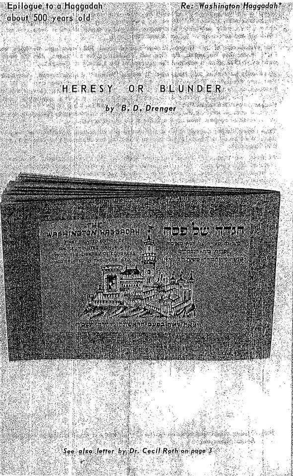
In his letter he indicates that indeed this was most likely inadvertent and that Joel did not have a different tradition regarding eruv tavshilin. Indeed, we know from Joel’s other manuscripts, where he records the correct blessing, that the Washington Haggadah’s version was simply a scribal error.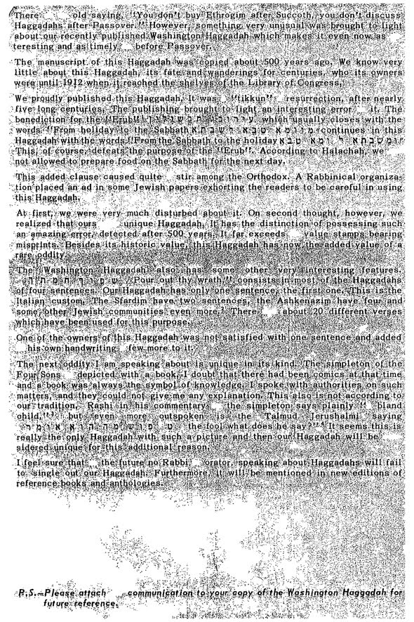
 This is not the only error related to halakha and haggadah illustrations. R. S.H. Kook, criticizes two aspects of illustrations that appear in the Prague 1526 Haggadah. Both of these issues center around how the wine glass is depicted. Specifically, he takes issue with the fact that in many of the illustrations show the wine glass in the left hand and not the right. Additionally, he complains that the illustration show the holder grasping the glass at the stem and not at with his fingers cupping the bottom of the glass.
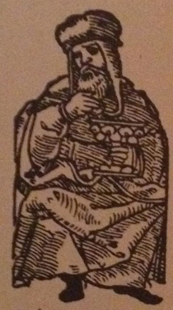
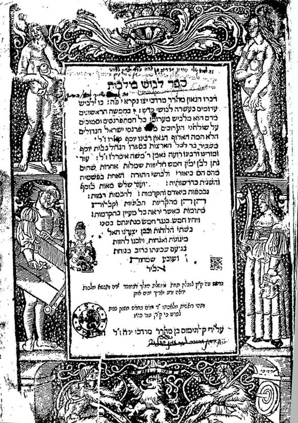
Regarding the first issue, that of left handedness, this anomaly may be attributed to the fact that this was the first completely illustrated woodcut haggadah. And, as it was the first, it was not necessarily perfectly executed. But, before we continue we must digress and explain about woodcuts in order to get to the left handedness. A woodcut when inked and put on paper produces a mirror image of whatever the woodcut depicts. Thus, if the woodcut was of a right hand, when pressed on paper would produce a left handed image. Additionally, when copies were made, the copyist were not careful and would reverse the images. That is, they were working off the printed image and would copy it directly rather than accounting for reversing the image to ensure that when it was used it would produce the same and not a mirror image. So, as has been explained, during the early history of woodcuts “copies [of woodcuts] were constantly being made, with or without leave, for copyright hardly existed, and the same printer would often have to replace worn cuts by new blocks in successive editions. It is not always an easy task to distinguish copy from original. Immediately recognizable as from different blocks are subjects which appear in reverse directions, for the copyist who does not take the trouble to reverse his drawing from the original print, will make a block that will print the subject reversed.”[11] We can now explain why the images are left handed, presumably, they were copied and the woodcutter was not careful to reverse the image, thus producing a left handed image. As an aside, another example of copying which reverses the images may be seen when the Prague 1526 Haggadah was itself used as a model for a woodcut. The border surrounding Shefokh was reused in the Levush. As is apparent, the images are that appear on the right in the Prague 1526 Haggadah appear on the left in the Levush. And, those on the left appear on the right.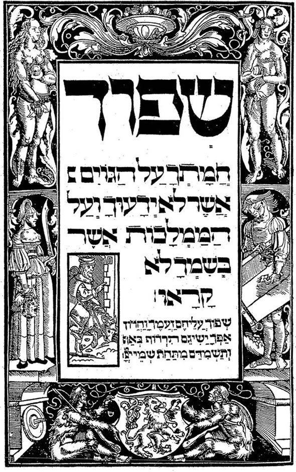
 Regarding the second point, the failure to cup the glass rather than grasp the stem, this can be attributed to an error on R. Kook’s part and not the woodcutter. While today it may be commonplace to cup the glass, this was only popularized by R. Yeshaya Horowitz, in his book, Shnei Luchot ha-Brit, (Shelah). R. Horowitz wasn’t born when the Prague 1526 Haggadah was printed – he lived between 1565-1630. Moreover, his book was published posthumously, in 1648, more than 120 after the Prague 1526 Haggadah was published. Thus, it is unremarkable that the Prague 1526 Haggadah failed to account for a custom that didn’t exist at that time. This is another example of why bibliography is important, for other examples see here. Finally, we conclude this part of the series regarding halachot and Passover in general, and specifically, the notion that on Passover we are stricter than normal. At times it appears that some go overboard with the various humrot on Passover as well as cleaning all sorts of items that seemingly don’t require cleaning. But, from the evidence of manuscript illustrations, this notion of stringency is not a new one. The Golden Haggadah, circa 1320, includes this very nice image of cleaning and searching for leaven. If one looks closely they will note that the woman on the left is apparently sweeping the ceiling! Thus, indicating that perhaps going overboard has been the case for some while. Also of note is that the father is performing bedikat hametz and he is bareheaded (as is the son).[12]
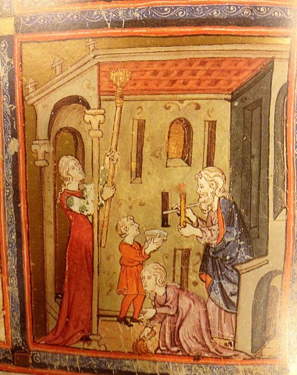
[1] Its title is a reference to the fact that from the mid-nineteenth century until 1957 it was housed in Nuremberg, after which it moved to the Schocken Library, and then to a private collector. The reason it is the the Second, is because Nuremberg also had another manuscript haggadah – now known as the First Nuremberg Haggadah. It too is no longer in Nuremberg. Today it is in the Israel Museum.
[2] See Steven Fine, “The Halakhic Motif in Jewish Iconography: The Matzah-Baking Cycles of the Yahuda and Second Nurnberg Haggadahs,” in A Crown for a King, Gefen, Jerusalem-New York: 2000, pp. 106-07. [3] See Evelyn M. Cohen, “Seder Foods & Customs in Illuminated Medieval Haggadot,” in The Experience of Jewish Liturgy, D.R. Blank ed., Brill, Leiden:2011, 24-25. We note that while this article provides a summary of some of the images and text accompanying medieval haggadot, the article provides little context for various practices. Indeed, the article fails to provide sources which support many of the illustrations and texts and instead merely parrots what the the manuscripts say or depict. [4] On this issue of which vegetable is preferable for marror see Zohar Amar, Merorim, n.p., 2008. [5] His comments appear in the Misrad Hasikon 1965 reprint of the Prague 1526 Haggadah at pp. 14-15. [6] See Therese & Mendel Metzger, Jewish Life in the Middle Ages, Chartwell Books, Inc.:1982, 216-17. [7] See the sources collected by R. Henkin, Shu”t Benei Banim, vol. 1, Jerusalem: 1998, no. 37, esp. section 5 where he discusses Italian sources. Thanks to R. Weinfeld for bring this source to our attention. [8] See Bezalel Narkiss, “Art of the Washington Haggadah,” in The Washington Haggadah, Commentary, M. Weinstein, ed., Washington D.C.: 1991, pp. 73-75, discussing manuscripts that contain the marror/wife images, as well as the source in the following note. [9] See R. Yisrael Mordechi Peles, “Controversies Regarding Customs That Can Be Gleaned from Haggadot,” in HaMaayan, Nissan: 5771 (51,3), pp. 13-14, available here. [10] The 1991 edition was accompanied by a commentary volume. The 2011 edition also includes some articles with the color reproduction of the haggadah. [11] Arthur M. Hind, An Introduction to the History of Woodcut, Boston: 1935, vol. 1, pp. 284-85, quoted in R. Charles Wengrov, Haggadah and Woodcut, New York: 1967, pp. 87-88. In general Wengrov’s book provides a wealth of information regarding the images contained in the Prague 1526 Haggadah.[12] Mendel Metzger, Jewish Life in the Middle Ages, supra, p. 148 discussing generally medieval manuscripts and depictions of headcovering or lack thereof.
The classic Vilna Shas, published by the firm of the Widow and Brothers Romm, was completed during the years 1880-86. It was the most complete and accurate edition of the Talmud printed until that time, containing many new Peirushim and using new sources to ensure the accuracy of text. This fact was not lost on the chief editor Shmuel Shraga Feiginsohn as he states in the famous Achris Davar at the end of Maseches Nidah.
“We did not print a Shas like every other Shas,… by copying what came before us like a monkey. We wanted to create something entirely new and to illuminate it with an entirely new light”
My purpose here is to concentrate on one small Sugya in Shas , the commentary of Rashi on it, with the accompanying diagrams in the Vilna edition. I will then show diagrams from some previous editions of the Talmud that are more illustrative and more accurate. Perhaps the reader will then conclude that there were some portions of previous editions that the Vilna Shas should have copied rather than the one that it did.
The Gemara on Yoma 11b discusses doorways that are or not required to have a Mezuzah. It then discusses one type of doorway for which there is a Machlokes between Rav Meier and the Rabbanan and that is the so called Shaar Madai. As Rashi there explains it, a Shaar Madai is a gate in the wall of a city which has within it an arched doorway (Kipah) and was used commonly in Madai. For our own purposes, think of the Shaar Yafo which is substantive structure in itself and within it is the actual doorway into the old city.
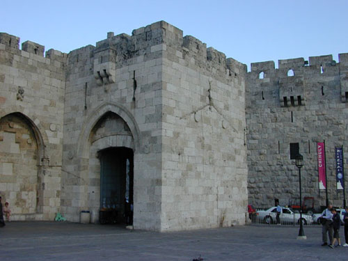
As a bit of background, for a doorway to require a Mezuza it needs to have three elements. It has to be at least four Tefachim wide on the bottom and the top, it’s side posts ( Raglayim) have to be ten tefachim high, and it has to have a lintel on top. The Gemara states that the only case of Shaar HaMadia where there is disagreement in Halacha between Rav Meier and the Rabbanan is this: The doorway starts with a width of 4 Tefachim on the bottom, each side of the doorway ( Regel) rises up straight at least 3 Tefachim so that at that point there are still 4 Tefachim between them, but then the doorway starts curving inwards, rising on each side to a height of 10 Tefachim. However, at that point, there is no longer 4 Tefachim in width between the two sides. Rav Meier says that if the gate structure( the Chomah) itself is at least 4 Tefachim wide at a height of at least 10 Tefachim, we apply the concept of “Chokekin L’Hashlim” to this case. Chokekin L’Hashlim is a Halachic concept which literally means that we “excavate to complete ( the required measurement)”.Rav Meier says that if the walls surrounding the archway are thick enough that had they been excavated, the doorway could be made 4 Tefachim wide for a height of ten Tefachim, then the doorway requires a Mezuzah. The Rabbanan disagree and say that even this type of Shaar Madai does not require a Mezuzah.
Let’s go through the Rashi: “V’Yaish B’Ragleha Shlosha” “The sides of the doorway rise up ( at least) three (Tefachim)”….still maintaining a width between them of four Tefachim….but the width between them is not four Tefachim at the height of ten Tefachim…because before the sides rise to the height of ten Tefachim, they narrow to a width of less than four Tefachim…but you can expand the emptied out space contained in the encompassing structure ( The Chomah) to the width on the bottom ( 4 Tefachim)… for the gate structure does not parallel the inner doorway like this (“Kazeh”)…rather the wall ( meaning the gate structure)is longer on top than the doorway opening like this (“Kazeh”)
There are very nice diagrams of the two possibilities mentioned by Rashi in the 1829-1831 edition of the Shas printed in Prague by Moshe Yisrael Landau, grandson of the Nodah B’Yehudah.
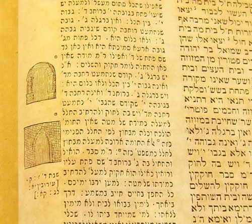
It is very clear from the diagrams that the first possibility mentioned by Rashi ( the one that is not referred to in the Gemara) is where both the doorway and gate structure curve inwards so that neither of them has a width of 4 Tefachim on top. The actual case discussed by the Gemara ( the second possibility of Rashi) is where the doorway curves in to be less than four Tefachim on top, but the gate structure itself retains at least the width of four Tefachim on top and is also straight on top.
Similar diagrams appear in the Lemberg small and large folio editions of 1862, and the Vienna edition of 1841. Here is what the small folio version of the Lemberg edition looks like.
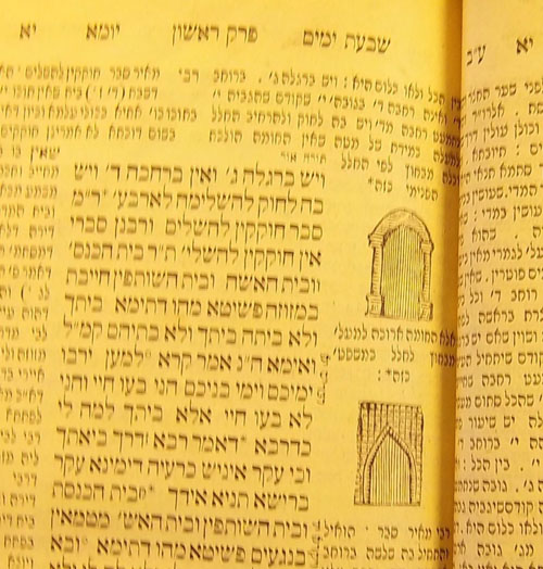
Before we take a look at the diagrams presented in the Vilna Shas, let us look at these diagrams in much earlier editions so we can trace their development. The only manuscript copy of Rashi that I was able to obtain (courtesy of Dr. Ezra Chwat at Hebrew University) looks like this.
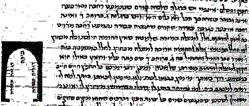
The first thing you notice is that this manuscript does not have the word “Kazeh” after the first case, rather just referring to the second case. The illustration for the second case shows a curved doorway within a rectangular structure, exactly the way we have seen it in the Prague, Vienna and Lemberg editions. This illustration also seems to indicate that the sides of the inner doorway must be at least 10 Tefachim high before curving inwards. The words “Ragleha Asarah” are inside the doorway structure making it appear that they apply to the sides of the doorway being ten Tefachim before they curve inwards. This seems to be the case where even the Rabbanan agree that a Mezuzuah is needed. The diagram goes against Rashi’s Lashon here which is “She”kodem She’Higbiah Asarah,Nisma’et Rechava Mi’Daled”.
Advancing to the printed edition, we first look at Bomberg 1521.
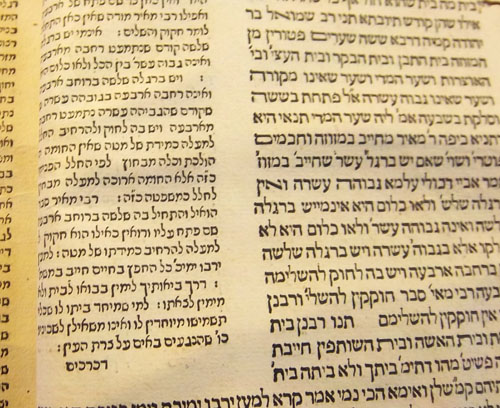
The Bomberg scholars must have had a Rashi manuscript which had the word “Kazeh” after both the first and second case in Rashi. However, they did not leave any room for it to be filled in by hand as in other Masechtos which have missing drawings. Here is an example of such a situation in the Bomberg Eiruvin.
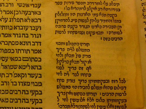
Moving forward I did not find these diagrams from Yoma 11b in the Constantinople 1585 edition, the Frankfurt on Oder 1698 edition ( even though it has the diagrams from Eiruvin ), or the Amsterdam 1740 edition. I did find fairly accurate diagrams in an Amsterdam 1714 edition but I believe they were drawn in.
The first edition I found these printed diagrams in was Amsterdam 1743 from the Proops printers. Here is what it looks like.
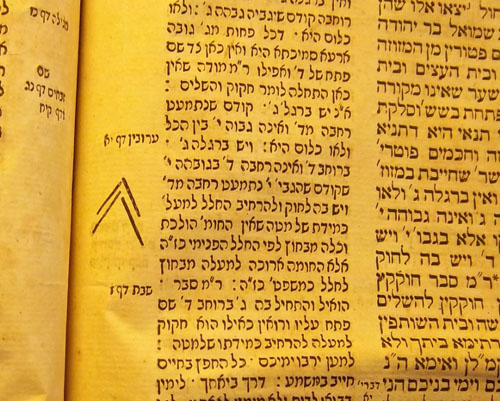
I did not find this diagram ( maybe it is two diagrams?) very helpful in understanding what Rashi meant when he said “Kazeh”. The diagram seems almost humorous to us, but imagine how many eyes studied this diagram and tried to make sense of it.
As mentioned before, by 1831, there were very helpful diagrams in editions printed in Prague, Vienna and Lemberg. The same cannot be said of the Zhitomir edition of 1864 which looks like this.
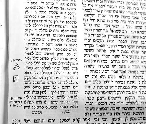
The first diagram is not nearly as accurate as the one in the previously mentioned editions. It mainly tries to show that the structure of the gate parallels the doorway by “curving” inwards. The second diagram which resembles a tooth, shows the doorway narrowing as it extends upwards with the gate structure maintaining its rectangular shape. My opinion is if a Rashi says Kazeh, the diagram should be as helpful as possible. No one expects a sophisticated illustration but it should be something that clearly shows what Rashi meant. In this case, I think the diagram should look like a doorway within a gate or walled structure.
We finally get to the Vilna Shas. The editors of this Shas clearly had the Vienna, Prague and Lemberg editions at their disposal. They knew what these diagrams could look like. Yet their diagrams look very much like the Zhitomir edition, with a little improvement on the second diagram.
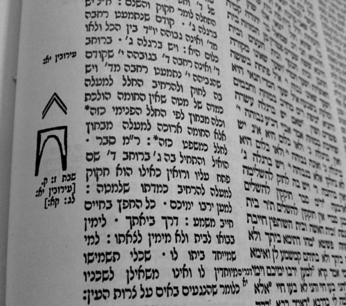
It is possible they did not have the technology to replicate the Prague 1831 edition but that seems unlikely, because in a parallel Sugya in Eiruvin 11b they have diagrams that look like this.
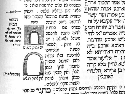
Maybe they had a Rashi manuscript that made the first diagram look like this ^. But even so, I think they should have tried to make things as clear as possible and the two diagrams they chose just do not do that.
Perhaps the ultimate irony in this whole Sugya is that not only may the diagrams be incorrect, but even the term “Shaar Madai” may be incorrect. The Rashash notes that in K’sav Ashuris, a Mem and a Tes look similar, and because of a Ta’us Soferim, the term Madai was used instead of the correct “Shaar Taddi”, which was a gate on the Har Habayis.